
Nice work! It was a bit challenging to customize things since the popups covered the working area and stacked; having them to the side would have been helpful. Also the font with the shadow really strained my eyes. I really liked the effect when you change gear and the stats update. Also kudos for controller support!
51 days ago(+1)
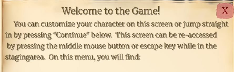
The welcome text. Since the font is thin, it ends up looking blurred. Comically it’s not as bad when small but fullscreen gives me a headache. Thankfully the other text is much better.
Moving the pop is MUCH better, though I’d also put the secondary popup underneath that one (for the definitions of words). Love seeing progress!