
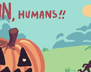
thank you for playing :)
A member registered Jun 02, 2024 · View creator page →
Creator of
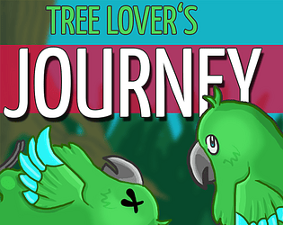
Parrot-friendly strategy game. Entry to the Godot Wild Jam #90
Strategy
Play in browser
Epic hero, awful timing. A comedic cutscene for GoedWare Game Jam 2. Theme: Five Seconds Too Late.
Play in browser
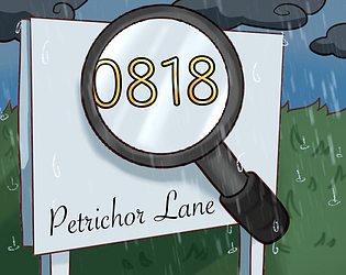
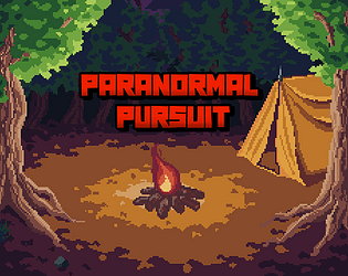
There is an uninvited guest in your house. Collecte evidence to report it to the police
Adventure
Play in browser


Your mission: Keep passengers moving, keep complaints low, and do not ignore system messages.
Simulation
Play in browser
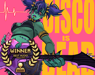
Winner for Best Audio in Pixel Art Jam 2025 | Fight your way out of hell to the beat of the music!
Rhythm
Play in browser
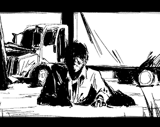
Navigate the wreckage and solve puzzles with wit and strength in this thrilling 2D adventure!
Adventure
Play in browser
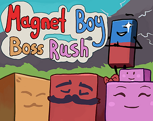
A boss rush game where you attack bosses by turning the magnet on and off!
Action
Play in browser
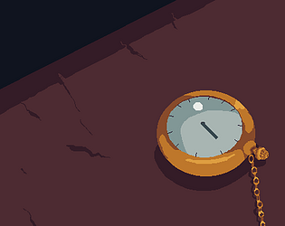
Pocketwatch is a 60-second cutscene about a time loop. Experience the tension and drama of his endless struggle.
Play in browser
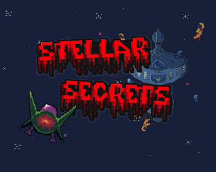
Uncover the dark secrets of a derelict space station in this thrilling 2D horror platformer.
Platformer
Play in browser
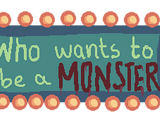
Dragged into a strange gameshow, will you leave rich or die in the dark?
Play in browser
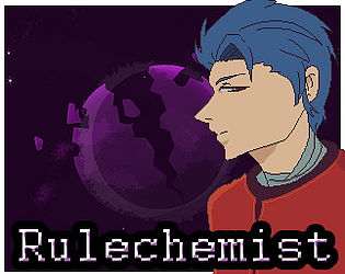
A small platformer where you create potions that alter the world you are in.
Platformer
Play in browser

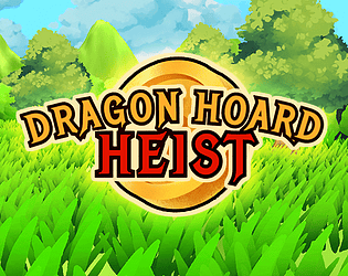
Gather enough gold to build your fortress before the dragon wakes up and blows it all away!
Platformer
Play in browser
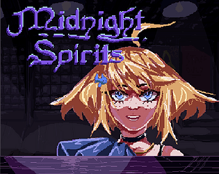
Midnight Spirits is a bartending simulator with a mix of puzzle and gambling.
Visual Novel
Play in browser