Oh, it works on actual hardware? I wasn't sure since the jam judges were allowed to use theoretically accurate emulators, and I'm not in a good financial situation for buying the needed gadgets. I'm glad you enjoy it.
A member registered Feb 04, 2014 · View creator page →
Creator of

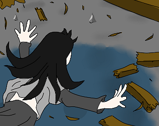
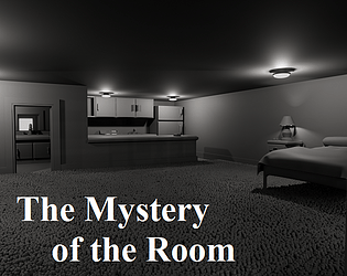
A short story about a mysterious student in a mysterious house
Visual Novel
Play in browser
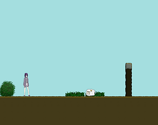


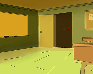
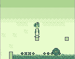
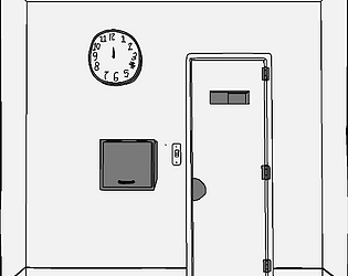
Creepy puzzle game where the puzzle's already been solved.
Puzzle
Play in browser