Sorry for this being really late, I got my hands tied with a lot of other things as of current. I wanted to finish the game before writing this, but I wasn't able to...
From what I saw of the first few levels however, THIS IS WAY BETTER THAN THE OLD VERSION.
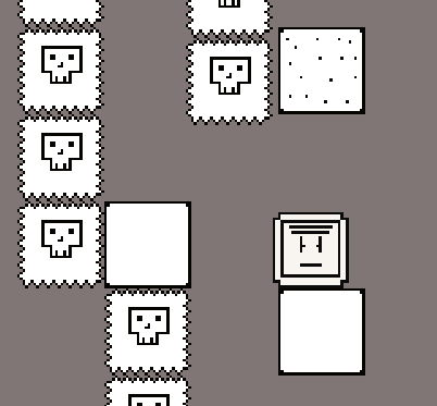
It's much easier to traverse levels now that the UI is smaller, and I like a lot of the new level design! The levels feel more structured ( I didn't have a problem with the old level design, but it's now far easier for me to memorize level layouts ).
The newly added crystals ( I don't remember them in the older version ) make it easier to know when you need to time travel, and the level design gaurantees you know where to do so.
I have just one small tiny little problem though... The clocks add 1 second, and are usually huddled up... The reason this is a problem, is that if you spend even 1 second to get a watch, it becomes a waist. But since clocks are huddled up, this isn't a problem, since it's always give you a bunch of time when collecting them at the same time.
What's the problem? You don't have time to collect every since watch, and if you left a few behind the first time, the time you get isn't worth the amount of time it takes to get those watches.
But that's just about it. I like the new art, menu, UI, and just about everything else. I can't tell, but I think the player's physics are slightly better than before ( I have no idea )?
Anyhow, I am extremely glad you updated the game, as this had some of the most potential of a game out of this jam!