
This is an okay game.
The player doens't feel too responsive ( as the animation stays the same regardless of input ), but this is honestly really minor.
I feel the camera should be zoomed out, as it feels cramped during gameplay, but once again this is also minor.
The player falls down too fast ( be careful if you ever change this to not make it floaty ), making it annoying to angle your jumps properly.
All of this isn't too bad ( except for the last one ), and are forgivable in my book.
The game has a lot of different mechanics, which ( could ) lead to interesting setups and level design.
But, what is the main problem with the game? Sadly, Level Design.
There are many times were you hit your head while jumping, have a lot of mechanics introduced at the same time ( causing confusion and leading to the lack of experience making easy sections harder ), jumps that need perfect timing and precision, random spike placement, and a lot of other problems that stem from this one aspect.
Quick examples from the first level:
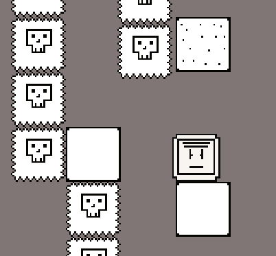
I wanted to beat the entire game, but this was too difficult to do because of the random spikes ( both literal and metaphorical ) in difficulty and unfair level design.
I thing the art is okay, and works for this type of game ( simple scaling platformer ).
I like the fact this game is ( mostly ) in grayscale, as not many games ( if any ) in the jam have tried this style.
I think you did a good job with making the player know where everything is:
Thanks to the darker backgrounds, simple style, and lack of clutter ( too many things on screen trying to grab your attention ). Unlike a lot of games in this jam, this didn't hurt my eyes!
I wish some of the graphics were more consistent ( double outlines used only in certain places, some things having slight color ) but this is forgivable.
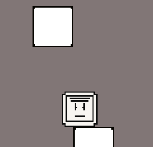
Some of the graphics are unclear ( like the player, not sure what most of the lines on his face mean, nor his outer body ), and could be described better ( through using clear shapes & symbols that people are familiar with ).
Some objects ( like the moving platforms/spikes ), could have been given unique visuals to show the fact that they are different from they're normal counterparts.
Overview:
Nice work, you showed a lot of skill in many aspects, but the level design and graphics could definitely be improved!
WARNING:
Do not take all advice people give you, as it may be biased or simply just not work for your original vision.
Please look through what you may feel is important and is genuine for the game you wanted to make, and any you may make in the future.
You do not have to update your game if you do not want to, I just want you to take any valuable advice I might have given with you for any projects you make in the future.