Ask and you shall receive
A member registered Nov 06, 2016 · View creator page →
Creator of
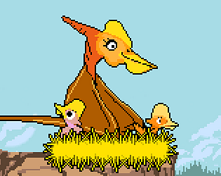
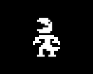
Learn to fly as a dinosaur! This game was developed for DINOJAM3.
Platformer
Play in browser
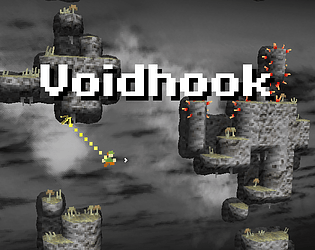
Series of short challenges tied together by colorful visuals and a sweet little story. +Level editor included
Platformer
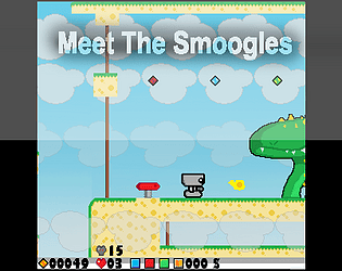
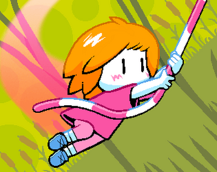
My first released game. Meet the Smoogles is a platformer filled with bugs and quirks, but also charm and passion.
Platformer
Recent community posts
Eatvolve community · Created a new topic Unable to find any instance for object index '47' name 'obj_player'.
Hi, I keep getting this error in the demo version of the game. It always happens when the timer gets to 0:00.
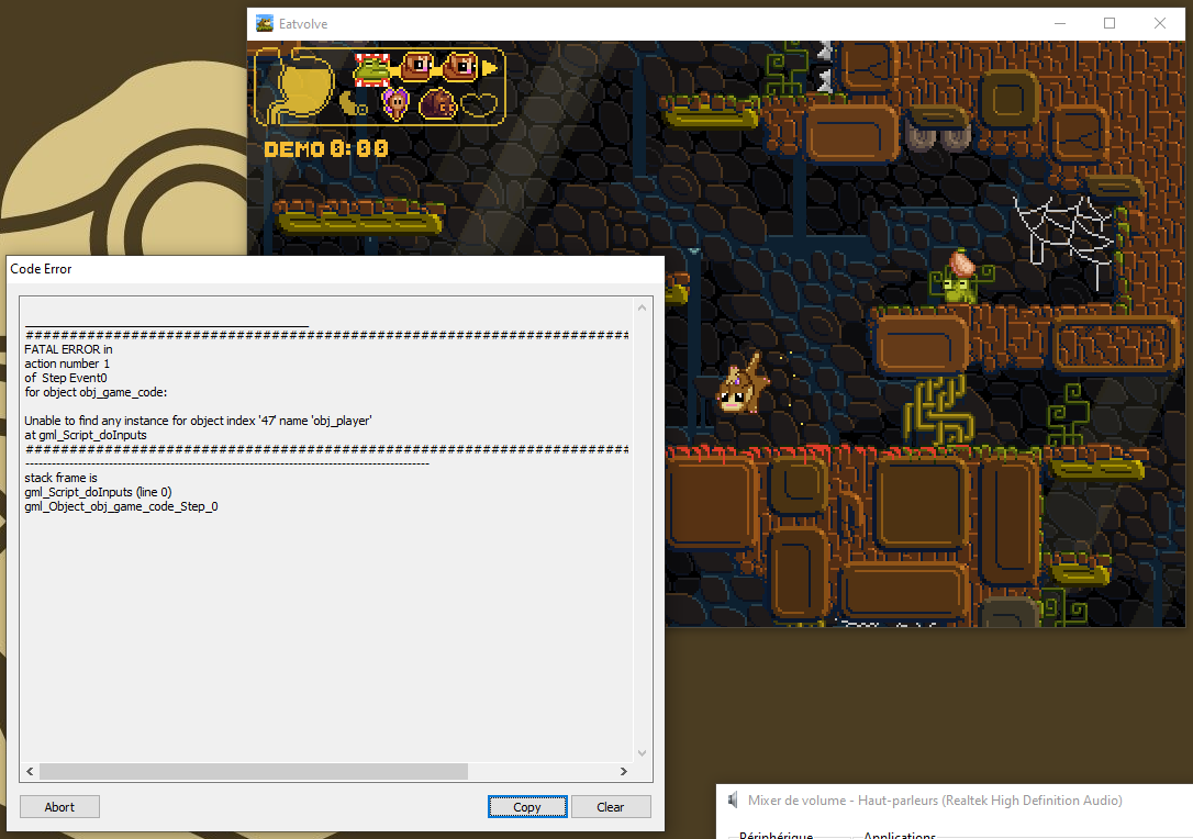
The game also restated a few times; I undestand from this thread that it is an intentional restriction for the demo(?) I though it was a bug until I looked through the forum :/
Anyway, the game seems cool so far. I'll have to give the full version a try!

itch.io Community » itch.io » Questions & Support · Replied to Ludonauta in Collect emails on free download
itch.io Community » itch.io » Questions & Support · Replied to Ludonauta in Collect emails on free download
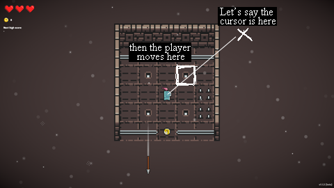
itch.io Community » Game Development » Get Feedback · Replied to ALMI Games in DodgeOnDungeon beta feedback
I see! Honeslty, I don't think I would mind losing diagonal movement if it meant I didn't need to precisely and quickly click on squares.
Or if you're keeping the mouse, you could use the angle from the cursor relative to the character's position to determine where to move. It would require less precision.