Thank you for the feedback! We've received some similar complaints about latency in the browser version, specifically, did you try out the executable? Perhaps that could offer you a more satisfying experience :)
Francca
Creator of
Recent community posts
This frog's tongue could technically qualify as a hookshot, and since we all know having a hookshot in your game makes it an automatic masterpiece, I fear we've found the best game in this jam :D
But in all seriousness, great job! I really liked the platforming, the visuals were nice and the loop theme is used nicely. It almost felt like a very small metroidvania, which is another big bonus, since I love those. Keep up the good work!
At first I was skeptical if just an "undo" button really qualified as a loop-like theming, but I was quickly proven wrong as all of the mechanics unraveled into one of the most creative puzzle games I have seen, not just within this game jam, but also in general! Even though I got stuck at level2_04, I thoroughly enjoyed my time during the entire game. Very well done!
How does this not have any comments yet? This is an amazing concept and an amazing game! While slightly similar to titles like Exit-8, this goes way beyond in its scope but retains the same simple and effective feedback loop. I would love to see this get expanded with a dozen more rooms to weave through!
The audiovisual aspect is also very good. I like the early 3D textures aesthetic, and the ambience and different sound effects are utilized very effectively. Great work!
Spoilers below for anyone who hasn't played it:
My fastest time was 1:18:45. I feel like the unlockable sprinting ability could be toned down very slightly to make it feel more fluid and responsive, but I still had fun trying to beat my own time regardless, and gave you a perfect score on Enjoyment.
Thank you for the really fun experience!
The game has tons of charm and a cool premise! I like how it differentiates itself from its obvious influences with the tone and visuals. I'm assuming the order of the rooms is randomly chosen, which is a great choice. Our game also used randomness to shuffle the order of different musical stages around, if you're interested :)
All of the anomalies were fun to find, but I did encounter one room with a moving poster that should've been an anomaly but I failed the level if I reported it and even if I didn't, so it was kind of a run killer for me. Regardless, well done!
Thank you very much for the nice words!
There are 16 loops in total, and 6 different client portraits with all of their own unique song filenames as well as win and loss messages.
The input timing and other aspects of the difficulty were definitely things that our team tweaked together for ages, it can be really challenging to get that sort of stuff right with a game as randomized as this, but I'm glad you ended up having fun! :)
So many great things to say about this game, where do I even start? The narrative's the best I've seen so far, the art is unique, beautiful and captivating, and the core concept, while perhaps a bit unpolished, is incredible! The idea of looping around a black hole until you can finally escape it is great, and is improved further by the audiovisual elements around it.
The only harsh criticism I can really give this game is that the movement controls feel quite unresponsive, even if that is the point. I would've liked to have a bit more control over how to avoid enemy ships and their projectiles, since this game is pretty much an on-rails shooter until you get the vertical thrusters and more fuel. Although probably more realistic, I feel like the black hole shouldn't impede your movement decisionmaking this much.
All that said, extremely great work! I would love to see this spun off into a full-fledged game! :)
Hello there, fellow DJ loop developers! We had a similar theme for our game, though we certainly went in quite a different direction.
Wow, what a cool and unique idea! A mouse-controlled turn-based dungeon crawler rhythm game is an incredible concept to even attempt, and I'd say you manage to do it quite well, too! There is nothing I can criticize about the core idea itself.
However, I personally found the UI to be slightly too overwhelming. The audio track-like movement system is a nice touch, but I feel like the inputs should probably be closer to the general dungeon area of the screen, as I couldn't manage to properly focus on either part very well. I feel like you should maybe lift up the movement UI to the same height as the dungeon gameplay, or it can get very confusing and/or difficult to follow. But there's some genuinely great core ideas here that could be expanded into a full game!
That might be since many people have been developing their games until the very last second, so they haven't had time to try out others' games if they finished earlier. Even our rhythm game was only finished 10 minutes before the original deadline ended.
But that only makes this being your first game even more impressive, considering how quickly you managed to construct it! Keep it up!
This kind of loop is quite interesting! I'd recommend making deadly obstacles a bit clearer and maybe adding more landmarks in the terrain or background to improve traversal through the different cave levels. Having the controls somewhere, even just in the game page's description, would be really nice :)
Really good for a first game, well done! The vibrant visuals and clean models made up for the more rudimentary movement physics, especially with the jumping. You had some nice ideas for platforming and the updraft mechanic has potential, but I'd encourage you to further make use of the spherical nature of your player character.
Also, as another person mentioned about Linux, the game doesn't actually run on Mac either. Mac can only run .app-type games, not .exe's. But I managed to emulate the executable, so there's no problem. Thank you for the experience!
Despite being pretty short, I had an incredibly fun time! The game looks absolutely phenomenal, especially considering the constraints you were working with. It took me a while to understand I had to use diagonal movement inputs, but I had no issues with the controls once I understood that. Very well made!
What a great game, with even better execution! I really liked the art/setting, and the music was solid as well.
We actually made a very similar game, one where you can also shoot at objects to resize them. Our mechanic was a bit simpler due to our team consisting of just two people, and we actually would've wanted to implement the same mechanics of shooting yourself with mirrors, if we'd had more time or coders. I'm very glad to see it in action in a similar game! Well done!
Thank you very much for the varied and positively critical feedback!
We hoped using the highlighted mouse sign on the side of an interactable block would make it obvious enough that it has to be used to aim at objects, but perhaps it could've been improved somewhat. The conveyors are indeed extremely powerful when small, it's intended for speedrunning/skipping certain obstacles! Perhaps the camera could've shown more of the area in front of you when using one, so it's clearer where you're landing? We will certainly take these into consideration. Thank you once again!
Hello! We’re very glad you enjoyed your time with the game. We’ve received a few comments about the shrinking tutorial level, please note that some browsers don’t support using Shift (the Turbo button) and right click at the same time. It’s also possible you’re mistaking the object cooldown for a bug; we added a failsafe where you can’t immediately shrink something after they have been enlarged to avoid any game-breaking issues.
Hi there! Thank you for the feedback. The shrinking upgrade for the Proportionator is right before that section, maybe you accidentally jumped over it? You may also be experiencing an issue with the web version where you can’t hold Shift (Turbo) and use right click at the same time. You should be able to right click at that point in the game, check if you missed the item at the beginning of the level :)
Now this is my jam (no pun intended)! Really loved the style and concept. I didn't think a Bedwars-style resource management game set in outer space could be my favorite of these games so far, but I've been pleasantly surprised. Although the balancing needs some work, the core idea and gameplay loop is excellent. I would absolutely be interested if this game ever got a sequel or a full release. Fantastic work!
Although a bit basic, this was a pretty fun and simple shooter game! There's a reason lots of games use a similar upgrade system as yours does, and that's because it's satisfying, which stays true here as well.
Obviously there's always room for improvement in game jam titles, especially in jams as short as this one, but if I could give just one suggestion, I'd say giving more feedback to the player when they do different actions (like shoot or throw bombs) is crucial. It often felt like I hadn't even hit an enemy because there were no hit effects. And these don't have to be anything flashy, even just a few small particles flying around or a satisfying sound effect can do the trick.
There were a few reasons! For one, both of our previous collaborations (kekis and I) have featured humanoid protagonists with four regular limbs. We initially discussed having some kind of robot on wheels be the main character, not only to spice things up but also because the walk cycle would be easier and faster to animate fluidly (you may notice it really only has 8 pixels go in circles on the scooter's wheels, and the rider slightly shifts forward and backward). We were also discussing a sprint function, which would be equally easy to animate if no legs were involved.
When we started thinking more about our character's backstory and how they're stealing someone else's property, we realized we should make him as douchey as possible and make him ride an e-scooter (our native country has a stereotype of e-scooter users being annoying in cities). That ultimately developed into the Paavo we all know and love today: a microwave pizza-loving, government property-stealing e-scooter enthusiast.
What an interesting concept! Loved the Papa's-esque setting and the different-looking products, each with their own realistic collision. I could definitely see this being expanded into a full-sized game. If you're at all still interested in developing it further, please don't hesitate! This is some impressive work for something done in just two days.
What an absolutely amazing idea, despite its simplicity! I couldn't get very good at the game, but I had fun the whole way through regardless, and there's clearly an incredible amount of depth despite how straightforward it is. Like Tetris itself! Even just the natural risk-reward system you've got going on with the different-sized pieces is remarkable. This game definitely deserves way more ratings, preferably ones with deservedly high scores.
(Side note: I'm not sure why, but my 2023 MacBook Pro could not run the game and only showed the UI and played sound effects and music, but the gameplay itself was just a black screen. I could, thankfully, still play it on my old Windows laptop. I recognize most people probably aren't developing on Mac so other players likely won't run into the same issue, but I just thought it might be good to know this if you ever plan on updating anything about the game. But again, the game's great!)
Hey, do you happen to use any free planning/organizing sites like Trello or Miro? Our dev team found a lot of use in just having a digital "board" with all of our ideas collected together so we could - for example - decide on keeping the most integral parts of our game and throwing away any of the other things that seemed too far-fetched or unneeded for our time, skill and manpower limitations.
You can use Trello to make lists like "to do", "in progress", "done" etc. that you can then fill with cards for stuff like textures, code and sound effects with all kinds of options for checklists and jobs for different members. Miro is a whiteboard-like service which lets you draw, paste images and generally visualize any of your ideas on a community whiteboard that everyone can view in real time, so you can easily share your vision with the entire team at once. Both were absolutely integral to our process, Trello especially, and I very much doubt we would've ever managed to submit a game in playable form - if at all - if we didn't have at least some kind of organization and way to track how much of our objectives were in the "done" pile by the end of a certain week of work.
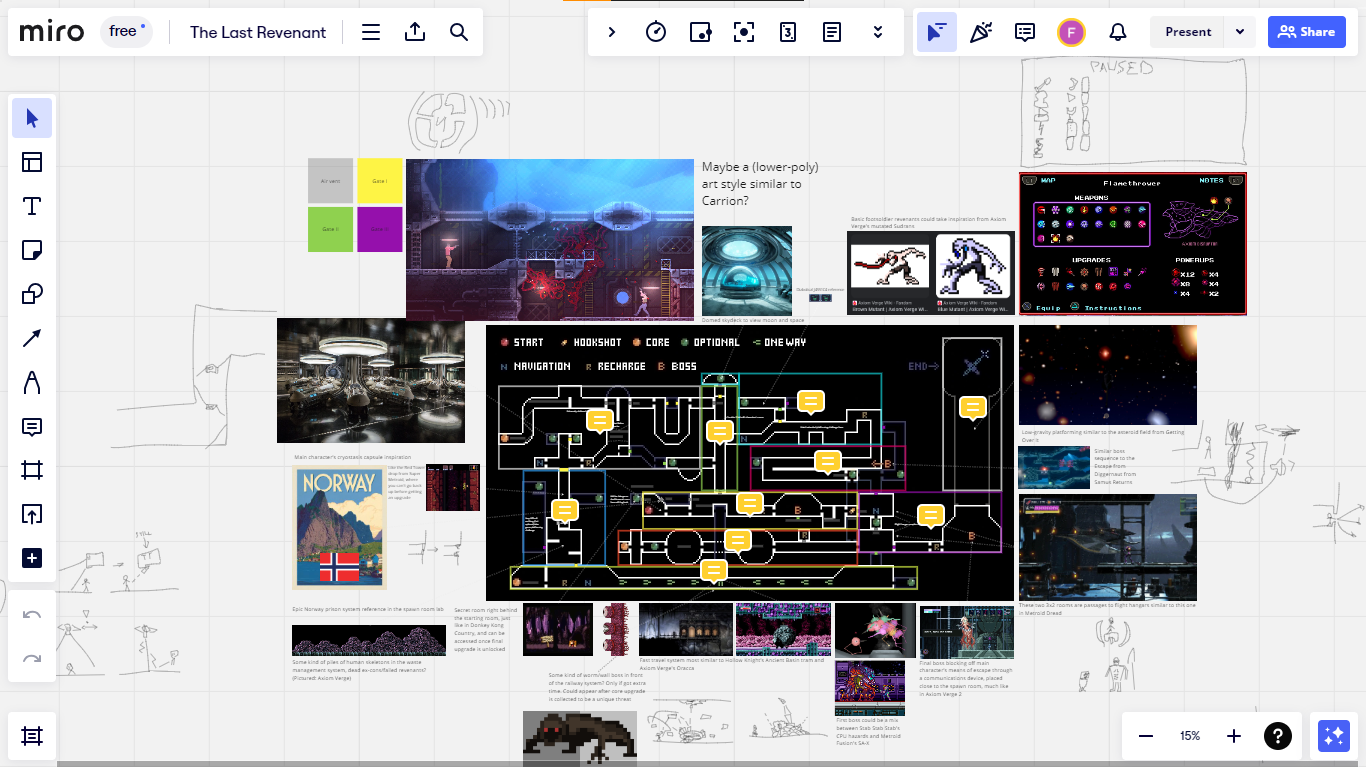
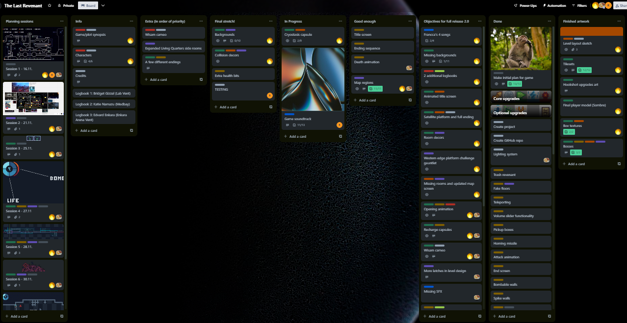
But to be fair, it is absolutely important to note that you guys had a much bigger dev team and scope in general, while we only had two developers and a composer, so I absolutely do not want to make any false comparisons here. On the other hand, that might be even more reason to invest in sites like the ones pictured above, so you can be more certain of everyone being on the same page as well as having their priorities in check as well as ready on time.
I absolutely don't want to seem like I'm talking down, though. Our project was still quite rushed at the end and definitely wasn't the perfect final result we were hoping for, but I feel like the one thing that we did do really well as a team was this synergy in planning, although again, it's much easier said and done when you basically only have 2-3 people planning the game. But whatever the case, even if unfinished, visually your game looks absolutely amazing in many aspects and has immense potential in others. I would very much be interested in seeing the final result, if you ever come around to make it! Hope this helped! :)
Hi, thank you for the constructive feedback! With "funnelling" level design I assume you're referring to the metroidvania progression? The only few dead ends the entire world map has should lead to rooms with items. Otherwise I've tried to use the design philosophy of games like Metroid Prime 2 for progression, meaning you almost never have to backtrack outside of the immediate area to progress through to the next upgrade, so there should be as little confusion as possible.
But maybe the optional item expansion rooms could be more obviously optional? That's certainly possible, and I thank you for bringing this to my attention so I could take another look at some of the level design and reconsider if the invisible holding hand is gripping tight enough ;)
Also, I will definitely check your game out soon! :)
I think this is an interesting question to ponder, considering I've seen many different ways to do it here. With my question, I'm not trying to imply there's a right or wrong way to implement lore, considering every game has different stories and systems that are complimented by different ways to deliver it, but I would simply like to know what does everyone here prefer.
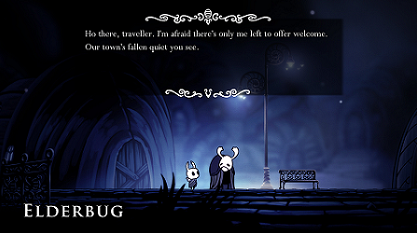
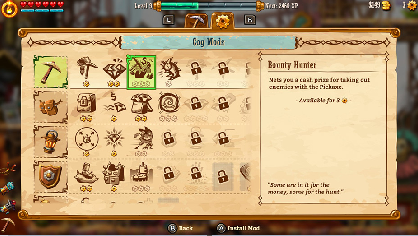
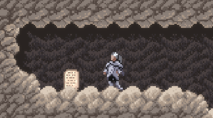
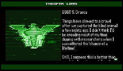
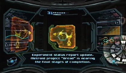
By far the most common way I've seen developers implementing lore in this game jam is just NPCs or other static entities telling about past events in the game world when you walk up to them, something you see in games like Hollow Knight. Another way it's been done is by just dumping the lore on those "Item obtained!" screens that explain the use that said item had before you collected it, something games like Steamworld Dig 2 also do. Furthermore - while I haven't seen this in any jam games as of yet - there are games like Axiom Verge and AM2R that practically treat lore as a collectible, Axiom Verge having its notes and ancient slabs and AM2R having its scannable Trooper logs. Then there's also the far ends of the spectrum with the Metroid Prime games allowing you to scan almost anything and everything, while others like the original Metroid games go by the more hands-off approach of not explaining almost anything to you at all, unless you bother to speculate. And of course there's always the straightforward way of simply making the player sit through cutscenes that you can't avoid (other than by skipping), like in Metroid Dread, where the story is thus integral to your progression.
That's also a relevant question: how central do you want to make the lore be to progressing in the game, meaning if you actually need to know the lore/story to get through the game or understand what you're doing in general. Dread, for example, doesn't really allow you to play the game without at least activating its story cutscenes, and the final boss won't really make sense to you if you skip everything. There might also be NPCs that forcibly spout exposition at you if you want to proceed, like in Prime 2 and 3. Again, not saying any of these kinds of ways of teaching the player about the world's history are good or bad, I'm simply recollecting all of the different examples I can think of.
Just so you know, I'm mostly somewhere in the AM2R/Prime camp on this. You should be able to understand the game's basic premise and your goal as the protagonist without any separate lore at all, but at the same time there should be optional lore that the player has to put some effort into finding out, much like an item. I think it makes the game feel much richer, and the stories much more meaningful if you do decide to seek it out. While NPCs might make sense in some cases, they're usually placed in front of you while playing and you can't always know if they're going to tell you some actually crucial information or just recount their old days.
While making our game - The Last Revenant - I probably took the most inspiration out of Axiom Verge's note system, although we didn't have time to make the notes go into your inventory upon touching them, so in practice they're actually closer to static NPCs that you have to stand beside to get the information out of them, like in Hollow Knight. However, a crucial difference is that - aside from a few exceptions - all of the optional lore in our game has to specifically be seeked out. Very little of it can be found on the beaten path the average player will take to the end, so you have to get off on adventures of different sizes and scales to reach it. This also benefits the positive feedback loop of the game, because it basically adds a whole different type of item to collect that can help to put the world in just as much new context as your average core upgrade would do.
Anyway, what do you guys think? When making a metroidvania with a decently sizeable story or background lore, should the approach be more hands-on or hands-off?
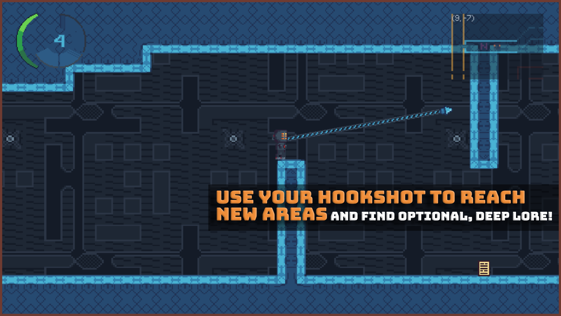
Definitely one of the better-looking games I've seen here, or in any game jam in general. The lore is also really interesting and fleshed out! As someone already mentioned, the performance is a bit of an issue, and a simple patchwork solution you could try implementing in the future is just adding the option to download the game, as that can often fix any lag caused by the player's browser. You definitely have something special here though, do carry on whenever you have the time!
Oh, my bad, there is a map indeed, and an excellent one at that! I'm very sorry for having missed it, I could swear I tried pressing M but maybe I misinputted and didn't bother double-checking, really odd. But thank you for pointing that out, it fortunately didn't affect the high rating I gave you regardless :)
This was pretty fun to try out! The style is amazing, it almost feels like a very high-end Atari game got transported from '80s, which is absolutely a compliment :) The colors and music are great but I feel like you could've added some simple sound effects. The level collision really doesn't have to be pixel-perfect, either, I would've preferred if you had made it a bit simple as some of the rougher geometry is a bit annoying to navigate through. Though this issue does resolve a bit by the time you get the Shift upgrade.
I got really far but eventually got seemingly locked out of progression, I lost to the tiny boss in top center corner of the map and the purple door locked behind it so I couldn't try and replay it, since I'd already used the key. I don't want to make too many negative criticisms though, because I fully understand that making a game as big as this - especially for a jam - can be quite difficult. However, probably the biggest issue for me is just the simple fact that you don't always know where to use the keys, and probably would've locked myself out even earlier if I hadn't noticed your game page's comment about the yellow boss' green door.
I still had tons of fun, though! Would love to see this get polished up for a more final release version, and I do think it was worth playing regardless.
By the way, funnily enough, the game I worked on also features a character escaping a prison-like scifi-themed complex owned by an acronymically named "Authority" (though I named mine the "Sirius Law Enforcement Corporation" [SLEC]), and we even have our own kind of climbing mechanic! Lots of funny coincidences. Feel free to check it out if you're interested :)
Absolutely amazing game, might even be my favorite out of the ones I've played and also my pick for winner! Had an absolute blast, the game was very polished, and gets a full score in pretty much every category for me, even if it does end pre-emptively. I see you've already gotten tons of (very deserved!) positive feedback, so I won't try and repeat what others have already correctly stated, and you can assume I agree with practically everything that has already been said about this game.
That said, I only have two real critical notes to make of the game: I was very happy realizing that you could also do vertical staff pokes/slashes, including a downwards one which works very similarly to something like Shovel Knight's. However, I feel like that pogo effect could've had a slightly bigger hitbox, and maybe even work by just inputting the down input instead of requiring the attack button as well, since the hitbox made it feel like I missed attacks that should've landed. The second point I'd like to make is that I'd have loved if there was any kind of map, even one that doesn't show the locations of items would be enough, just one that reminds you of which rooms you haven't properly explored yet.
Other than that, absolutely loved my experience, and would definitely play it again if you ever manage to finish it. Hope your finals went well!
Hi, second dev from The Last Revenant's team here, you've done an incredible job with this demo! I got swept away by some other funny-looking games that I ended up rating first, but I always intended to prioritize yours as this looked really interesting even just judging by the cover art, and I wasn't disappointed. Easily one of the best sensory experiences I've had on here, with the player's animations specifically being a highlight of my experience.
The gameplay concept as well - despite being unfinished - was really intriguing and unique. Not only the bubble shooting, but switching between the water types as well. It almost feels like Metroid Prime 2: Echoes' system of juggling between Light and Dark areas to progress through the game's world, and it gives a weird amount of structure to a game world that could otherwise feel really empty and directionless.
If I could give some constructive advice, I feel like you could still tweak the freshwater physics a little. The extremely high jump isn't necessarily bad, but I feel like you don't get enough horizontal air momentum and it feels a bit janky. Also, while I fully recognize that it's a demo, and this point didn't really affect my rating, in the future you might also want to make sure to prioritize adding some kind of health/death system to the game before releasing it, because restarting the game after every death crash got pretty frustrating while I was still learning the ropes. Otherwise, I think there's some absolutely amazing stuff on display here, and would love to see it getting a finished release!
