Thanks for playing and the great feedback.
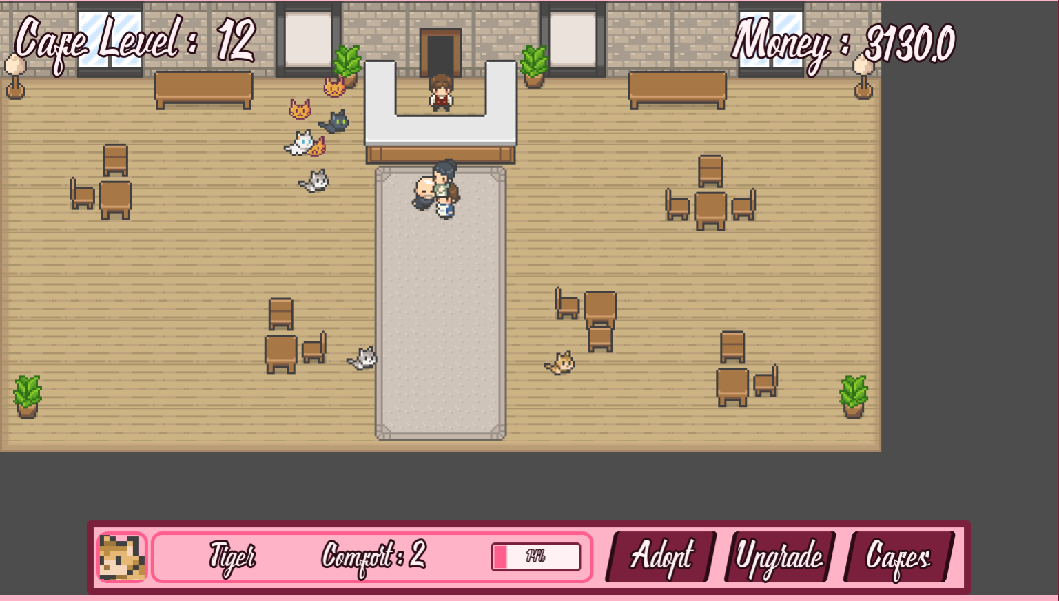
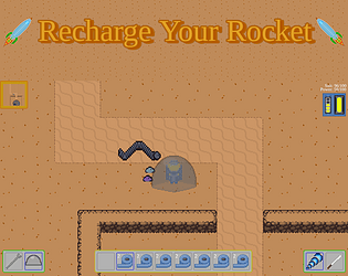
The post-combat inventory screen was there for the Inventory Management gameplay. I missed disabling it when Inventory Management is disabled, but it will be done in the next update. When you need to distribute your loot to each Slime for them to use it in the next combat, it made sense to have it show after each combat. It can be turned off in the settings, but should default to off when not needed.
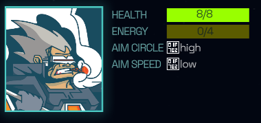
There are currently no equipable items for the Slimes. We plan to later add special Slime helmets as their main armor, along with some accessory type items. It didn't make sense for the Slimes to be able to equip normal human body armor. We do plan to make some updated to the character stats screen that shows equipment slots to hide the ones the current character can't use to make it more clear.
Most of our current UI work is done when a new feature requires changes. There are a few more things we think will need some improvement to better fit the change to make Inventory Management off by default, but they are lower in priority at the moment.
"Fight mechanic, RPG parts of the game, UI, UX, developer of the game"
Thanks!
So, the reason for our questions is that what we have feels stuck between styles. The story feels like it deserves a full RPG game. Our movement through the world limits the feel of exploration that is needed for a good RPG, and is one of the complaints we often hear. We've had several ideas on how to change this, but it is a lot of work, and will add a lot of time to development. Stepping back and looking at the game, the parts that are most polished are the combat and movement, which are not really RPG. The combat can work in an RPG, but it is also not a standard style for it. In order to get a game to release that is good enough, and can sustain our game dev work, we are planning to take the pieces of the game that work, and split them off into a new game that focuses less on the story and RPG elements and instead finish up a game with them.
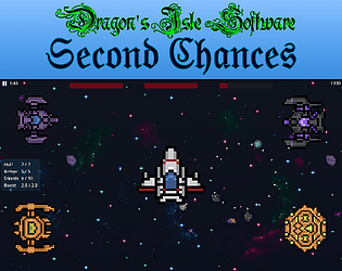
To make a fun game out of what we have, we are thinking the best option is to go with a Roguelite style. In looking things up I found that Roguelite is the more accurate term for what we are thinking, as we are not going for the true Roguelike experience. We will keep it in the same world setting, and are currently thinking of even being in the same area. The town our demo ends at, Wildemore, will be the starting point. You will start with 1 Slime character, and a party size of 1. You can unlock additional characters, including non-Slimes, and increase the party size. At the start of each run you pick your party. There will be the typical unlocks for permanent stat boosts, and other stuff you'll be able to start with on future runs. We figure storywise we are going to center it around fighting off various generals leading groups of the invaders, rather than going for the big bad. You can keep playing and building up, fighting ever harder forces. We will have less travel along the main road and fewer towns. The player will eventually be able to pick different directions to travel from the starting town.
I'm currently doing an overhaul on our systems for handling events and placing the segments that make up the world, which has long been planned anyway. Once that is done, we just need to add in the unlocks for future runs and build out the world for this new mode. It will be far faster to complete than an overhaul to make exploration more core to the game, especially if we go with more traditional JRPG type free roaming exploration. We also hope that keeping it in the same world will allow cross promotion and help get more interest in the base game.