I like the setting for this. A tower defense game based on working fast food is a great idea.
We use Linux, so this was played in Wine.
The first thing I noticed is that loading feels very slow. I also wasn't always sure when I needed to click to advance and when it was just taking time to finish loading. The long load times, even for simple screens, made me not want to just click around and explore the way I normally would.
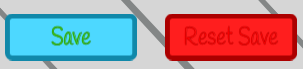
Once it loaded, I saw 2 red buttons with what looked like no text. Hovering over them the text became a bit more clear, but was still hard to read.
When I started the game, the text felt too slow, so I clicked to see if it would show it all. It looks like it skipped to the next bit of text, instead of showing the rest. I would suggest making the first click show all, then the next advance. I'd also increase the speed of the text. You describe the game as fast paced, but the starting experience feels very slow. As long as the text does not auto-advance before you can read it, writing it out faster is fine, as even slower readers can read at their own pace before advancing, but those who want to read fast or just skim the text, and get into playing, can also do so.
I found placing the "towers" to be inconsistent. I often had to move the items around until they indicated they could be placed, rather than being able to click and drag them to a known spot where I could place them. Sometimes it felt like I had to drop them in the middle of the table for them to be placed on a plate. For a fast paced game, the player needs to be confident in where to click to have things happen.
I got to the point where you had people wearing surgical/health masks. The mask got knocked off part way through. I'm guessing this was meant to be like an enemy with a shield, but this is a terrible way to do it! People wearing masks for health reasons is not something to make a joke of, and having your gameplay involve "attacking" them to remove their mask was reason enough to stop playing right there. I can understand wanting to add something symbolic of an increased challenge, but with all the serious health concerns going around these days, making light of people who wearing masks for health reasons is totally unacceptable. Maybe you could use sports or motorcycle helmets, or other non-health related items.