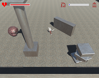
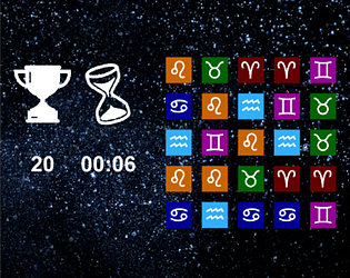
This was super well-made! The house environment models are really impressive, and this totally feels like it could come straight out of one the indoor levels from Pikmin 4! I also like the elegance of the visual indicators for the rabbit's strained heart and for when the rabbit detects the kid nearby -> it's simple but consistent with the overall game atmosphere.
Agggron
Creator of
Recent community posts
I love the visual indicator of the patient's life draining away -> it reminds me of games like Graveyard Keeper, and really gives off the sense of urgency. Also, I appreciate the high-risk, high-reward mechanic of increasing score the closer you save someone from the brink of death (I've definitely replayed a few times to try to get the max from a save!). And it was great working alongside you all!
I am such a fan of the aesthetic -> it reminds me of everything I loved from the Flash game era. I like that each obelisk has its own effect, to incentivize a strategy of what order to bring particular obelisks back. Perhaps it'd be even better if it was more obvious what effect an obelisk would have (pushing, slowing, etc.)?
Super cool game! It was challenging, but the colored visual feedback was presented in a way that made me keep trying to hone down the proper rhythm (finally got to the second monster after a bunch of tries :P). I particularly enjoyed how the sound waves had a little interference effect when they collided with each other.
Hey, thanks for letting us know (and for giving our game a shot)! We reduced the embedded game size to hopefully be out of the way of the itch overlaid buttons. Apparently there's threads for itch to fix these user buttons overlapping with games (such as this thread), but doesn't look like there's been any site-wide changes to fix things yet.
If this size reduction still isn't enough, it looks like clicking the fullscreen button in the bottom right of the embedded game should be another option.
Again, thank you for the feedback!
Hey! I love the entire aesthetic, and thought the music played perfectly with the way you somehow made a zombie game whimsical, haha. I wasn't sure at first what to do with the tutorial, but the on-screen icons did a pretty good job of pointing me in the right direction. Another random thing is that when I died from health (RIP), I couldn't go back to the main menu. Other than these small things, I thought this was super cool!
Thank you for the kind words, Tony! I had a feeling that Unity wasn't originally designed for 2D sprite work, but I wasn't sure what solutions there might be for this. I appreciate you bringing up your approach - and the Unity link - which I will definitely look into!
Best of luck to you as well, I always look forward to your updates!
Day 26:
Quick update before I head to work: combat system is finished more or less! Might need to tweak some values for game balance since as of now some items are instant KOs haha. We'll see what I can wrap up tonight, might not have time for much. I hope to have a more detailed post-jam write-up. It's been a pleasure updating this. :)
You are using Unity, right? I don't know if you actually need specific libraries to make a dialogue system. I looked at these three tutorials on dialogue boxes to get me started. The first two are ~15 mins each:
- Unity RPG Tutorial #28 Dialogue Boxes
- How to make a Dialogue System in Unity
- Dialogue System and Interactions | Making a Simple RPG - Unity 5 Tutorial (Part 3) (longer so maybe not)
I wish you the best! I hope to play what you have since I know you've spent a lot of time on it already.
Day 25:
Today was a day of massive progress (kind of needed because um, there's only a few days left in this jam). Some of the things I was able to accomplish today:
- Creating the main character's library of beer, wine, and assorted liquor (can be seen in the first screenshot)
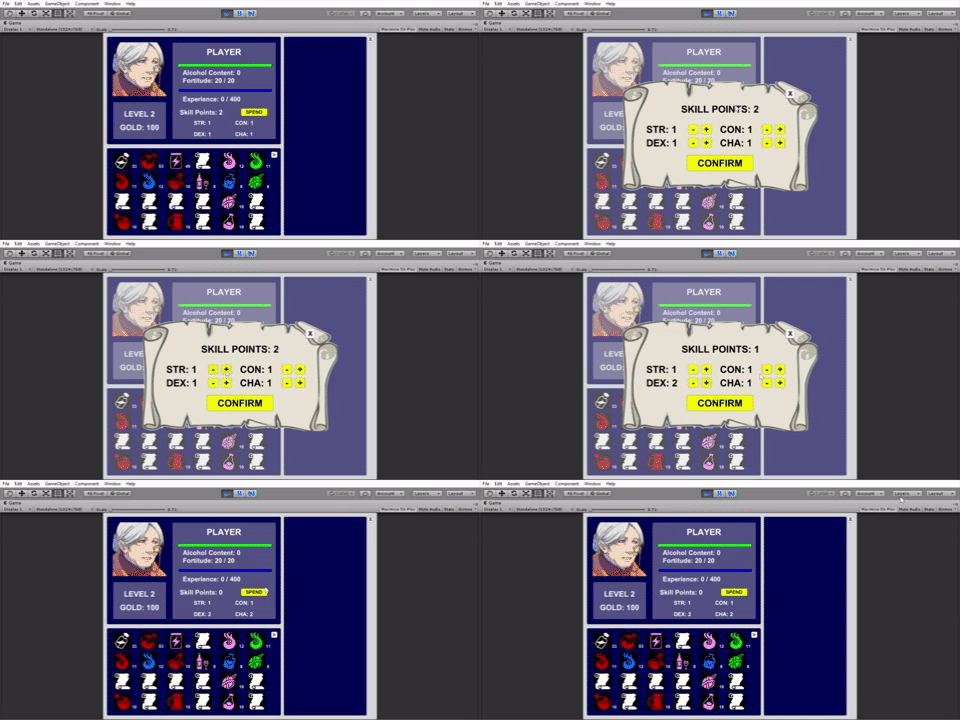
- Being able to allocate/upgrade your statistics using skill points from leveling up
- Implementing "cutscene" dialogue for the main character to advance the plot

- Refactoring objects in the overworld to be interactable (previously done with just dialogue, now it is using ScriptableObjects -> which also allows me to call methods from interacting in addition to dialogue. So I could technically increase EXP, find items, etc. from interacting with these overworld objects!)
- Made differing enemy types.
With two days left I can see how much I still want to do yet will inevitably have to compromise on. For sure I need to fix some aspects of combat -> making sure all of the items are doing their appropriate effects, of course. That is pretty much the only mechanic that still needs to be done. Everything else is story-and-aesthetic-driven: adding the dialogue, adding music, touching up the screens to fit the mood. Not to say that these are unimportant - they are critical - but we'll see how much can get done in these final hours!
Day 24:
All of the combat and inventory are now functional! Items can be made and seen in the inventory, and used in battle. Combat also ends appropriately, and has win/lose conditions, including granting experience and items/gold to the player if they win in combat! Technically at this point I could play through the game levelling up our gutsy granny, alternating between combat and creating new items with the loot. But I would fighting the same old test enemy over and over - akin to staying in tutorial mode. With my Excel design document by my side, it is now time to create the differing types of enemies and expand on our withered innkeeper's liquor selection!
Day 22:
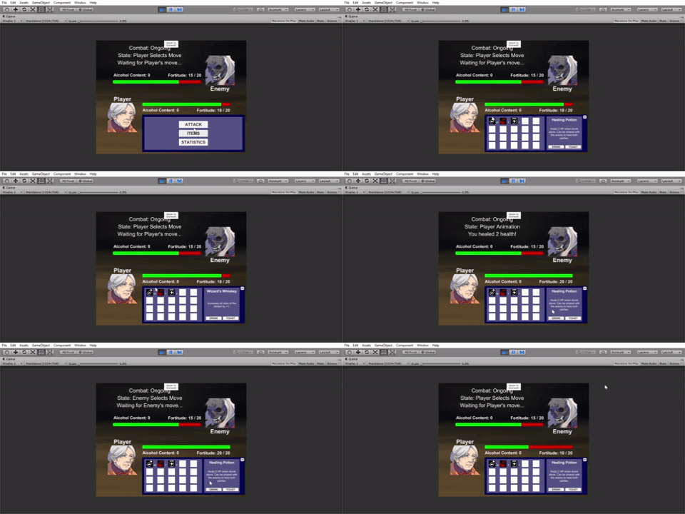
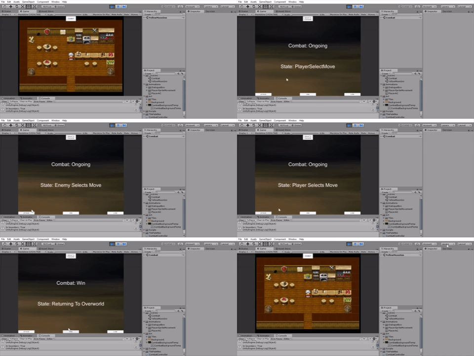
Successfully integrated the item system into combat! I had the skeleton combat loop from the early weeks of the project, and I now revamped the UI, with selectable menus for attacking and using items. Thankfully I had done the work for displaying inventory items and having the selected item featured - the UI here is very much similar to the UI in the player stat/inventory screen. Some modifications are just what text fields need to be updated, and I got around that by having an enumeration for what screen the code is currently in - if in the inventory screen, the code would display certain text, and in the combat screen other text would be displayed. Somewhat hacky but allows me to reuse a lot of the code!
There is still a little bit more to do with the combat: ending the combat with winning/losing, and being able to gain experience and items/gold to loot. Currently I have an escape button (Return to Overworld) to switch scenes, but next up is having that occur naturally in-game!
Day 20:
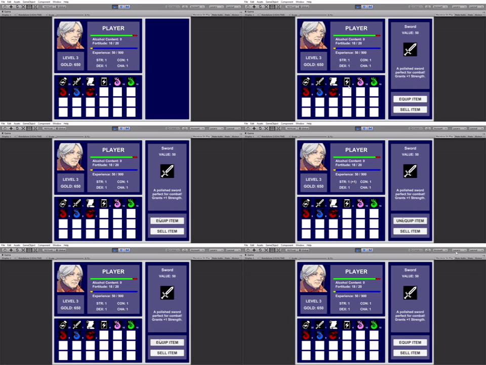
Back to work! I was able to flesh out the inventory system entirely, using Scriptable Objects to hold my item data and functions for what happens when they are consumed, equipped, crafted, etc.
Several features are now functional, including:
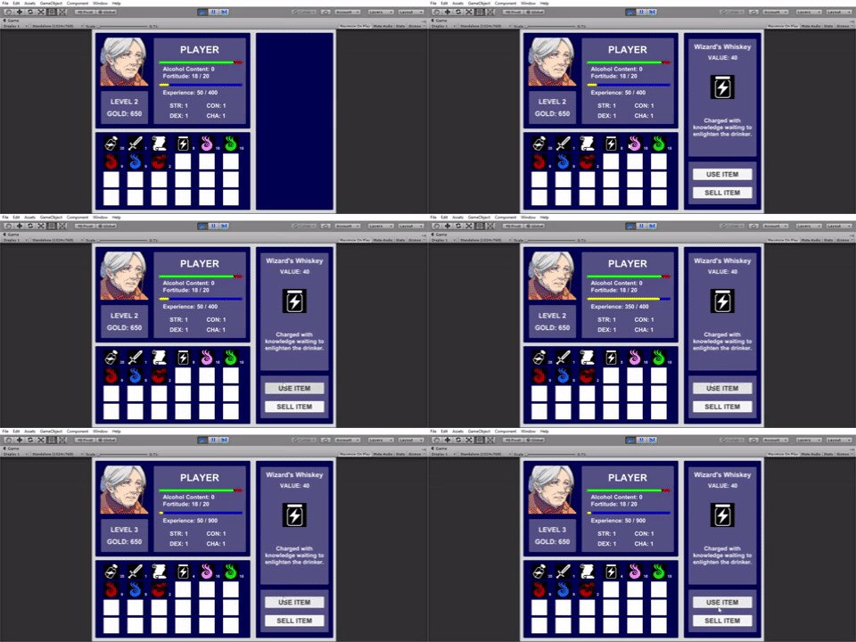
Consuming items and selling items:
Gaining experience and leveling up:
Equipping items and having them affect your stats:
Crafting items, adding items to the inventory when appropriate and removing items from the inventory as appropriate:
Honestly, it took some effort to set up but I like how it turned out! Next is being able to integrate all of these inventory items into combat, which seems daunting. But compared to setting up the inventory itself, I can directly see how I can do this. Since all the inventory items currently are built up with building blocks of data and functions stored in Scriptable Objects, I just need to extend the ability to "use" items in combat with new functions. I'm looking forward to this, since the design of the different RPG items is really quite fun!
As far as scope goes, for this jam I don't think I can do a whole lot more after integrating all items and abilities into combat, since I would like enough time to actually have the game look nice rather than just the blocky placeholder style (at least fitting the overworld map). What I hope to have is this inventory system (basically complete), combat system (next on the list), and then dialogue cutscenes in between battles where the player advances the plot, uncovering why they ended up in this inn in the first place... ;)
Day 16:
I am actually going home this weekend to spend time with family (Happy Chinese New Year!). So for the next few days if I have time I will provide updates for my current progress, but otherwise I hope to get back on track early next week!
I have taken a look at all of the other ongoing games-in-progress for the jam and they are all inspiring! This weekend would also be a good time to evaluate how far I've come, how far I still need to go, and update my scope appropriately.
Day 15:
No screenshot for today unfortunately! I am currently taking internationalfish's advice and trying out the use of dictionaries to store inventory information. My first attempts are kind of tricky since I can't actually see the contents of the dictionary in the editor. Hopefully this weekend I will have time to look at Custom Editor Scripting to manually visualize the dictionary contents. :)
Day 14:
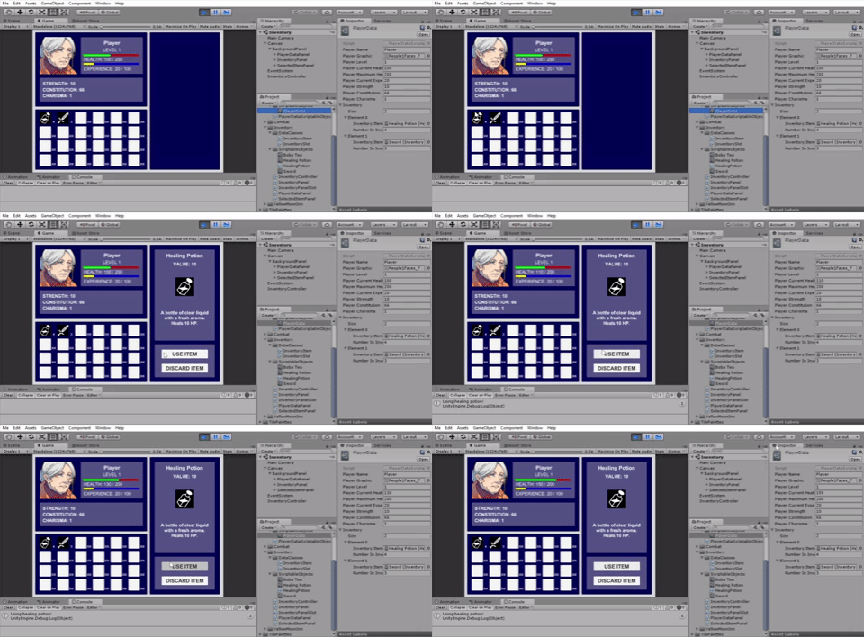
I implemented the Use Item button for the inventory. Currently all items have a RespondToUseItemButton function that is called when this button is clicked, and this can alter any values in the player data - in this case, healing the player's health. I realized tonight that right now I can't efficiently change the actual inventory list from the Use Item function. Ideally I should decrease the quantity of the item (and update the inventory UI accordingly) but currently I am using an array to store the inventory items, and so when an inventory item drops to quantity 0 and /should/ be deleted, I end up with a gaping hole in the inventory list since the array does not resize. I will look into alternate data structures later - Dictionaries and Lists are options, but if I use those I will need to update Editor Scripts so that I can visualize what is in the inventory at all times.
Day 13:
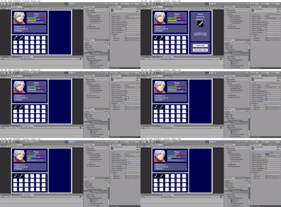
I feel like I have a decent architecture set up for the inventory screen now! I decided to refactor everything, using what I learned from ScriptableObjects to make a new ScriptableObject class called PlayerData - which stores all critical game information about the player (level, stats, and inventory items - each item of which is its own ScriptableObject). Using this system, I linked the UI to all of this player information. The upper left box (player data) and lower left box (player inventory) kind of just display the information. More complicated is the right box (selected inventory item) which displays all of the item information for the item selected in the inventory panel. Now that I'm typing it out it seems really simple but hey, I'm proud that I got it working cleanly!
My next goal is to add functionality for the Use Item and Discard Item buttons - this will need to communicate with and alter the player data/inventory (e.g. to heal the player, or to remove an item from the inventory altogether).
Day 12:
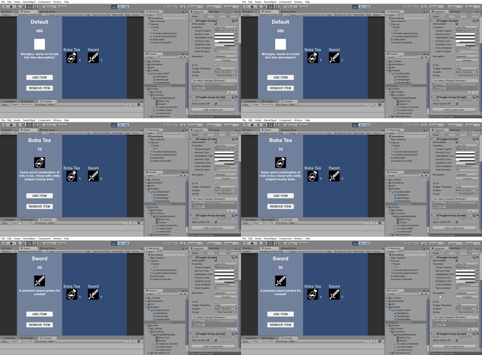
Making slow and steady progress... I created a panel to display the most recently selected item in the inventory in more detail (have not implemented any use or remove item buttons). I am currently using a Toggle Group shared among all the inventory items so that only one can be selected, although actually the way that I am setting this up right now (instantiating all the inventory objects as GameObjects) does not seem to be the wisest move. Or at least, I can see it getting messy later on. So I expect that later on I will have to refactor this into a different data organization that I haven't thought of yet...
Day 11:
At this point I am stepping into unchartered territory! Previously I had at least basic experience with what I was working on, with the exception of the 2D tilemapping - but that was more of using a tool and was relatively simple to follow. Today though, I delved into learning about ScriptableObjects for use in the game's inventory system. Having recently started in computer science, I am just beginning to get experience with organizing data architecture, which is what using ScriptableObjects is all about. So there is a lot for me to take in, though I am finding Unity's videos on Live Training on Scriptable Objects as well as using ScriptableObjects in a Text Adventure both very helpful resources. Overall, all of the architecture can get overwhelming for me, but I have to start somewhere, right? :P So here I am trying to set up base classes for InventoryItems, and displaying them on the UI Canvas.
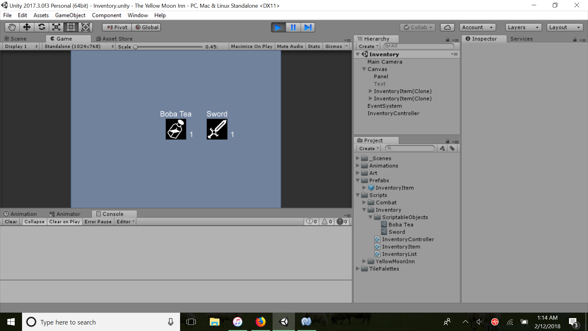
Seems okay for now. I know I have a lot more to learn here though, such as linking the instantiated inventory items to display in a Layout Group (which I haven't used before, but apparently helps in dynamically resizing based on the number of items in the group). And of course user input such as hovering over the item to display a description, and being able to add/remove items from the inventory. It is kinda scary not knowing how much time all of this is going to take and if I can actually do this all in time, but hey, if nothing else, I have already learned quite a bit up to this point!
Day 9:
I incorporated player and enemy health into the combat system, animating it with a slider. One thing to note for the animation is that since my slider is using integer values for the health, the speed that the health drops in the slider must be set reasonably high for any change to occur (at least, using the Mathf.MoveTowards function). If you don't have a high enough speed, the rounding stalls the health animation from ever dropping, and sometimes you get random drops of 1 health increments.
With the main combat loop settled, it's time to iron out the full combat mechanics of the game! Then I can get around to implementing these mechanics into the combat system. What I am thinking right now is, that although the main character herself is not prized as a physical specimen, she has extensive knowledge brewing alcoholic potions and liquors. These consumables can have a variety of effects: ranging from buffing her combat statistics, healing herself (and possible party members if I have time to implement this), or setting up elemental damage combos on the enemy. But, with a limited stock of booze, she has to decide when it is most advantageous to use her consumables. And she must watch her alcohol content, or that may harm her combat abilities...
Day 8:
Today I set up the bare bones skeleton of a turn-based combat system. I set up a separate scene that can currently be navigated from the overworld via a button. Then, I have the combat game loop running as a coroutine that keeps track of all combat states. Thanks to Jamarin for the inspiration in setting up a working environment first, before trying to implement each feature individually. In RPGs especially there tends to be many layers in the inventory screens, combat screens, etc., and rather than get bogged down too much in all of that at the beginning, I would rather just make sure I can get the minimum game loop up and running. So right now the one Attack button seems to be functional with actually changing the combat state. Next up is integrating this combat state system with player and enemy health!
Day 7:
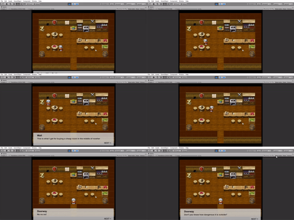
Today I fixed the bug of skipping text panels. Basically what happened is that I was having the Update function in two separate scripts checking for user input of the Space button: one script checked Space to start the dialogue pop-up, and another script checked Space to move to the next text panel. Integrating all of this into one script that keeps track of the state - of whether a dialogue already exists (move to next panel) or does not exist (start a dialogue) - solved this issue.
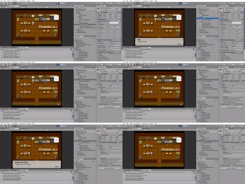
Now I have the overworld interactable! At least in a basic sense - the main character responds to many of the objects around the tavern. She can't interact with them any further at this point, but anything read-only is available!
The next big task in the combat system! I'm hoping by the end of this weekend I can have a basic functioning one going since this will be the meat of the encounters.
Yeah that's what I was trying to get at in my update - to add components for a Tile, I think we need to create a custom SpecialTile class. Unity has a live training video on ScriptableObjects for this purpose, but it was an hour+ and I didn't have time to watch it, so that's why I'm taking my hacky approach instead.
Day 6:
Following my goal yesterday of integrating the dialogue pop-ups with player movement, I managed a clunky system that still needs debugging. To make the actual tiles in the 2D tilemap interactable, I am pretty sure I will need to use ScriptableObjects and create a custom class for these types of tiles. I didn't have time to go through that in detail, so instead my hacky solution is to create GameObjects for each interactable tile that is in the same position as the tile sprite itself. Then, in my movement, I check what direction I am facing, and if I press SPACE to interact, I find the position of where I'm facing and see if it matches any of the interactable objects. If so, the dialogue pop-up appears!
That's the gist of it, but some bugs appear because I am using the same command (getting keyboard input for the Space) to trigger an interaction but also the same command to go to the next text panel of the dialogue pop-up, which can skip the text panels.
I think it's smart of you to have planned out your work and set milestones for yourself. I believe you can do it!
Maybe I'm not getting it, but just wondering - what are Moon Obliterators? I at first thought they were moving enemy targets (as opposed to just stationary enemy camps on the planets that you have to destroy), but since that phase is called Mutiny/Skirmish, are the Moon Obliterators actually part of the Imperium and you can betray the Imperium by siding with the Mutinous Allegiance + taking out the Obliterators? Haha I hope you can clarify this, seems like a neat setting! :)
Day 5:
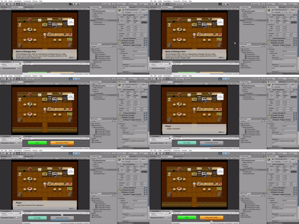
My next short-term goal is to create the text-screen UI that appears whenever the player starts dialogue, or when the player interacts with an object in the game world. After watching different Youtube videos on how to approach this, I settled on creating a custom C# class (here, Dialogue), that contains information for each text pop-up -> right now just the speaker, and the actual text that will be displayed. Then using Unity's UI system, I utilize a DialogueManager script that takes in a custom Dialogue class and uses the information from this class to populate my text onto the UI elements. To handle multiple panels of text, I hold text blocks of elements in a C# Queue that I can pop off sequentially (an array would probably work just as well, but a queue doesn't have to worry about indexing). And to have the text appear letter by letter, I used a coroutine that adds in one letter to the text panel for every frame. I actually read a recent Gamasutra blog on text reveals that points out this method's flaws and says that it is a naive approach (and suggests how to improve this), but for now it works and I have time later I can try to polish it up following the Gamasutra's article's suggestions.
My current dialogue/encounter pop-up system looks like this:
So right now there's an awkward white box in the upper right corner saying START DIALOGUE for me to reveal the text panel. Tomorrow I want to actually integrate this into the current player movement - that is, when the player is facing an interactable object and presses SPACE, the text panel will appear.
Day 4:
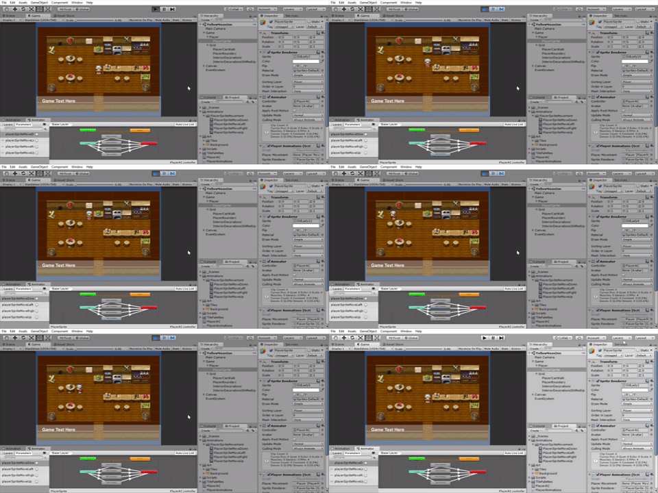
I added the main character sprite and animations!
Again the actual spriting is from RPG Maker free assets, but to actually use the sprites and get them animating to follow along with player movement developed before, all had to be done in Unity. The tavern owner in The Red Dragon Inn (the board game this RPG is loosely inspired by) has a young wench delivering all of the drinks. But I wasn't really satisfied with the art for younger characters, so instead I'm settling (for now) on an old yet wisened hag. Having already lived most of her life, it makes a little more sense why she would be setting up a tavern isolated from urban society. And although she isn't the most natural fighter, she is wise and observant enough to absorb all the knowledge fellow travelers share with her, thus improving her combat skills as the game progresses.
I had basic experience before with Unity's Animator Controller system. One problem where I got stuck for a while was that after I play the animation to move in a certain direction, at the end of the animation the sprite would always revert to the downward-facing default sprite. This would occur even if I used an animation event to manually change the sprite renderer to display a different sprite at the end of the animation. The end fix: a property of my default idle state called Write Defaults: this would automatically revert to the state before the animation, which is why me trying to use animation events was not working. Unchecking Write Defaults worked perfectly in my sprite maintaining their directionality after playing the animation.
Day 3:
Okay, so today I definitely learned a LOT about the Unity Physics engine (and what NOT to do during it, haha). This is regarding me trying to deal with collisions of the player with wall tiles, so here's a summary of what went down:
As I said yesterday, I was trying for the longest time to get my player rigidbodies to work. In the end, turns out kinematic rigidbodies don't actually respond to collisions (as note, I'm pretty sure dynamic rigidbodies CAN detect a collision with kinematic ones). I had been wanting to use a kinematic rigidbody for the player because I didn't really want to use the Physics engine - I didn't want the player to be pushed via force, but rather be clamped to move a certain distance in set intervals. I tinkered around with the Unity CharacterController but it seems built for 3D. Finally, I eventually settled to try to expand on my previous movement script: setting transform.position directly, BUT checking beforehand if the tile space that I want to move to is already occupied by one of the wall tiles (or other tile that doesn't allow player movement). Here I end up going on a wild goose chase to find the right function to detect a collision of a point with the tile collider - I try Physics.OverlapSphere, Collider.Bounds.Contains, etc. before finally finding Collider2D.OverlapPoint, which was right under my nose the whole time. Whew, it works now, but quite a ride now!
With that roadblock out of the way, it was time to populate my room! This was the fun part - I created multiple layers of tiles and added furniture and other decorations for the tavern. The room will be quite homely - there will hopefully be a few NPCs that stay for a prolonged time in some of the stools/chair that the player can interact with, but all of the combat encounters will take place in a separate combat scene. You can take a look at the current tavern below:
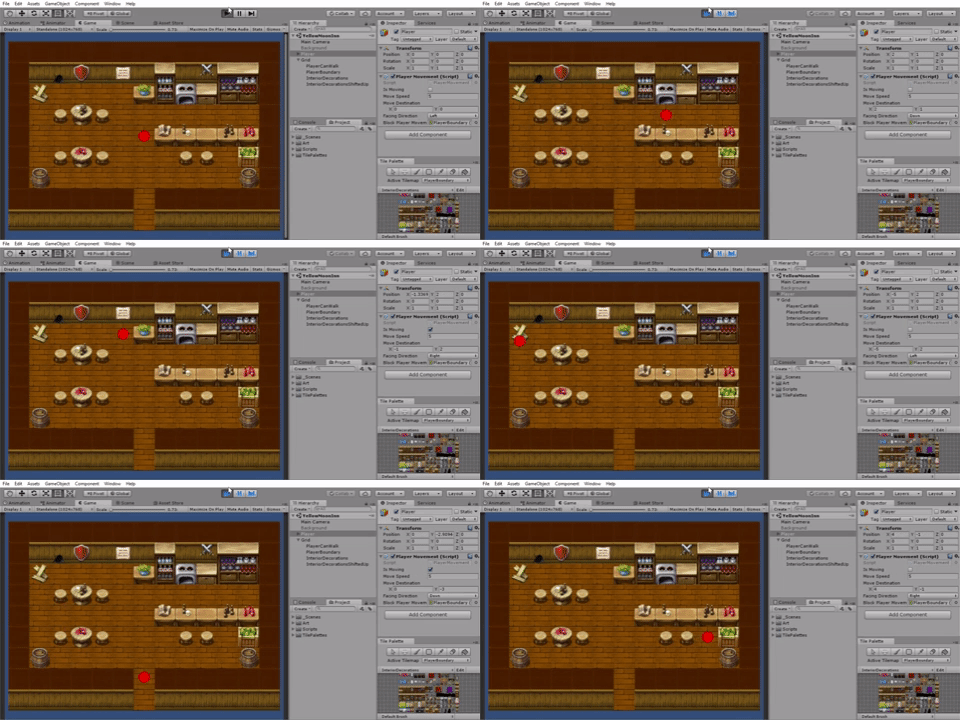
There are many other components that need to be worked on, but with the workweek coming up I have to decide what is feasible in small chunks. Some of the things I could work on relatively soon are getting the character sprite/animation, adding dialogue boxes when the player interacts with an object, and eventually try to get the turn-based combat system set up!
Day 2:
Today was all about figuring out how the 2D tilemapping features of Unity worked. I have owned RPG Maker (only because it was on sale a long time ago), but haven't really used it much, so I basically was learning from scratch. I followed the official Unity videos for the actual usage of the tiles and that part is decently intuitive - e.g. using brushes to "paint" on tiles in a certain way. Before I could get to that part though, I had to export the RPG Maker images and reimport them into Unity. To get them onto the Tile Palette in Unity this required me to cut up the tilesets using the Sprite Editor. My first attempt at doing this resulted in tiles like this goober:
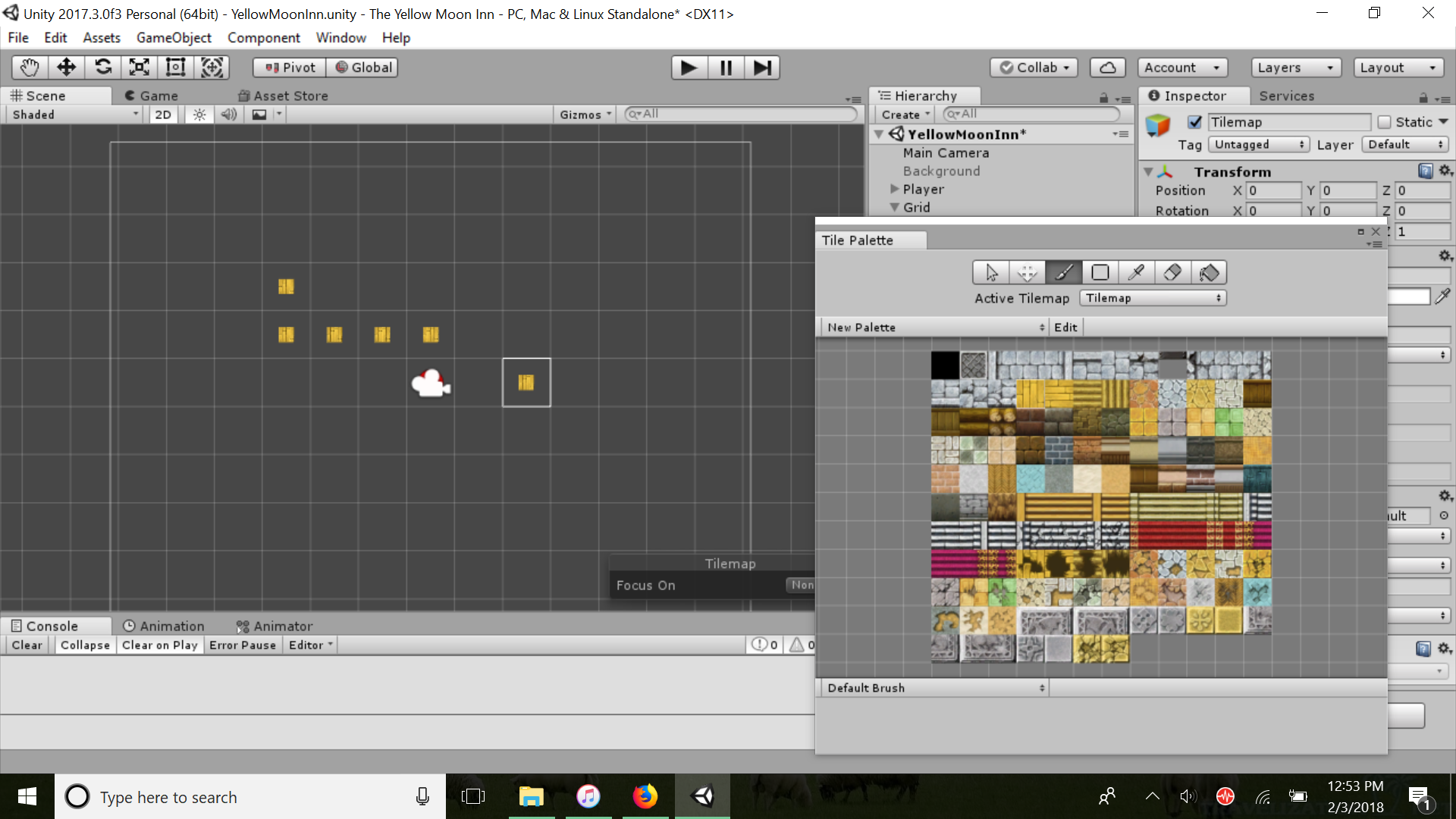
Oops! Turns out there's a few settings that I didn't really pay attention to. One important one is the Pixels per Unit, which since these were 32x32 pixel tiles, needed to be set to 32 (they are set to 100 in this image).
Eventually, I got to paint the tiles on! This resulted in the current bare-bones model of my glorious room: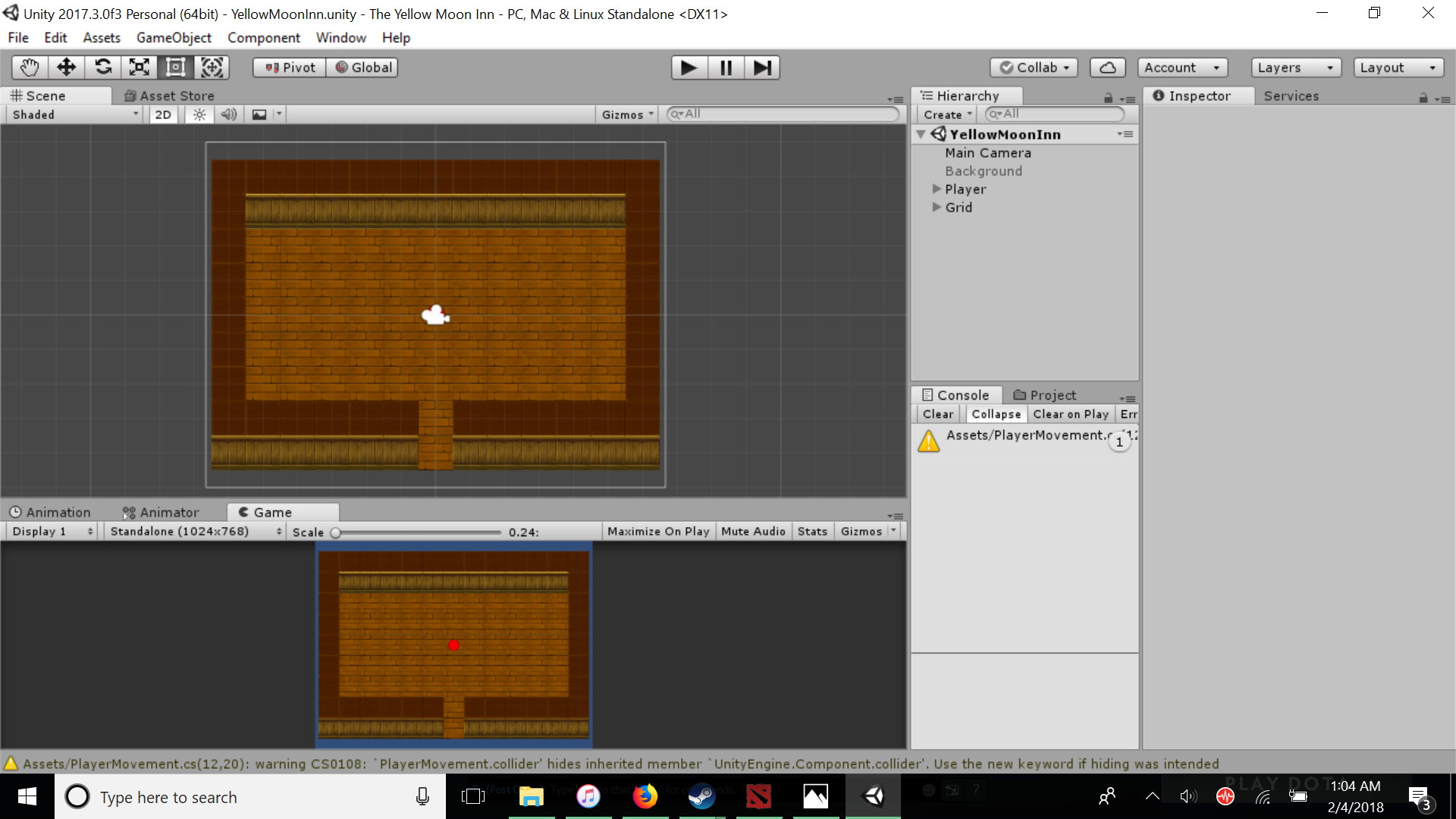
Obviously the best tavern in town!
It still could use some sprucing up in terms of furniture and decorations. And actually, I am having some trouble with player boundaries - currently the player is not detecting a collision with the outer edge (wall) tiles. This could be due to my player movement actually setting the player to move via altering the transform.position (which after some research means that it bypasses any collisions). I will have to try redoing movement using rigidbodies (which do respond to collisions), or find some other way to get this functional tomorrow!
Hi everybody! I decided to create a devlog so that I commit myself to updating the game as often as possible. A previous game jam that I was in encouraged devlogs and although I did not have time participate in that jam, I enjoyed reading the thought processes that went into other people's devlogs. I am pretty new to game development, so I am learning all of this as I go. Afterwards it will be cool to see the progress I've made! And hopefully, other people may find my journey useful (to at least avoid the pitfalls that I am bound to fall into, haha).
The Yellow Moon Inn is (hopefully going to be) a top-down RPG where you (the player) run a tavern in a fantasy setting. Unfortunately, you shortsightedly chose a not-so-safe location for your tavern. Consequently, the people that visit you range from parties of adventurers that may trade with you and assist you, to hordes of enemies seeking to raid your spoils in turn-based combat. It is up to you to defend your tavern and improve its reputation!
About Me:
I'm Aaron - you can call me Aaron/Agggron/whatever you'd like! I'm 22 (graduated two years ago), and I am currently a biochemist looking to get into computer science. I always thought game development was really cool but never got around to trying it until recently!
My favorite games are RPGs - I grew up on (of course) Pokémon and MMOs such as Runescape/Guild Wars. Some of my personal favorite RPGs are by indie development company Spiderweb Software, especially their Exile series (now being remastered as Avernum!). I love their retro-style enormous open-world exploration and immersion into the game universe. I am also (now) a big fan of board games, and the idea for this game jam comes from one of my favorite board games - The Red Dragon Inn - where you play as a party of D&D adventurers who visit the tavern (and drink each other under the table/gamble people's gold away). I wanted a similar atmosphere for this game, but here I'm flipping the script and presenting it from the viewpoint of the innkeeper/tavern owner! And of course adding my own RPG elements for game progression. I'm excited for it!
Goals:
Here on itch.io, I have done a few small-scale game jams but this would be my first time tackling a (hopefully) larger-scale project. The main thing that I would like to accomplish is a working (polished if possible) turn-based combat system integrated with the "open world" (of course, for this game jam the world is just the one room, which is actually perfect for limiting me in scope). For this game jam I was going to start with Pokémon/FF-style combat. Maybe in the future (but probably not for this game jam) I would move onto tile-based combat similar to Fire Emblem/Spiderweb games. Also, the games that I've made so far have been more action-like so I've never had experience working with UI screens for inventory, skills, etc. All of this I hope to implement in this game! I'll track as much of my thoughts as I can for this development - they might be basic, but hey, it could help me/others out in the future!
Platform:
I will be using Unity for this game jam. It's what I first started looking into, and all of my previous games have been using Unity. Actually, there have been recent updates in their 2D tilemapping capabilities - I've never used them before but will try them out for this! I am very much not an artist, so right now I plan to use free RPG maker tiles/sprites (and import them into Unity), and if I have time I will try to polish/create them myself. But most important to me right now is to get the gameplay up and running! :)
---
I think that about covers my background, and of course if there are any questions/feedback I'd love to hear them! I (hopefully) am on the Discord channel frequently enough when I'm not at work.
Day 1:
I wanted to start by being able to create character movement on a 2D map. To this end, I wanted to restrict character movement to unit intervals. I basically have a placeholder player that follows keyboard input to move left, right, up, and down. Instead of just setting the transform of the object to the new position, I had it move towards that position (and made it so that during the movement, you are unable to move anywhere else!).
Next step is to create the map of the room!
I like the progress so far and am looking forward to seeing what comes out! I like the palette that you choose for the wooden-lodge feel. Personally I think that the first image you posted has the tile closer to wood than like brick/clay, but it might be the case that the character stands out more when using the tile in the second image. Only time will tell. :)


