
Indie game storeFree gamesFun gamesHorror games
Game developmentAssetsComics
SalesBundles
Jobs
TagsGame Engines

AbstractLaser

69
Posts
6
Followers
3
Following
A member registered Oct 14, 2016 · View creator page →

Creator of

Recent community posts

Hi!

Thank you for your wonderful feedback and also the bugs that you reported, I will be sure to fix them in the next build.
You're correct that you can only rally residentials when at least a family has moved in. I will make it more obvious next time.

The reclaiming building mechanic wasn't communicated enough this time around and need to be updated. I apologize that the "ratings and points" system is also creating confusion, as I am still figuring how to implement a proper progression to the buildings. You're correct that the idea is to build some buildings to increase some points so that you can build other buildings. In this build, I intended it as a way of progression, but it was not a good solution. I will play around these for a while, and right now I am leaning toward discarding the rating point system altogether and only use the rating system to unlocking crowd commands. For progression, I will only make building available as you build the preliminary buildings. Will see how things play out.

It was a rare thing that I see a full map with all buildings established even when I play it myself, so it makes me so happy seeing your screenshot! :D

I am glad you found the game fun to play even in this buggy state, and I truly appreciate the time you put into playing it and writing these encouraging words.

Thank you! 

Thank you for taking your time to play the game!

At this stage, I'm still exploring/refining the core gameplay and expanding buildings to have more varieties. 
I will try to implement somepolish here and there as time go on.

I am using linux OS and tried to run your game with Wine, but somehow it just couldn't load. Since I saw a post that you are working on a linux build. Please let me know when you have the linux build ready and I will do a proper playtest and give you feedback. For now, I will share my thoughts on the Alpha trailer on your YouTube page.

Judging from the trailer, you have a good 2D pixel-art action roguelike. UI is clean and gameplay is understandable.

For my personal taste, there is a jarring disconnect between character and the settings (equipment, skills and enemies). The character being a chicken with what seems to be humanoid equipment, items and skills don't go well together. My suggestion is to go full-on with the chicken theme. To give out some several examples, instead of using bow and arrow to shoot, how about reframing it as chicken flapping its wings to shoot out feathers. And same with the equipment... I saw there are "mask",  "amulet", "glove", "ring", etc. The mask and amulet fit well with the chicken theming. However, the "glove" or "ring" doesn't make sense. On the enemies, you could play around with having enemies that are natural predators to chickens such as foxes, snakes, or eagles, instead of blocky zombies which are more generic.

That's what my overall impression on the trailer. 

All being said, you did a great job with making a polished gameplay.
I will look forward on playing the linux build when it's ready preferably on the same feedback jam by the end of May.

Shooting and destroying asteroid feel very good and polished, you did a good job here.

However, movement still doesn't play well (very slippery like some feedback you already received). After a few minutes, I found out that it's best to stay near the middle of the screen and just try to shoot asteroids that come your way. It's just that when I want to get a power-up or avoid unwanted item that I do move the spaceship. And because of that, I always slammed into the asteroid and died. 

It would be clearer if you show a simple pop-up text when you get the power-up to clarify on what that gives you. The 3-bullet is very clear so it doesn't need mentioning. However, I find the extra-speed power-up is very annoying because just a simple nudge cause you to crash into an asteroid. I imagine showing a simple pop-up text is very quick to implement so this would be my small suggestion.

Also, regarding the spaceship scrolling to the other side of the screen when you reach one end is OK. The problem is that the asteroid seems to spawn around that area. For me, when the movement get out of hand, it's mostly a matter of seconds until random asteroid spawn and I ran into it.

I played for while and can only get the score up to around 5000-7000 before crashing into any asteroid. I personally think the game need more varieties to justify higher score requirement to get to the next phases. I think adding more power-ups with different shooting patterns may make the game more engaging.

Having the options to auto-distribute, and several difficulty options will certainly improve the game albeit much more work on your side.It is good to experiment with it for now and see which one feel great to play with. 

Just being curious... have you played Final Fantasy 8 before? Are you familiar with the junction system? The discourse around inventory management in Hungry For Loot seem to have similar characteristics with the junction system in FF8. For new players, it is a very clunky system to work with. But once you get the hang of it, it is very enjoyable since it offer high customizability and the ability to be overpowered at the start of the game if you know what you're doing. I feel like it may be the case with the inventory management in Hungry For Loot.

I will stress-test around the reclaiming lot and establishing on it; to see if I can reproduce the "null" bug you mentioned. Yes, the reclaimed lots can be built on for free. I was aiming for the gameplay loop to be around reclaiming lots and building structures on them. But hearing from you, this gameplay loop is still unclear yet and need to be communicated more.

Hmmm at this point, I am leaning toward discarding the point entirely. Making the label "Ratings & Points" seem to introduce more unseen problem. But I'll play around it first this time. Thank you for your suggestion.

(1 edit)

When I first play a game, I tend to skip the tutorial so for a while I didn't know to press "Enter/Return" to start the fight. It would be good if you just show a simple text instruction there.

The control is very wonky even if you are purposefully making it a rage game. At the current state, every battle is very random for me. It feels like I'm waiting to be lucky when the enemy happens to come closer as I swing around my weapon. I think there are still lots of room for improvement regarding character control. I can't give any suggestion on it since I don't know the direction you're taking with the game. But I would at least try to make the character movement easier, that would be a huge improvement. Currently, it's just impossible to tell my character on where to move (bordering annoying).

Also.. due to the control, I mostly lose every battle, so I didn't get any chance to acquire any money to buy different weapon/armor. 

On the positive side...

I like that you have a good amount of variety to make every battle different, good job!
Every ability the enemy executed also has good sound and visual effect and make the game feel alive.

Personally, I can see the game being very fun after the control issue is fixed. There is some potential here and I hope you keep on working on it!

Hi Dragon's Isle Software!

I will take into consideration your advise on the tutorial. Currently it's only there to tell the player to how to play. I will look investigate the corner cases so that there will be no soft-lock in future plays.

Could you tell me around when do you encounter the "null" text in the pop-up?
Is it after multiple plays, or just simply when a few days has passed?

Regarding your comments on the rating numbers and its text label, I suspected that there will be confusion with it. There are "number/currency" which is used to purchase buildings; and "text-label" which tells how the neighborhood status is and grant crowd-command after reaching certain ratings. These are not supposed to be tightly related, so as you mentioned, it is weird having poor ratings number of 88, 132, and 521. Having them next to each other does make them seem tightly related, thus the confusion. At first, the "number/currency" was implemented as a mean to direct player's progression (limit the building options and only open them slowly). But this seem to create more confusion than the problem it solves. Thank you for your feedback on this, I need to work out a different solution.

Again, thank you so much for the time you have put to play the game and thorough feedback.

Looking forward to the next play/feedback session!

Thank you for your nice comments!

Although the game is still in very crude shape, I appreciate the time you put in to play it.

Thank you for your reply, I just got back from a short vacation and saw this.

I see.. so the inventory system is to promote strategic decision for players.
Yeah, auto-distribution system is not the correct solution for this, but an "easy" mode so that each member has access to all items in the bag may be a "nice-to-have" feature further down the development. But since you want to promote strategic decision, of course you can also omit this *easy* mode suggestion entirely. 

On the other hand. to make players care more into learning each party member's strengths, I would probably suggest making the party members much more distinct from each other (visually, in sprite shape and animation). I suppose this is already an item in your to-do-list, just haven't gotten into it yet. But I believe nailing this early would be critical for the game. Please think of this just as a friendly reminder.

Cheers! Looking forward on the next update.

(1 edit)

A little bit regarding technical issue... since there are mostly scrolling dialog I find it a bit jarring when the choices show up on screen, the dialog just pop up without scrolling.

It's very hard to tell if the game concept will work or not. But since romance novel has and will always sell, I guess it could work. 

I notice there are sometimes choices with the exact same meaning but the word order is just reversed. Also there is one particular time where both the choices are just "..." and "...". Perhaps, you could make the choices more impactful by differentiating the meaning carried behind them.

Overall, since this is made for a game jam, I think the game has an OK story. It's short enough to not get boring, but I didn't feel compelled to find out the branching narrative after finishing it. I also didn't get the theming around terminal screen and the story being told.

I skipped every tutorial since it is quite long; and didn't bother with using keyboard to play the game, so I missed that you can use the hotkeys. I forgot to try out the right-click though, will keep that in mind next time. Yeah, don't spend too much time on mobile playability, let's focus on desktop first.

I think I have mentioned this once before regarding the inventory management. Since you want it to be as quick and possible also, instead of manually assigning the obtained loot to individual party members, why not just get rid of it? Having all party members the access to the common inventory seem to be more intuitive. Is there some kind of design decision for having manual assignment to each party member's inventory? Since inventory management happens after every battle, and there are tons of battles between towns, at the moment it feel more tedious than satisfactory to do so. 

Sorry if I seem so blunt with my words. Since I am still learning about game design, I just want to know what kind of design decision went into making the game.

Hmm.. I gave a good 20-30 min for the game. There was no apparent bugs as far when I was playing. If there was any error per se, it's just spelling mistake here and there. 

For the gameplay, there was almost no direction on where to go or what to look for. So it's just walking randomly from one room to another until cut-scene happens. I would suggest making the dialog introduce the world and point players to the right direction slowly.

Hello!

Thank you so much for implementing the debug mode, I wanted to see how the game finishes once you get to Wildemore so I got there immediately ;p Anyway... this time I played the game in random bursts jumping here and there using the debug mode.

The usage of ability/items in battle now feel better and organized. Although it takes a bit more click to execute an action, it definitely feels more intuitive which button is for attacking, defending, skills, or healing.I see now the attacker members have skill to target single or multiple enemies. Most of the time, targeting multiple enemies seem like a no-brainer. I think it would be beneficial to have significant damage difference between these two options.

I like the newly updated inventory UI. The highlight of each slime's affinity when you select an item is immensely helpful. Thanks to this, I was not overwhelmed this time in the item selection screen. I think you have addressed the huge pain point in managing inventory with this highlight. Regarding clicking and dragging items to the selected member's inventory... I am just thinking out loud here...  I wonder if it will be better to just be able to double-click an item to transfer (I am wondering for this in my own game too where you can execute an item in a menu with double-click instead of moving the cursor across the screen).

Everything comes a bit more alive this time after you added more animations. Since the game revolves around battle, perhaps we can expect flashy attacking or skill animation next or in the future? I'd imagine this will be the main draw for the game.

Good work on the project! I felt a significant improvement in this update.

(2 edits)

Hi!

Please do not blame yourself for me not designing things to be clear enough :D. You gave a very good point though, that the player should be able to interact with the moving agent thing and be able to stop it.

I haven't fully fleshed out the ratings system yet so it does not really have any big gameplay effect. But for now, the ratings is only a metric on how good the neighborhood has become. The plan is making them affect the crowd mechanics. Such as, high education will give bonus for protesting offense, high safety will give bonus toward barricade defense, and high health will give higher stamina. It would be a while to see the ratings have any significant gameplay effect though.

Hmm... perhaps I should make the game last a bit longer for next month's game build.

Thank you for your heartfelt comment and feedback!
I truly appreciate the time you took to play the game and giving comments.
Also looking forward to what updates you've been cooking on "Hungry For Loot" by the end of the month!

Thank you for trying out the crowd mechanic and the feedback! 
I am glad that we're aligned that the crowd mechanic give the player more control towards game victory.

What you said are on-point. As a start, I would rather err on the game being too easy than difficult. (I don't like game-balancing in gamedev LoL).  I guess it kinda backfired because you were planning to do other things but won abruptly instead. I am implementing on having the option for the player to join the crowd protest.

Yes, for this month I only managed to make the enemy take one-way static path. (TwT). Will definitely implement different paths and also different spawn-points, so as to make the barricade usage less predictable. The plan is to design for high-risk/high-reward type of play for barricade. I am also taking notes on your suggestion regarding the corps calling out security during protest.

Thanks for reporting the bug on text staying red also, will fix it ASAP.

Great to hear back from you!

It seems your team is heading in the right direction with making the combat and item management easier to manage. Choosing which ability to use and only being able to choose the items to enhance the ability will definitely make the choices less paralyzing. I will be looking forward to the next update.

Yeah, I understand that there are just soo many things to be done with so little time. With RPG type of game, even if we do not have a save/load system, is it possible for your team to provide a cheat-code to skip to certain event/location? That will be super helpful for playtesters to just focus on the things under test. just my two cents!

Cheers!

I played it on medium, hard and very hard mode. The hard and very-hard are just impossible to play. On the medium mode, I did clear several levels, but quickly stopped playing because there is no satisfaction in clearing the levels.

The game can clearly help with some VFX or SFX especially when you collect the scrolls. And what does the scroll do? I think it will make the game better if collecting scrolls give you hint on where the exit is. Or the scroll can give you some power to repel the enemies. At this point, the game is only about luck on whether you find the exit or not.

Since the tone of the game is dark, I am assuming you are going for a horror feel. If that is the case, you can put some SFX or some blood markings to make it spooky.

I am sorry if this sounds harsh, but the game at the current state is a very inferior version of Pac-Man. It has similar structure but without the fun and very limited visibility. All being said, I hope my comments can point you toward which improvement to make. Best of luck!

(2 edits)

Hello!

With the ability to heal between battles, I managed to go quite far in this playthrough. I reached Wildemore where you fight a bunch of cult. This point is actually quite intriguing but it took me roughly 1 hour to get there. I feel like the in-between towns are too much and I find the fights tedious. When I got defeated I felt too tired to try again and decided to write my thoughts on the update.

The tavern and inn interactions are nice touches. As with every other RPG, I am usually compelled to talk to every NPC so I also did that here. But most of the time, the dialog still doesn't seem very interesting (yet). I guess it will be polished in the future. For now, it is a good start. One note I've got here.. every town you pass through seem to have a little bit of townspeople doing slightly different thing. But because of the tavern/inn UI, they're blocked.  So as you can see in the screenshot below, you can see the silmefolks playing card on the bottom side. But once you open the tavern/inn/training-hall UI, they get blocked by the UI.

Since most towns have the same background and structure arts, I actually look forward to what kind of different NPCs activity when I reach new town. There is also a town where kids are playing balls and I find it charming. I kinda wish the UI doesn't get in the way of it.
Seeing Jessie and James as a couple in the bar to interact with also put a smile on my face :)

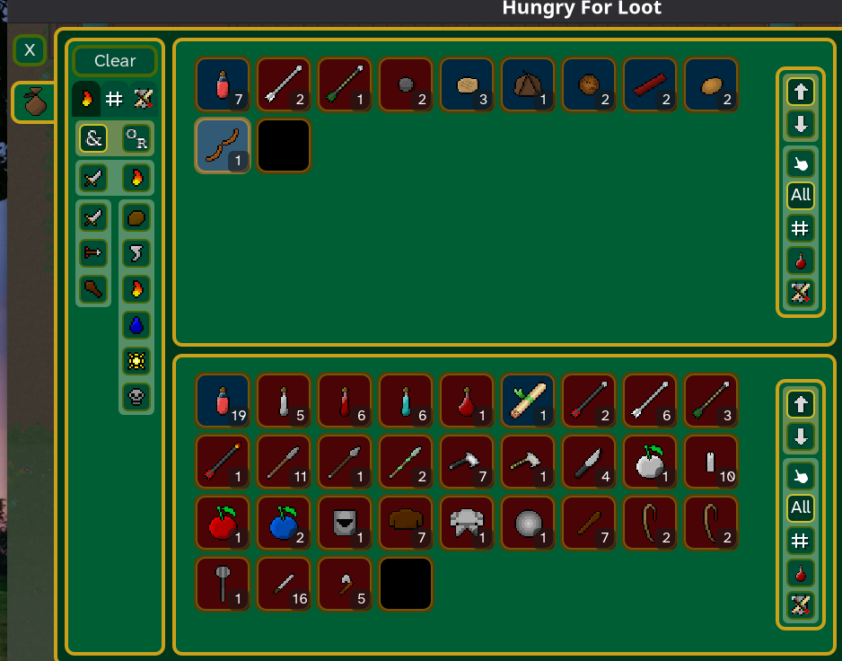
Regarding the item stacking... it is an improvement from the last version. However, I still feel the amount of options too overwhelming. For the first few battles, I was willing to assign items to which party members. However, after 5+ battles, it just feels tiring to do so due to the sheer amount of options. So Again, an auto-assignment will be a cool feature. 

Since everything is based around on loots you gather, everything is crammed in the inventory making it overwhelming very quickly. I guess that's why in other RPGs, consumable-items/skills/spells/equipments have their own category.

Also regarding the items, some icons don't feel intuitive. There are the elemental berries that deal damage but has apple icons. And there are also healing berry. I would assume that apples/berries will heal you, but they don't here, so the icons feel out of place. Similarly, there are healing potions that heal you, and elemental sample that deal damage. Their icons look the same but act differently. I guess you can tell if you look closely at the icon background (blue for healing, and red for dealing damage), but it would also be better if the icons are also intuitive. 

That's it for now. Overall, I think it's a slight improvement from the previous version. It is a big game and even slight improvement requires tons of effort and time. So you did a good job and keep it up!

Firstly, the artwork and music seem nice, everything is in proper place. The transition with the music as you change scenery is also a nice touch.

I feel like there is no gameplay at all. The choice of places seem arbitrary so I just went through all the places randomly. I also feel the choices of dialog seem to carry no consequences.
Since you mentioned of expanded dialog choices from 2-3 to 3-4... I don't think this addition matter that much at all. Having only two options but showing different consequences would be much more effective. For now, the different reactions that we get  is not enough. Since this is a VN, unlocking different background stories or have branching ending will be a better usage of the dialog options.

Another suggestion from me is to display the question when the player is presented with dialog options. This is just in case if the player go through the dialog pretty fast and didn't get the question.

On the race gameplay... coming into this, I was expecting a racing game where you drive the car, but I was wrong. It is quite frustrating when you car just bump into other cars and never overtake them. The only interactions are what looks like a nitro toggle on the bottom-right of the screen and it does speed up your car a bit, but not significant. I also don't really see the effect on toggling the aggressive/lax mode on the bottom-left of screen. The gameplay for the race itself is pretty non-existent at this stage, I hope you'll make some improvements on this in the future builds. More often than not, I get frustrated because you keep bumping into other cars and there's no way to control it out. Or worse, when there is a faster car bump into another opponent's car and pushing the slower car to move faster.

Another thing on the race, if I want to win I just select Porchat and it will just blaze through the race track. But if I choose the truck, I will just always lose.

I can't give any positive/negative judgment on the idea at this stage. It still a lot of work since you're mostly watching the race play out with no interaction. There is also not much to customize at the garage. One suggestion is maybe start with loads of money but only 1 basic car without any equipment first. Then let us choose which part to buy and install.

I think you did a decent job on the customization in the garage UI clarity. Everything is quite understandable on the get-go. One improvement point is you should show your available money in the garage screen. Player starts with $1000 but it is not communicated in the garage screen where you're actually buying for mods.

It seems a bug where there is no UI pop-up after you finish the second race. You are just stuck with the game looping until you reload/refresh the browser page. 

That's it for now, keep on working!

Screenshot of my truck getting stuck behind two other trucks:

(1 edit)

On your opinion about the music, increasing intensity/tempo as the deadline is getting closer is a nice idea. I am putting that into my list. And yes, I agree these are all polish features and I intend to leave the music player at the current state for a while. There are more pressing issues to be addressed and core features to be implemented. The music I am using are all free under the creative common license, I should have that mentioned somewhere in the game page. Thanks for pointing it out. I will probably look into paid options some time further deep in the development, will definitely check out your suggestions.

I have just entered March's jam!
Looking forward to more development and playing everybody's games!

Thank you for playing the game and the thorough feedback!

I will definitely fix the things that you find frustrating, especially with things being not obvious when they can be built or not based on the ratings. I just implemented the ratings currency (EC, EN, and such) this month thus the very uncommunicative UI. (sorry, this is just my excuse, haha). You're right, I will try to make things more obvious for the future builds.

On pausing the game during establish, thanks for mentioning this. I have tried to make the game not punishing even when the time moves when choosing buildings. But I will keep this in mind on how to proceed next.

Interesting that you pointed out about the background music. I was thinking of mixing a different vibe every now then, thus there are some preppy music and mellow ones XD. 

Even with the game in a very buggy state, I really appreciate the time you took to play and leave a very thorough feedback.
I really wish moving on forward, there is a monthly jam like this for us to play each others' games and post a feedback to improve both our games!

Thank you for playing the game and the comment!Thank you for the very thorough feedback, particularly on the game communication (UI, indication, controls and such). I agree with you that most of the things are still not obvious and has to be worked out with several play, so I will definitely try to improve that on the next iteration. 

You can use right-click to cancel action and movement, but this is my fault for not communicating it enough on the tutorial. 

I am so glad that you could enjoy the game since it is still miles away from finish (thus the unbalanced gameplay). I am so worried that the victory condition is very lackluster at this stage since you only try to rack up points.

Again, thank you so much for playing the game and the wonderful feedback.
I really wish that moving forward, we can play and give each other feedback to improve both our games!

Woah, I did not expect to read a novel in this jam submission, haha!

SPOILERT ALERT!!! For others that haven't played the game

The amount of decision-making vs. story feels appropriate. I enjoyed having to choose a reaction based on others' actions. The pacing seems appropriate for now, but I think story beat can work being just a little bit faster. 

I did not enjoy the prologue scene because it feels like a short-cut to evoke tension that do not resolve in anything. Personally, I just hate dream scene in stories, it feels low-effort because you can just wake the person up and be done with it. Perhaps it would be better to just start the story from the morning you wake up. The weird dream can be included some time maybe after the day ends. I digress.

But overall, I enjoyed the demo and would love to see more

OK, I will keep your comments in mind with future review. it's good to know the intent of the developers so that the area of feedback can be more focused. If you are planning to do this like once every month, I would love to give some feedback on the feature you specifically just implemented or requested to review. 

Thank you also for hosting this kind of feedback jam thing. I feel we gamedevs are trapped in our own project for too long without any external opinion that it just warp our senses. It's just good to have an outlet for honest and constructive discussion in the early part of creative process.

I didn't read the tutorial so I played most of the game in day mode. But then I changed it to night mode, and then somehow get stuck in a place where I needed a key to get out and stopped playing. Honestly, it's a decently made block-moving puzzle game without the day and night mode.

At first, it is not really obvious what the "up" directional block is. But eventually I realized that it can be imagined as a locked door. But it not a big work to draw a "lock" sign instead of "up" arrow. Then after a while of playing, I did learn that you can push the X gray block to cover a whole and walk over it. Since the game was made for a jam, I guess the game design is passable even at the current state.

When I get the hang of the game, I think I cleared almost all the room in the "III" level (to the north of the beginning level). There is a particular moment where I felt smart on figuring out the consecutive holes and locked door puzzle. Mind you that I did this all in day mode. That's why I think the night mode is redundant unless there's a cool lore behind it.

Another note, there seems to be a room where you can't possibly enter since it is blocked by red teleporters. 

Overall, this is a decently made puzzle game and I enjoyed it

I was playing the classic 1P mode.

On game mechanics.. firstly, the objective is simple and easy to understand. But It seems that the control will get stuck for a while after you move 4 or 5 steps, and then the black-holes change place. After that you are allowed to move again, so the control does not feel responsive. Is this just me or is it because it's a web version? If it is indeed the game rule that you cannot move after a certain number of steps, it would be better if there's some animation to indicate that the space changing and the players cannot move.

For the appearance.. I am assuming that you're going for a trippy ambience simple game. Probably it's not worth mentioning, but more animation is needed, such as making the black-hole pulse or a quick interpolation on the player's movement will be effective. 

Overall impression, I imagine this will be a fun party game when everyone is drunk (O.o) and waiting for something.

(1 edit)

Hi, thank you for your reply. 

Yes, I understand that a lot of the system in place are basic RPG system and will be refined as time goes. I hope I didn't come across as intrusive to the development of the game. I would love to have back-and-forth discussion on this if you don't mind. Just putting out thoughts as a consumer, so please take my comment with a grain of salt.  

But coming from a perspective of someone who like and used to play a lot of JRPG (same as you through the PS1 era), I expect to see a dramatic story, cool characters, or environment at the beginning of the game to get invested in. If you guys are indeed planning to do a full JRPG for the project, I think making a well-crafted story, with engaging plot, intriguing characters, or cool environment first (just for the beginning part)  would be the utmost priority for what you want to achieve? Implementing the battle, inventory or tutorial system seems to be secondary for the type of game you're aiming.

 I managed to reach the next village but got annihilated fighting the boss with the knight armor :D

This is such an ambitious scale for a game jam, The game still needs a TON of polish to make it appealing.  But,, I think you did a good job on implementing the basics for what looks like a turn-based RPG game.

Here are some of my thoughts:

- I feel the game is too relentless since I don't see any opportunity to heal between battles.

- Having to re-shuffle items when I don't see the one I want is frustrating. It feels like I am being punished for not doing anything wrong.  Since I am used to classic jRPG like Final Fantasy, being able to use all available items when acquired is just more natural (with the exception of FF Tactics) 

- Operating loot assignment after each battle is kinda confusing. The tutorial has too much text at too short period of time. Instead of text, I think adding auto-assignment to loot will make it simpler.

- Again, the initial tutorial is kinda long-winded. I am happy that you at least include the option to skip it. But making it shorter for the next iteration will be sweeter.

Just my two cents... If you are planning to make an RPG with epic story and such, I think you should first make the game less punishing and do less battles in-between story beats. Making your main characters as slime is very hard make it appealing, so it needs a LOT of polish to the visual to pull it off.  Right now, the slimes only differ in color so it's difficult to distinguish between who and who. 

Good luck!

No worries, it is just a minor issue.

I wasn't even thinking about pressing anything while the intro is playing! Probably I got used to just watching any cutscenes when playing games.

Noted. 

The boss level is confusing when pixelmaschine played it. So I really agree that it should be re-designed going forward.

Also, thank you for pointing out the frustrations with accidentally closing a door that you have unlocked.

Really appreciate your feedback!

The premise is cool and the idea of using fog-of-war in a management-sim game is neat.
It is such an ambitious genre to be made in a game jam though, so great work on making it to presentable stage!

It was quite confusing on what to do when the game starts. I wish there is a tutorial level that guide you through the UI and landscape. So, instead of being able to choose where to land, maybe it should've always landed in a fixed location with rich resources, because first-timers certainly don't know anything about the game yet. Or another suggestion is to be much more forgiving with the resources.

But overall, I like the idea of the game and would certainly want to a see more polished version of it.
The art itself is quite polished but the UI some more work (it's forgivable since this is a game-jam).

Great work!

(1 edit)

I love the art and aesthetic of this game! It reminds me so much of the late 90's early 00's video games, particularly Pepsiman on PS1 where the NPCs are flat 2D sprites in a 3D world.  The character controller is also done well, roller-blading around is pretty fun.

Unfortunately, I can't comment on the gameplay since there it is almost non-existent. 
But this submission is a really cool proof-of-concept/prototype for the art and player controller.

I would definitely want to see a more fleshed out version of the gameplay with this atmosphere. 

Kudos on the submission!

Thank you for your feedback, glad you like the game!

Adding more player agency would be the design challenge that we would like to tackle next.

(3 edits)

A cool interpretation on the theme.
The aesthetic is charming and overall the art looks very cohesive.
The tutorial is very helpful to the player to get immersive quick and knowing what to do.

My two cents, please take it with a grain of salt.... in further levels where it gets big, it can be off-putting not knowing where the packages and drop-zones are. Since the premise of the game is a delivery service, I feel the player should be able to to tell where things are in one glance (like a mini-map telling what is where). So the player can focus on strategizing which route to go first or which action to take first, not exploring the map. Delivery service shouldn't explore places, they should deliver things efficiently.
Edit: on further play, I discovered that you can zoom-out to locate things quicker. This did alleviate the frustrations I had. I still do wish to see how the game feel if we start each level with a zoom-out screen with the package and drop-zone locations.

All being said, this is a very solid submission!

As for the current state of the project, being a shipmate just going around and digging for stuff that you don't know where to look for is repetitive, however it does fit the game jam theme really well. You can make the repetitiveness bearable or even fun if you can make the player more "fun" to control (e.g. less clunky movement). The cartoonish-style is OK, although more polish on the animation would also help with alleviating the repetitiveness.

It also helps to have an indication on where you have dug as to avoid spamming dig without any purpose.

Good job on the theme interpretation.

(1 edit)

Firstly, good visual style.
Then, interacting with the cat using both keyboard and mouse is really fun. Kudos on the controller implementation!

As have been mentioned in the description, there are some area that soft-locked me from progressing further. One between the shelf, and another one I got stuck on the floor (cannot jump) on the where there is a moving platform.

Personally, I think the intro text is a bit slow. But maybe this was deliberate.

For lighting, I wish the immediate area around the cat is a little brighter to illuminate the cat's line of sight. 

Overall, it's a nice little platforming game. Good job!

Thank you SnakenBacon for your feedback, we are glad that you like it!

Your idea of reversing the meter sounds cool!
We had an idea to only alter the properties of the cloud, i.e. hard/soft-ness, thick/thin-ness, etc to get the cloud into different forms with different abilities. Time didn't allow us to experiment with it though.

Yes, we should've included a level that forces the player to change MC's direction using Platform Cloud. Totally forgot about that while designing the levels ^^;