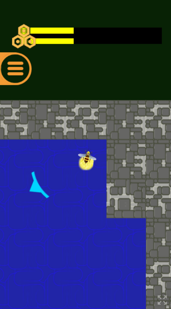
Great premise and making use of the theme. Sadly got stuck on the nameplate part, but it showed promise! Could have used some hints system or more contextual clues, in case you get stuck.
1Am2Good4You
Creator of
Recent community posts
I apologize for the start of the game. I fell into the trap of developer tunnel vision where things seem easier for me compared to the average player. Thanks to the help of a few playtesters, I managed to put in a hint system to try and mitigate that issue. As far as I recall the beginning is the most difficult, in hindsight not that smart of me. Thanks for trying it though!
WarioWare catnip edition. Certainly a vibe. Kinda hoped it would be more rhythm based but fun nonetheless. Only the flying packages minigame had me struggling how it determined a loss. The reason I mentioned WarioWare is because most of these minigames telegraphed when you needed to do something, so that's great.
As I saw someone mention in the comments, great idler gameplay. However, without any sort of introduction to the mechanics, combined with the pretty long time before you are "forced" to die, lowers the gameplay aspect for me a bit. Don't get me wrong, great idle game, but not very exciting in terms of interaction. Played around for 30-40 minutes and can say it does get better once you can perma upgrade your stats (a shame that i had my manual toggle off, and missed out on that aspect). Hovering over icons to get a tooltip would already have made it much more user friendly.
I appreciate the feedback.
- Effect was indeed one of those attributes that made me think twice before selecting a card. There is some logic behind its effectiveness but it's far from the elemental type chart in terms of familiarity.
- The shapes were probably too easy, didn't see a particular type effectiveness chart that would be intuitive enough. I could buff the effect multiplier and lower the shape multiplier to make it a bit more balanced, as well as expand on the effectiveness in the tutorial if that helps the player understand.
- Your suggestion for the block minigame is a good solution to the problem. In the beginning I had a similar idea and opted for the "osu" style so it seems I might have to revert that and implement a time based penalty.
- Glad to see you felt an adrenaline rush playing the game, did you eventually get to the victory screen?
1) The intro does a good job of worldbuilding. It could however benefit from some cutscenes (dream) mixed in with the manual dialogue. That would make it feel less like a chore and more something uncontrollable like a dream.
2) The inventory UI is jarring. Everything in the game is neatly stylized with pixels and then you get a bright flash of white, modern text that takes you out of the experience.
3) An option to change control scheme would be nice. Personally more of a fan of the WASD, spacebar, e kind of controls than the arrows keys + bottom keyboard row.
4) The first objective you get is collecting berries. Without a solid indicator of progress, you end up having to find out at the very end if you accomplished the goal. To make it more confusing, when you transition between scenes the berry bush sprites are reset and you have to manually walk past each of them to find out if you missed them.
5) The objects that allow you to save, require the player to manually interact with them. Perhaps you could make the default (walking next to them) be saving. This would still leave you with the level up part as functionality for interacting. Forgetting to save is worse for player motivation than saving one too many times.
6) Having each "room" reset on transition seems like a disaster in the making when it comes to balance and gamefeel. It would make it easy to farm currency which only demotivates the player. As an example fully clearing a room could be rewarded and not punished.
7) Lastly the transition from the introduction to the actual gameplay could be smoothed out a bit when it comes to visual appearance. I don't know what part of it felt a bit off but the transformation was very sudden. Perhaps a short animation giving the sword would already resolve the issue.
1) Main menu UI scaling seems to be off. Text was so small, it was unreadable in the WebGL build.
2) WebGL build forcing fullscreen did not work, perhaps introduce a fullscreen button?
3) If you hold down LMB before interacting with an object that shows dialogue, you can trick the game into thinking you are holding down LMB permanently.
4) It looked like a nice terraria/minecraft cave exploring setting. Sadly you cannot die, therefore once you commit to going down, you inevitable need to make the journey to the top which can take a while.
5) Mining seems tedious due to the long time needed to break blocks (if there are upgrades ignore this).
6) The tutorial was pretty nice, not too intrusive and made sense within the game context.
7) First time teleporting was a bit jarring, perhaps with some visual effects this could be better telegraphed.
8) Small icons are great when the player knows what it all means. As a new player a bit more zoomed in gameplay would go a long way towards building familiarity.
1) UI felt very surreal at first glance. Character creation is put on the screen as a small window that is easy to skip if you want to close the main popup at game launch.
2) Movement feels wonky at times where you are trying to shoot enemies but instead walk towards that aimed position. Combine that with the camera that rotates when you move and it can feel quite chaotic.
3) The combat itself felt quite repetitive in the sense that there is no downside play ranged. You have a very safe position and pretty abysmal cooldown between seemingly infinite ammo. The 1, 2, 3 slots felt lackluster in comparison.
4) Infinite spawners feel bad in a way that you dont get a sense of accomplishment. It quickly changes the goal from exploring to speedrunning because staying in one room for too long leaves you more vulnerable than anything.
5) The picking up of items (if that is even possible) is not possible for me. Whether this is due to precise controls needed or some bug, I have reason to believe it led to me not being able to progress through certain areas with a locked door mechanic.
6) If the combat were a bit more skill based (less point and click from safe distance) multiplayer could be quite interesting.
7) For a fun competitive game mode I would suggest a mirrored generated dungeon setup that meets in the middle. This allows for players to gain an edge because of exploration and combat in ever changing terrain.
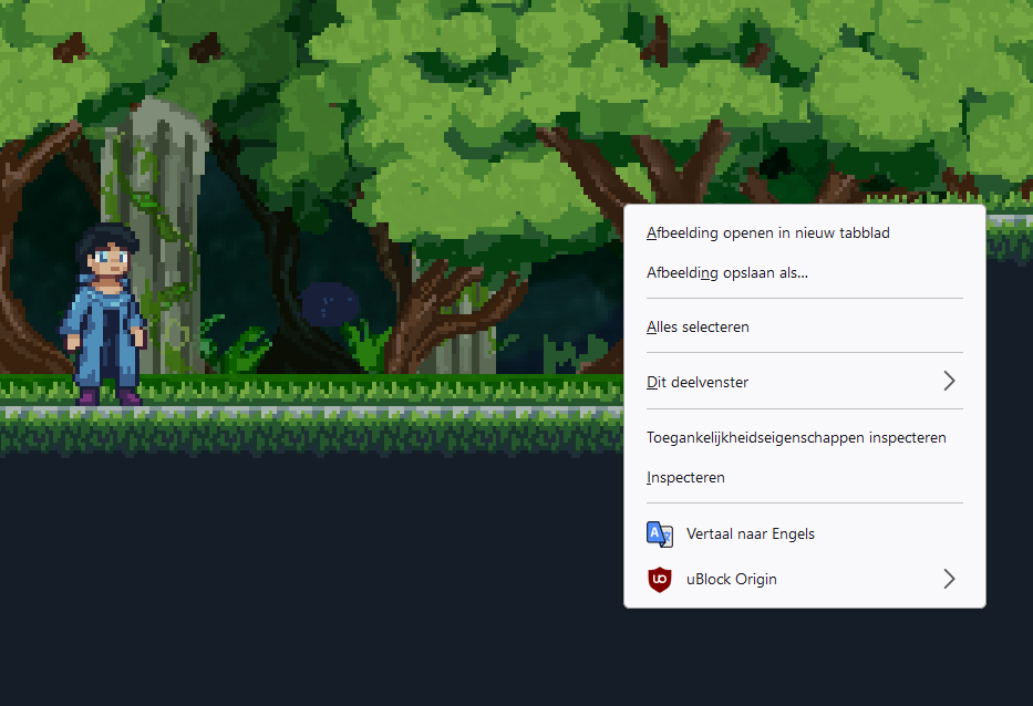
Sadly due to a bug, I didn't respawn in a bossfight. Combat system lacked some risk (could mostly play it safe from a distance because enemies couldn't jump over gaps). The fact that the context window when using right click was constantly popping up made it so I avoided using it. perhaps disabling that behaviour makes it more suited for browser builds. The rest of the game looked pretty good
You made clever use of the tools you got and nevertheless made a good prototype with several classes to boot! The art did however make it feel a bit lacking and the short nature of the game did not make it really enjoyable. Would have loved to see a longer version with some difficulty (as the current game mechanics make it quite easy to cheese enemies).
Haha no problem. The goal of what I had envisioned wasn't reached and this ended up being a broken version. If you really like the visuals or are interested in a multiplayer focussed game, perhaps look if I have made it a reality in the future. It is definitely still a work in progress and I will continue working on it even after the game jam.


