


Ok game!!!
Play game
Don't Fear the Tin Man's itch.io pageResults
| Criteria | Rank | Score* | Raw Score |
| Fun/Design | #246 | 2.390 | 2.857 |
| Technical Implementation | #247 | 2.271 | 2.714 |
| Music/Sound | #253 | 2.271 | 2.714 |
| Overall | #272 | 2.247 | 2.686 |
| Graphics/Animation | #288 | 2.151 | 2.571 |
| Theme/Limitation | #297 | 2.151 | 2.571 |
Ranked from 7 ratings. Score is adjusted from raw score by the median number of ratings per game in the jam.
How does your game apply the limitation (and optionally, the theme)?
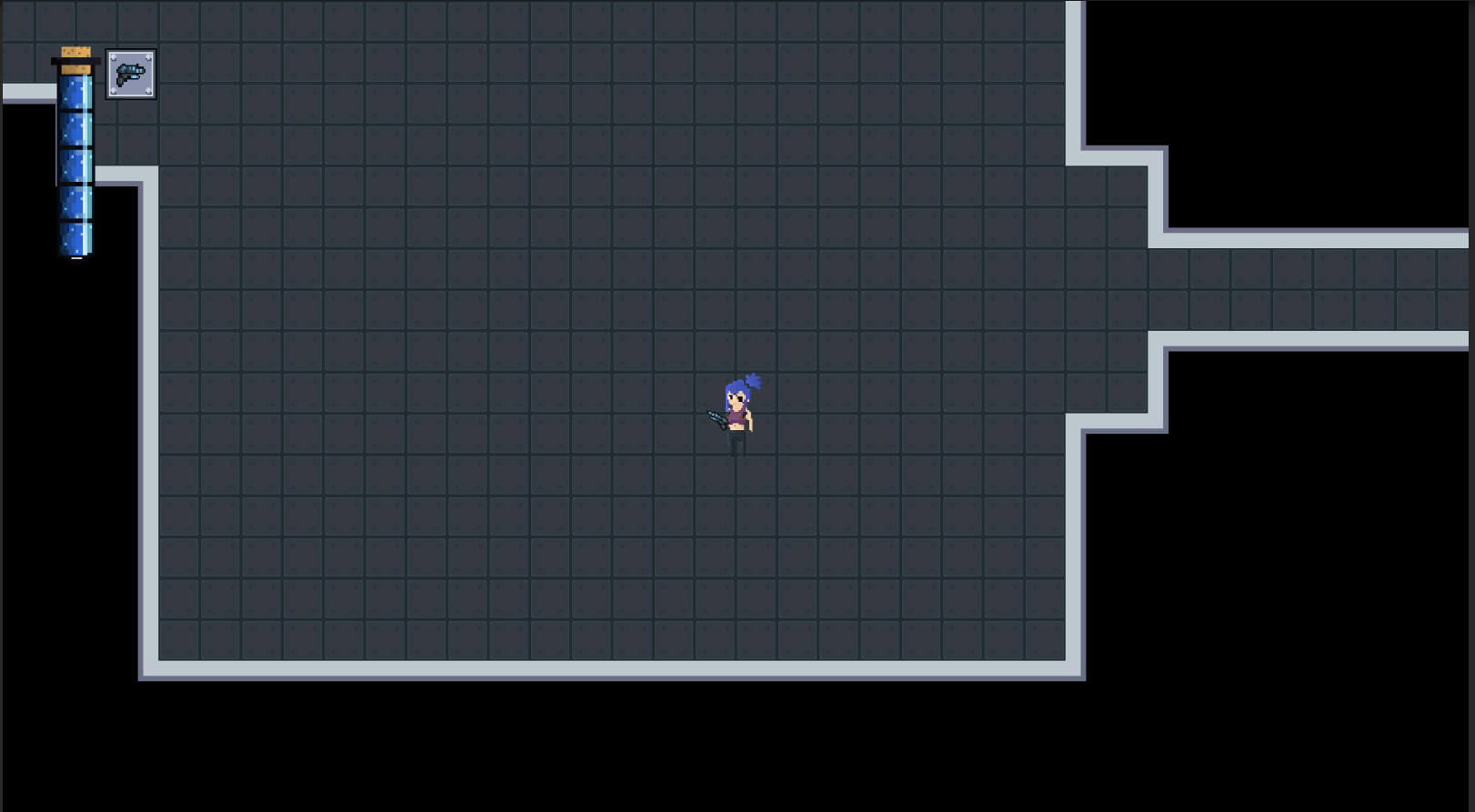
Your playing as Rui in the top-down roguelike where you are at the edge of humanity trying to survive, to escape you must defeat the boss who awaits you at the end.
Team Size
Pair (2)
What main engine/tool/language did you use to construct the game?
Unity
Comments
Interestingly enough, I just recently made a game that is pretty much exactly the same as this... Click on my game page and play 'Magic Mayhem' if you're interested!
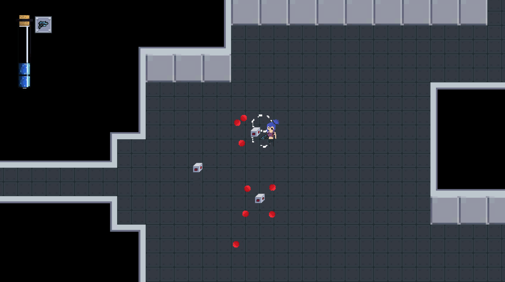
Anyhow as I made a game that was very similar, I can also apply a lot of the same criticism to this. First off, I noticed that you somtimes just did not place down any wall tiles? I don't know why but it just makes passages look weird.
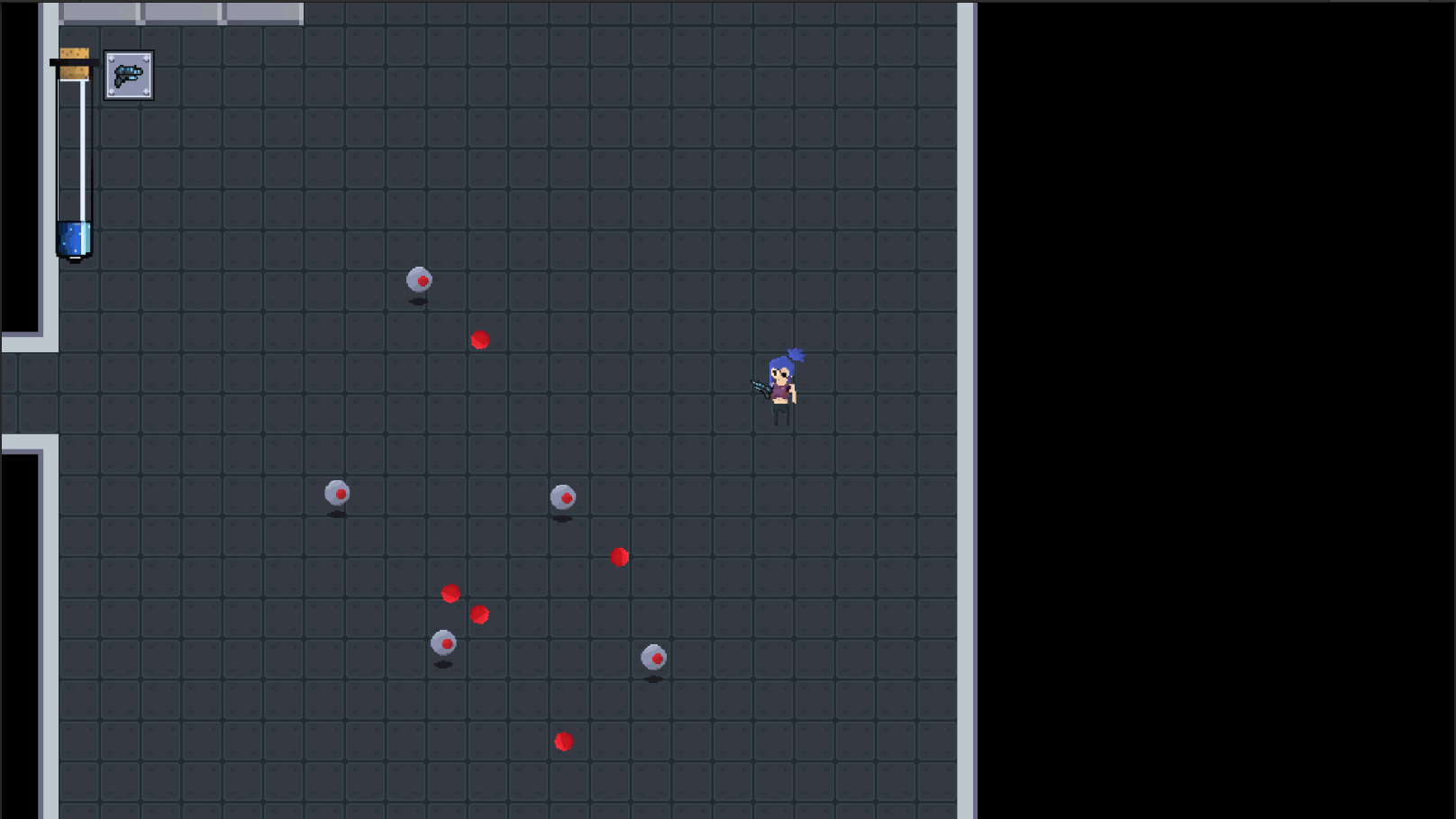
Something that also could have been helpful would be a minimad or an indicator of how many enemies are still around because it can get really annoying searching for one enemy that hadn't died yet.
Furthermore it would also be better to maybe get some differences in howw the floor and walls look as well as some diffenrences in enemies. Having only two types makes it very monotone very fast. Although, I am guilty of the same crime...
It is just a little bit monotone to run around the map only looking for enemies to kill. You could have improved that by adding collectables or multiple weapons to make this just a little bit more interesting.
Also, the tin man is a little bit to easy... I dunno, he just kinda doesn't feel like a threat.
I do really like the artstyle, the music fits the gameplay and the sfx are clean and good.
Submitted
Five Nights at Freddy's NESHi!
I managed to finish the game and defeat the boss. There's a few points I think could be improved:
- Indicate somehow the goal of the player ingame (not only on Itch): if someone doesn't read your description, he won't know that he has to clear an area from enemies before moving to the next stage (a simple fix could be to add a counter on screen of remaining enemies for example).
- Boss battle is super easy, you should probably try to add a few mechanisms or patterns to the boss. Here you just have to run in circle and shoot and you won't have any problem handling the fight.
- UI is ok, even if I don't understand why the player's life is represented by a kind of mana bar (with mana potions that restores it).
- Speaking about the potions, you should allow the player to walk on them without collecting them if already full life.
- Pixel ratio consistency! I kinda dislike the look of pixel art games where the assets aren't having the same pixel ratio size (e.g. compare your player to the walls, it's very different).
- Last thing about the theme: there's nothing ingame implementing that, only your Itch description is mentioning some story about why you're there.
Regardless of those points, the game isn't bad at all. It's totally playable and enjoyable!
Submitted
Deliver More!!!Thank you so much for playing our game! A lot of what you suggest is things we planned to do but really just ran out of time to be able to fully implement well. For example in the boss fight we were going to plan different attacks like a spread shot with multiple bullets to add some variety and bullet hell-esq challenge, but ya know, time crunch haha. We would like to expand on this game in the future and add many of the features you mention in some capacity to make it a bit more polished.
As far as the health bar, I understand the confusion. I was going for a less conventional idea and didn't want to do the traditional "red something" for health, red hearts just feels lazy. Can totally see it being confused for mana because blue is almost always mana in games. Certainly food for thought.
Thanks again for playing the game and giving feedback! Cheers!
Hey!
You're welcome! I know overscoping is the main issue on game jams, don't worry :)
Yes, it's nice to try out things. Also, for some stuff such as the UI elements or so, you usually want the player to understand easily what is what that's why most of the games use the same scheme again and again: cuz anybody will directly understand "ok so this is my life" :)
Hope you had fun making it!
Leave a comment
Log in with itch.io to leave a comment.