
Hello Aerosys.
I localized an issue that I had, in the past. ..But I havent communicated my issue well at the time—including the unforeseen root of the issue! Explained in one screenshot. Its the only UI-related issue I have left. ;w; Thanks in advance!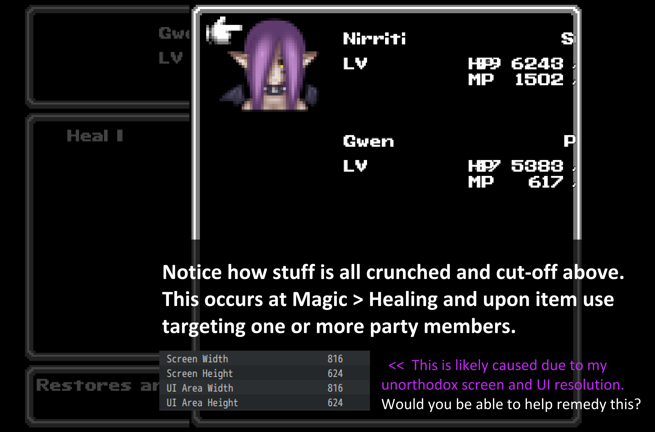
176 days ago(+1)
I recently released a new version 1.7.0 of this plugin, which offers some new controls for the Target Actor Window (ie the window from your screenshot), and more will follow!
Does the latest update already help you yet?
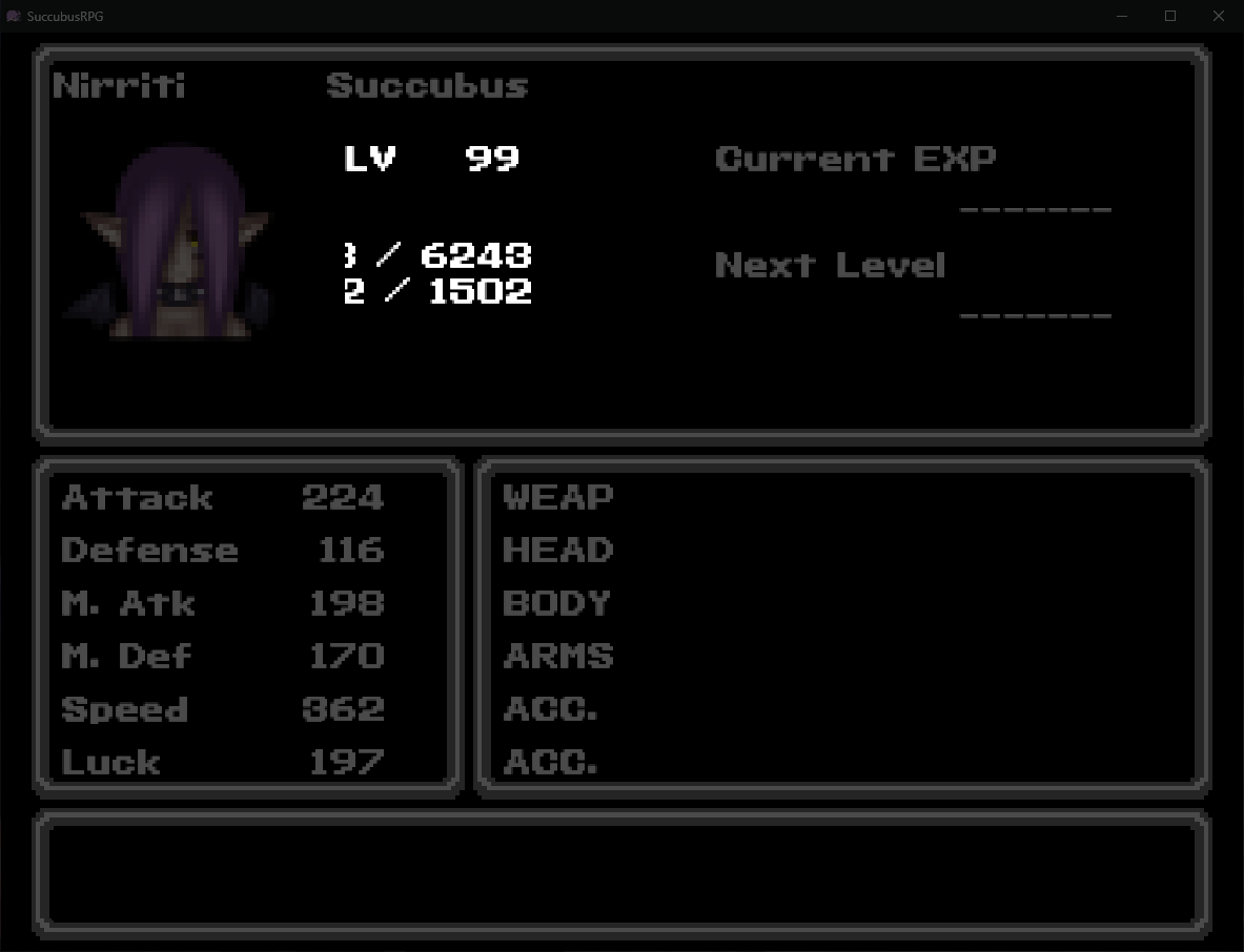
This fixes the crunched letters and numbers issues. However, there's now parts made invisible! Ive spotted that issue in the spell-selection, spell-use and status menu. It goes without saying, its prob the same in the item and item-use menus as well. I've added extra screenshots to show what I mean here. 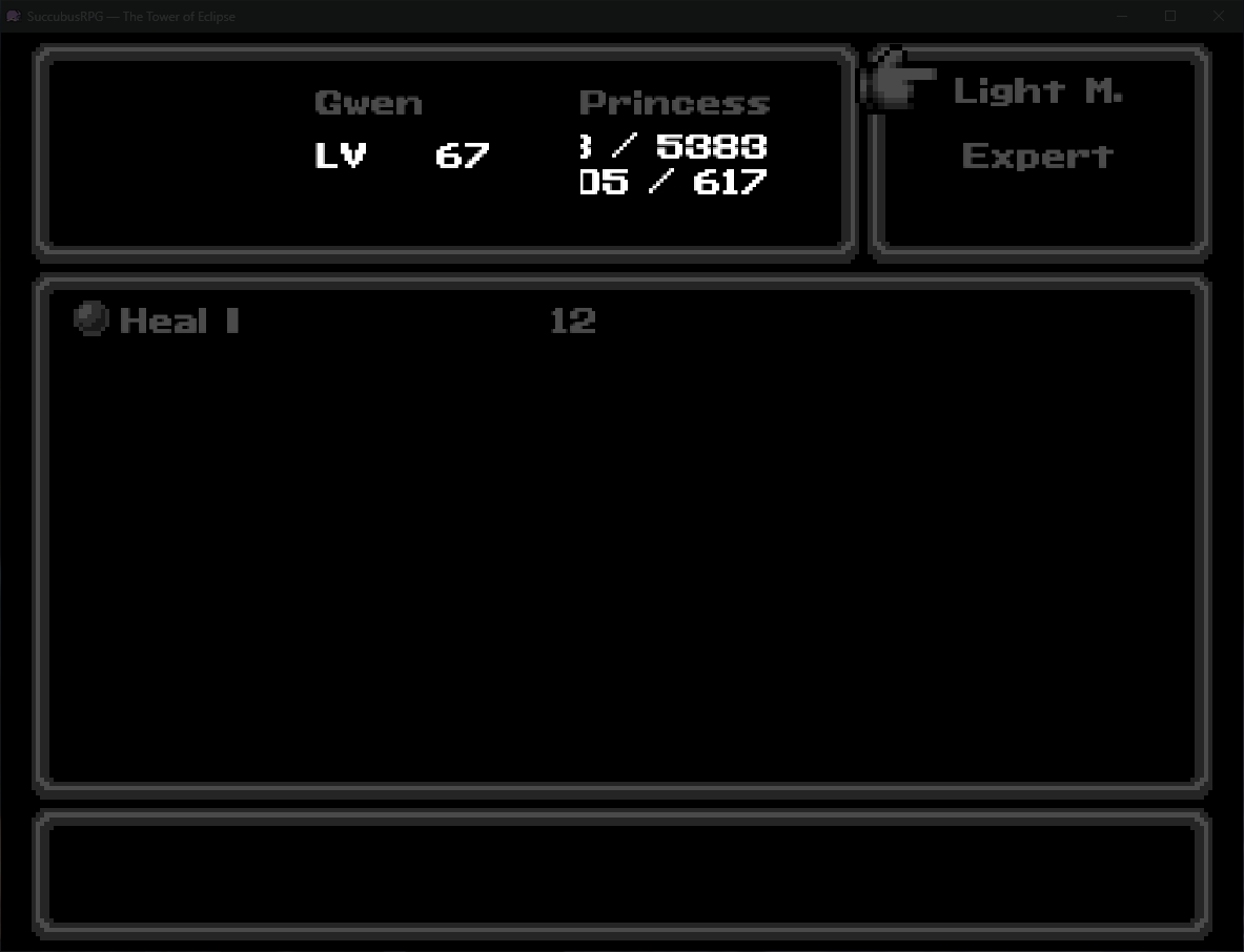
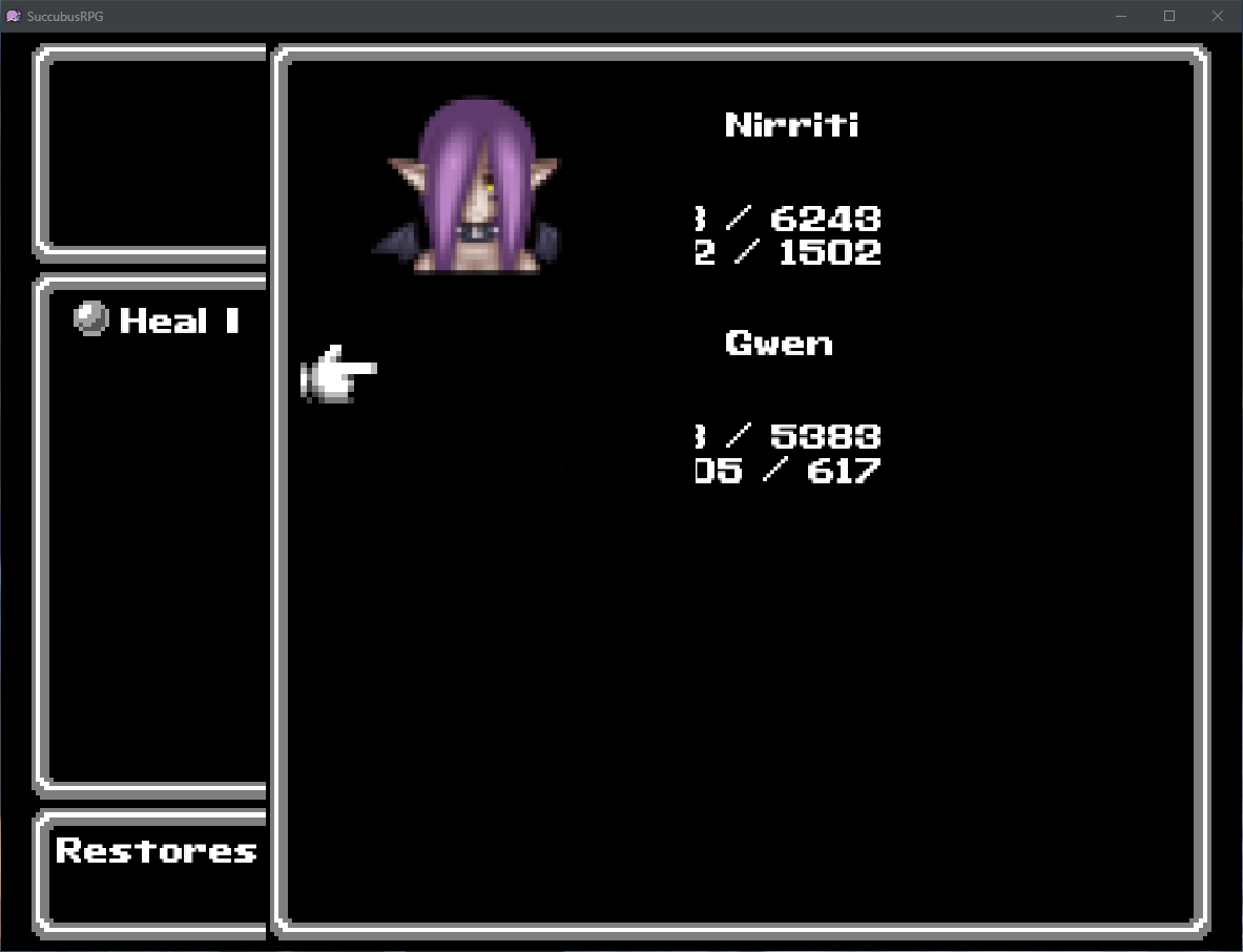
As I wrote above, its probably due to my unorthodox screen and ui size/ratio. You can see them on the first comment's screenshot above if you'd like to replicate it on you end.
Now, one might say, "why dont you stick to default size of screen and ui?" Thats simple: To force a zoom and to keep the frame of it all at exactly 1 square/tile (I.E.: Nothing cut off screen by misalignment), to not have too much be seen by the player and finally, nostalgia. PS: Gwen's avatar not being seen is NORMAL: I just didnt make hers yet. Its not caused by your plugin.
You use MZ, right?
It looks like only the HP/MP/TP are affected; in a way that the space is not enough to fit all the text in it. In my plugin, go to "Gauge Settings" and try overriding the "width" value, and set the override for "all scenes" or "all scenes except battle".
Furthermore, try disabling all other plugins and check whether the issue persists.
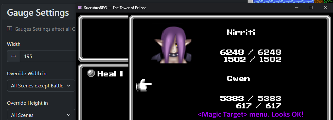
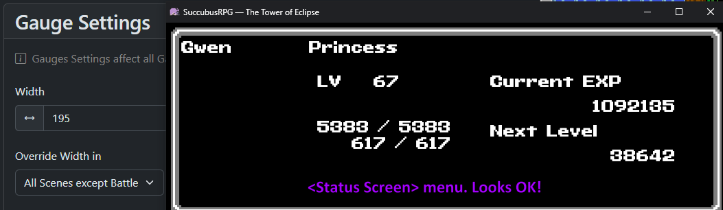
Correct, its on MZ! So Ive done some tests and it seems that the only place left where the letters are gone outside is on the <Magic> selection menu (which spell to use). Ive checked for <Items> (the part where you choose a target) and its just like <Magic Target Selection> (looks fine!) The status screen looks fine too now. Ill add screenshots to show what I mean (also note that Ive set the gauge Width to 195). 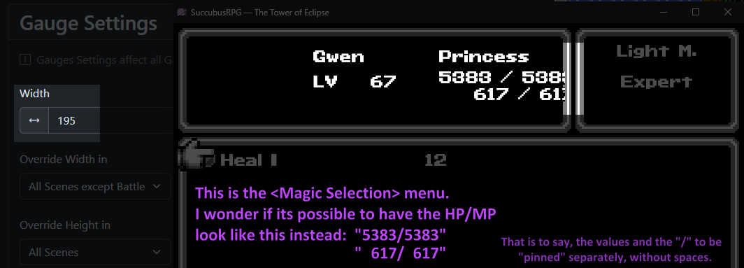
When the HP/MP are exceeding to the right in the skill menu, then I think that your game window resolution is too small. The MK UICustomizer plugin doesn't control the skill menu. You can buy my skill menu customizer because then you can move around widgets in the skill menu, or you can look for alternative plugins, because the MK one, which is available for free, only focuses on the main menu.
I like your idea to pin the / symbols to force-align them, so it will very likely come in a future update!
Sorry for my late answer. Its as I pre-emptively wrote above, youre right. But the thing is, I want that exact resolution. Natively, the game engine makes everything way too zoomed out, making everything looks small and impersonal. I calculated squares on a screen (on the games Im making a tribute to) and my current resolution mimics that 1:1.
The pinned idea came when I was trying to remedy something on the battle screen: You see, when HP values increase or decreases, the total width shrinks or grows (with that given plugin). "1" is thinner than "8" after all, right? Well natively it meant that numbers and the "/" sign keep moving around, which is irritating/weird. So I thought... well what if I PINNED those? I took a while to understand that plugin (thankfully its transparent and not too complex) and managed to have only actual number values (max not shown) pinned. So nothing "moves" and all is right. No "/" either.
Back on topic: Might just settle on how it is now. But for your Magic/Skill plugin, would it be possible to view screenshots of the other styles? (before purchase) Side note: Showing elemental resistances on the status screen was a good idea on your status plugin. :) On my end, Ill add those in the player manual's PDF later.