Since my English is terrible, I hope you can understand that I’m using AI translation.
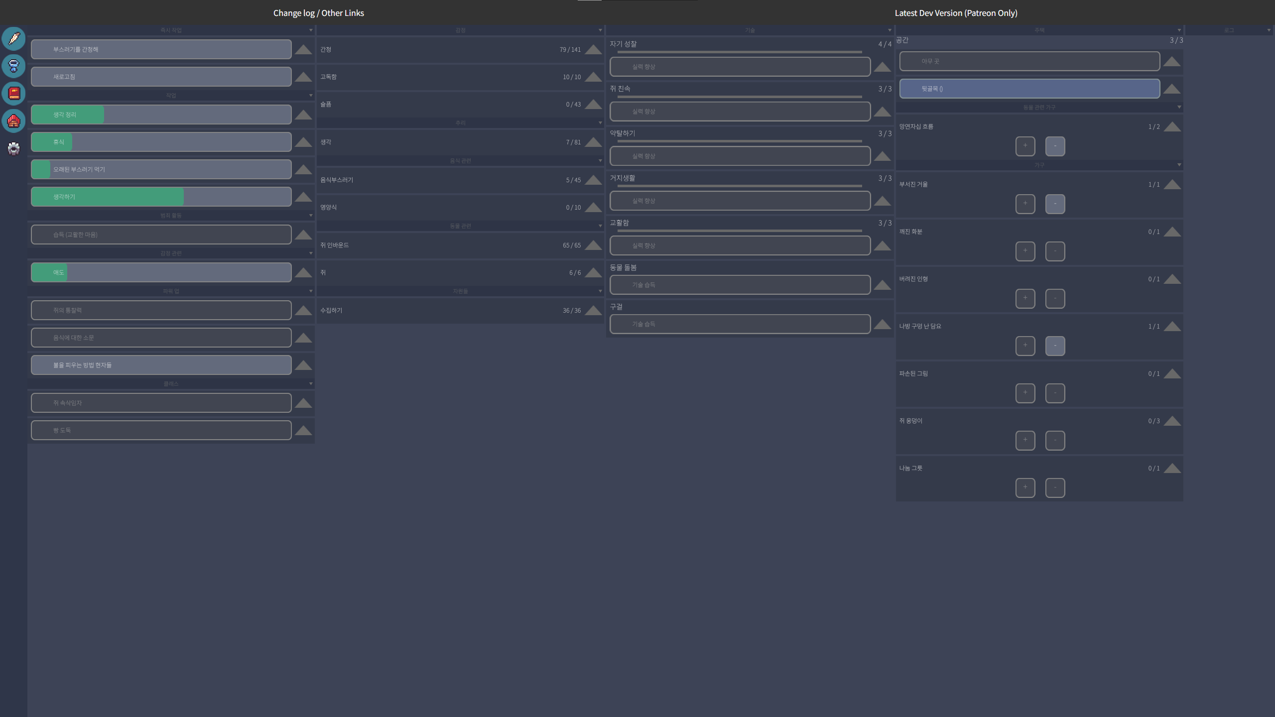
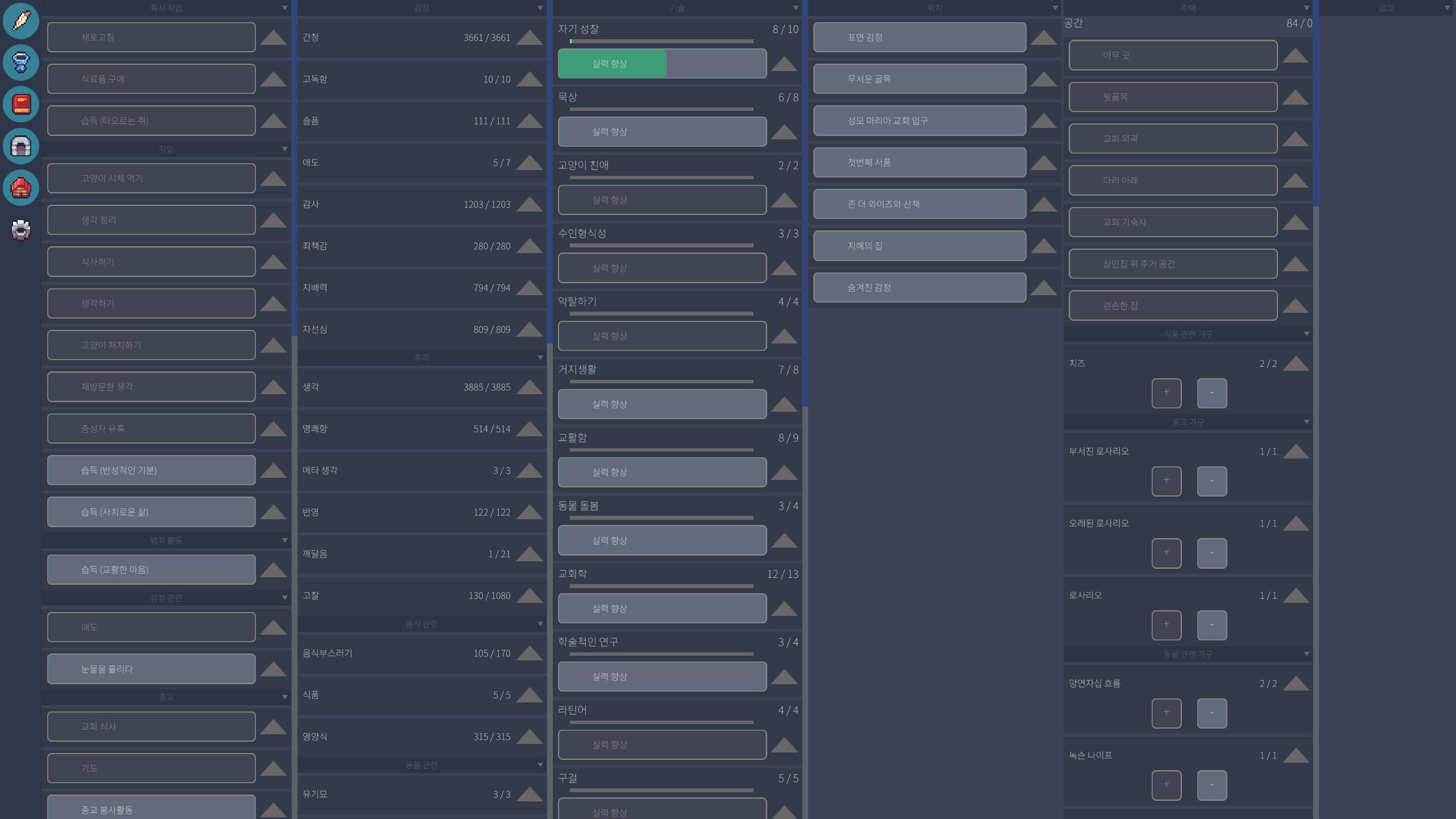
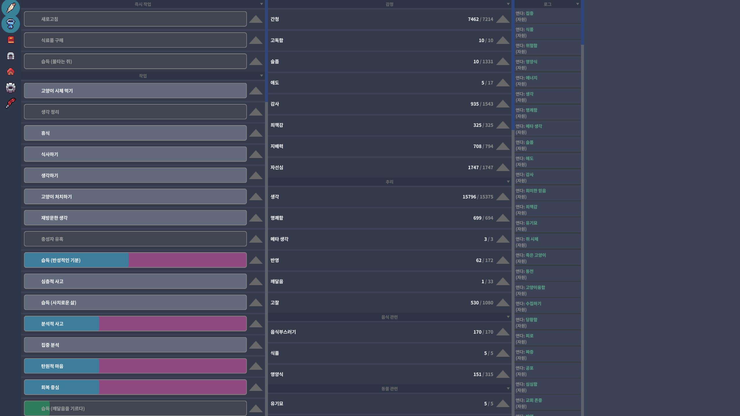
Actually, I’m Korean, and after checking your attached screenshot, I realized that the issue is particularly noticeable when reading Korean text.
The problem is that the font weight is too thin, so the text doesn’t stand out clearly from the background, making it hard to read.
In my comment above, I described it as a UI scale issue, but compared to English, it seems that simply making the font weight “bold” would solve the problem.


