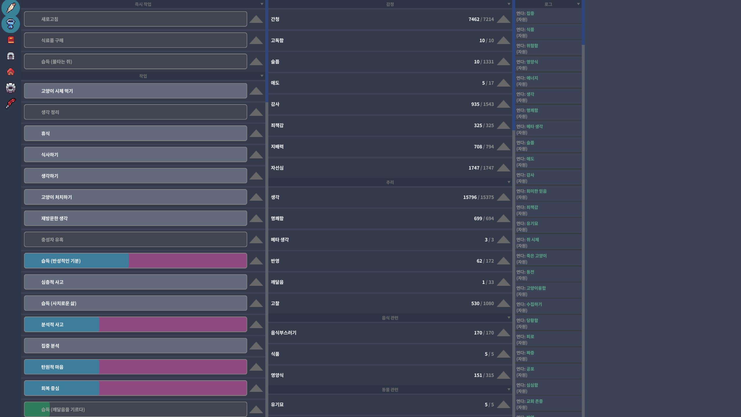
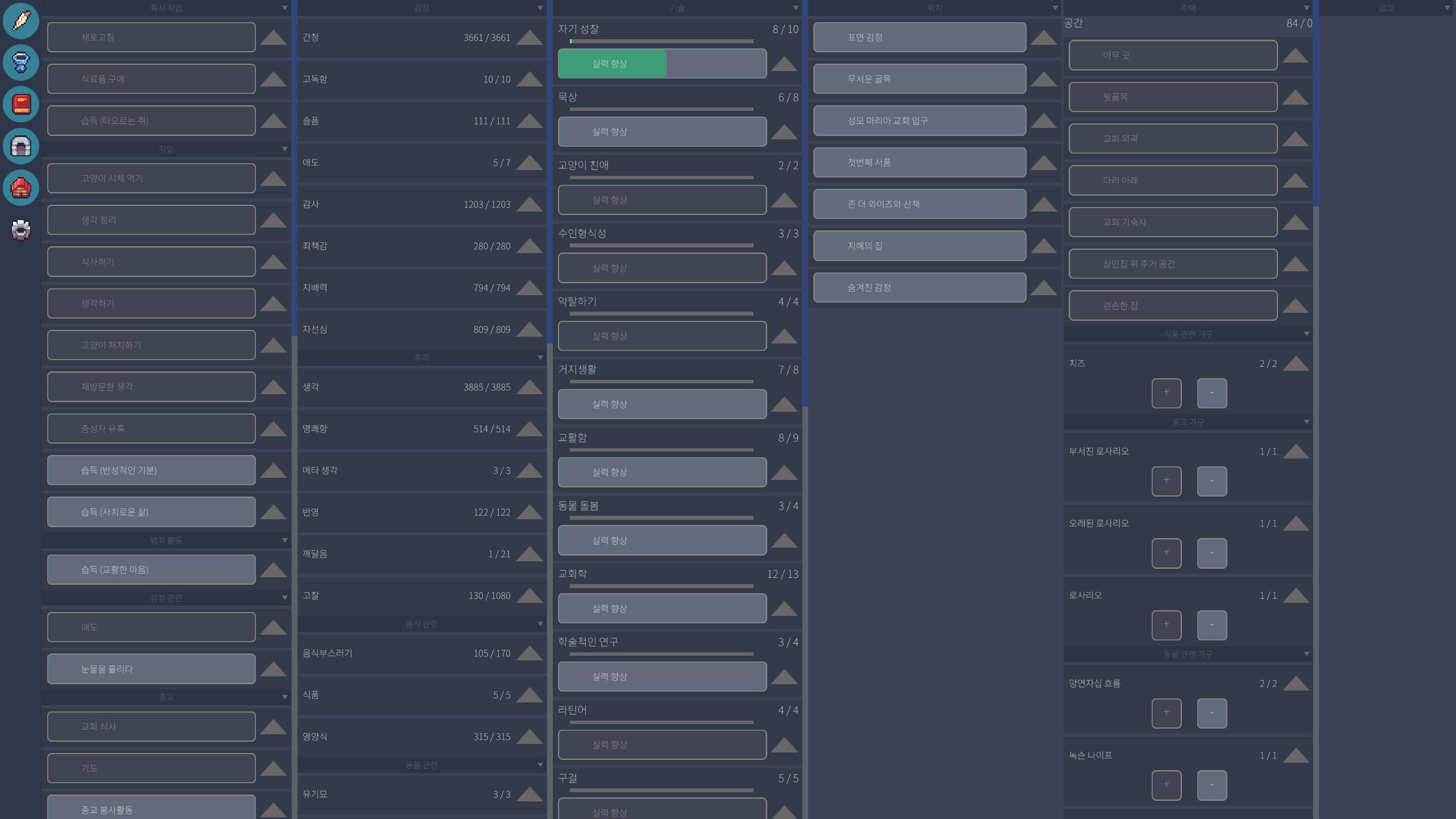
I don’t really feel that the buttons are too small. Either way, I just hope that whichever method is used, it helps improve readability :)
274 days ago(-1)
They’re nearly identical, but if I had to choose, the changed version is just slightly better. It feels a little clearer