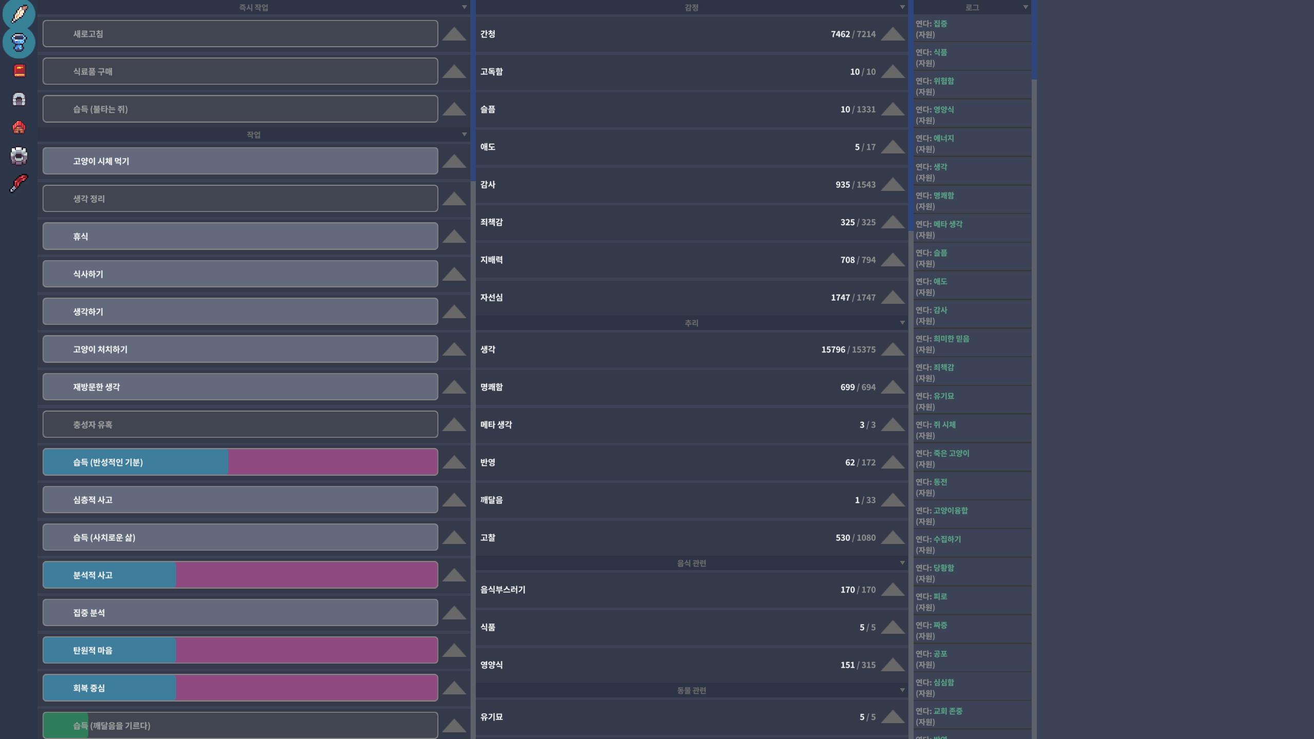
So you have a QHD monitor, and the text is small, and if you make the window take all the screen size, it's bad, but if you make it fullscreen it's worse, that is it, right? Your resolution is probably 2560 x 1440, right? Do you have a screenshot of that? I'm sending my own screenshot, is it like this? Or worse?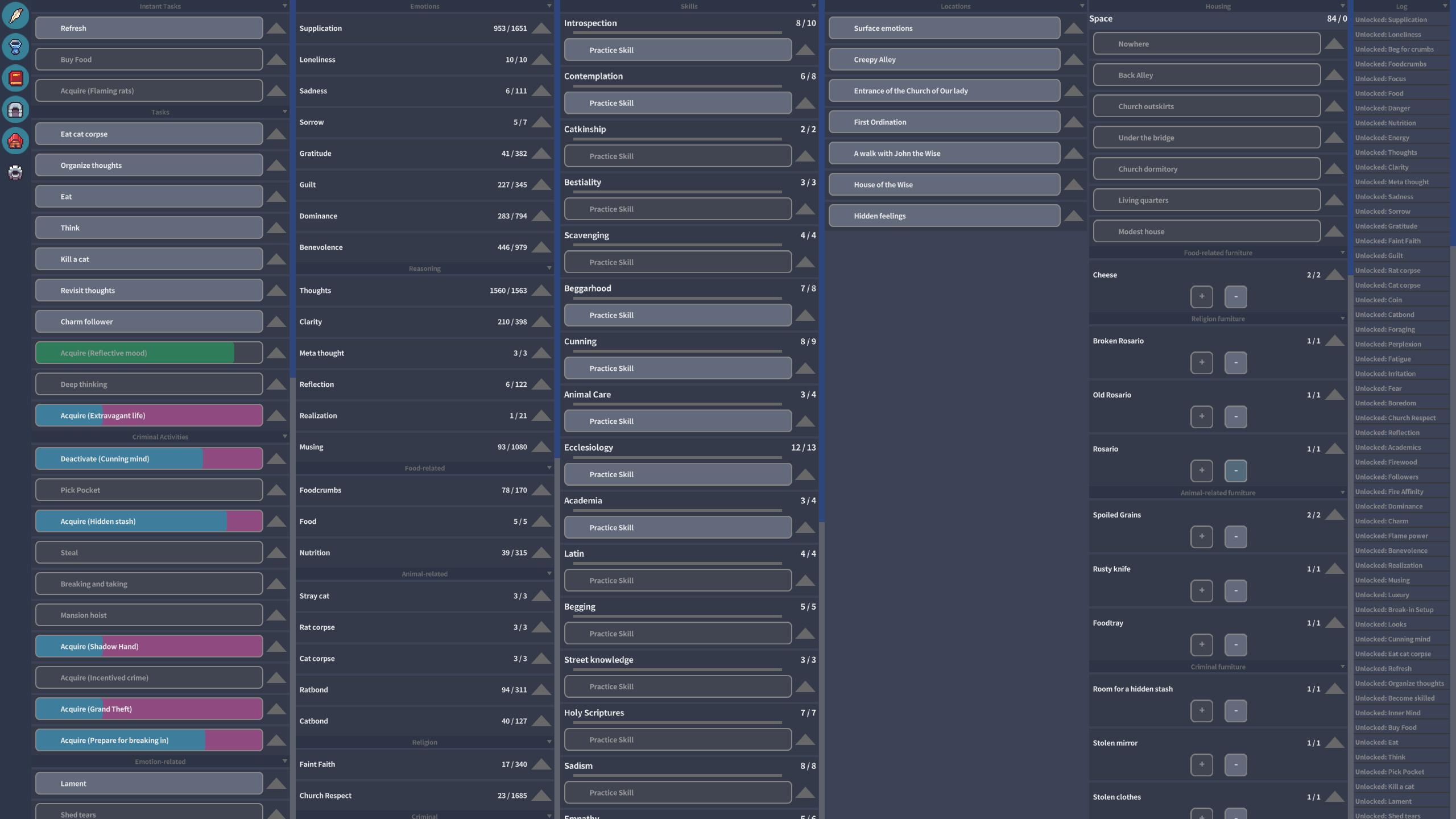
Since my English is terrible, I hope you can understand that I’m using AI translation.
Actually, I’m Korean, and after checking your attached screenshot, I realized that the issue is particularly noticeable when reading Korean text.
The problem is that the font weight is too thin, so the text doesn’t stand out clearly from the background, making it hard to read.
In my comment above, I described it as a UI scale issue, but compared to English, it seems that simply making the font weight “bold” would solve the problem.
276 days ago(-1)
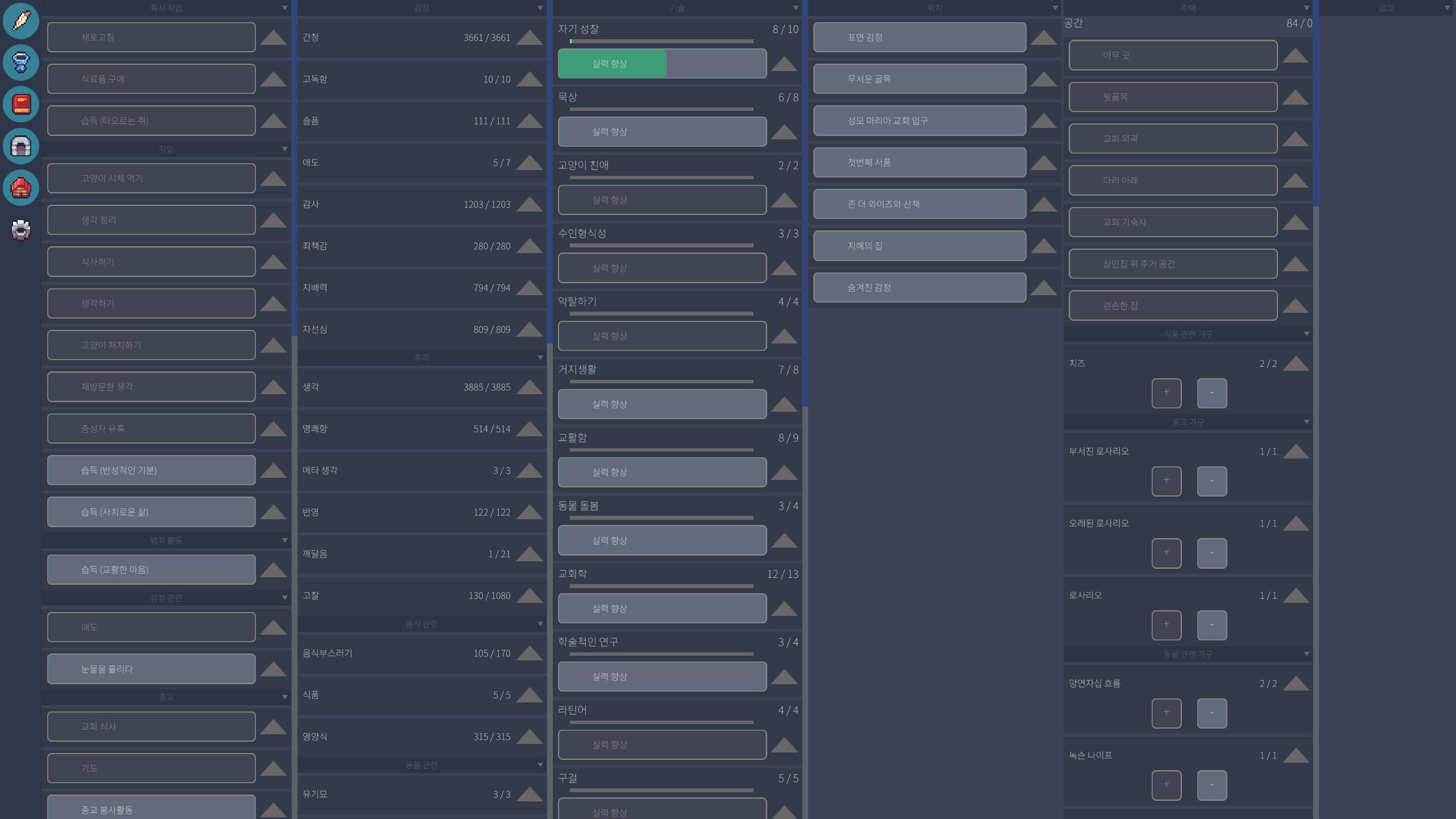
I don’t really feel that the buttons are too small. Either way, I just hope that whichever method is used, it helps improve readability :)
275 days ago(-1)
They’re nearly identical, but if I had to choose, the changed version is just slightly better. It feels a little clearer