

Play game
Companhita's itch.io pageResults
| Criteria | Rank | Score* | Raw Score |
| Overall | #35 | 1.429 | 1.750 |
| User Interface (UI/UX) | #36 | 1.021 | 1.250 |
| Visuals(Graphics) | #36 | 1.225 | 1.500 |
| Fun | #36 | 1.021 | 1.250 |
| Sound/Audio | #36 | 1.021 | 1.250 |
Ranked from 4 ratings. Score is adjusted from raw score by the median number of ratings per game in the jam.
DevLog Link
https://overbern.itch.io/companhita/devlog/1065591/alpha-2-img-jam-41
Leave a comment
Log in with itch.io to leave a comment.
Comments
I would try this game again after tutorial is added. Currently, I cannot play further.
Why do we need to hold the button to end a turn?
Are there action points for each unit? I seem to randomly lose the ability to do things. The UI should perhaps be redesigned a bit to better communicate the state of units to the player. It's currently not clear what each unit can or cannot do. The main parameters of its state are not shown in a clear way.
I managed to hit that single enemy several times but it always regenerates its health.
Conclusion: I need a tutorial.
Yeah, tutorial would be ideal but you can start by putting some simple written instructions into the game, that describe the basics of how to play. This should also reflect in gui. The information should be visually hierarchical: the most important information need to be most prominent. Try to visually design the game in a way that minimizes any possible confusion for the player.
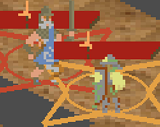
For example I'm totally confused about the ranges. They are somehow color coded and I encountered at least 6 colors: white, yellow, light blue, dark blue, ochre and red. There is no information on what any of those colors represent. I only guessed that the enemy is red.
I really dig the mood of the game and I can sense there is some depth to the gameplay. I'd like to defeat that enemy, but every time I try, the confusion caused by visual clutter sets in and I just lose any track of what's happening with my units.
Try to clean up the gui and add some basic instructions, either just text or a tutorial. It'll make for a much more fluid experience.
I just patched to try and make the board + the resources that determine what actions characters can take clearer.
Actions cost white triangles from the top right (command), and sometime orange inverted "r" shapes on the acting characer's health bars (reactions).
Color coding on the ranges is yeah what kind of thing they target, including like dark blue (don't care, it's aiming or something), and orange (any character). It's kind of a holdover from a previous UI that showed multiple ranges at once, which sucked. I've cut them down to 3 (move, aim threat, affect character), and might cut them further. Maybe instead have a couple different shapes on the symbols that show which positions you can click.
Not going to have time to move the tutorial into the game this jam, though.
Oh, that's what those triangles are. Ok, I think I'm starting to get it. You may want to make those something other than triangles. Triangles look like arrows which suggests direction, creating an unwanted association. I'd just put circles or squares there instead, and maybe write "AP" on the left side of them. Being an important element, they also should be in more contrast towards background. In action cost popups they're white on yellowish background, which is barely visible.
This new version is a bit easier on the eyes. One of the main causes of clutter are orange range markers of your units. They're just too thick, big and eat up all space. Those should be made subtler; perhaps thinner lines or just semi-transparent shapes without lines.
I'm not sure if the action points should be shared though. If they are then each live unit should at least add to the total at the start of turn. Imo it'd be better if each unit had their own.
I managed to bring enemy's hp bar to zero but it just refilled again. I'm at the same time happy and sad about it :D
I did just notice I have to make the triangles more visible on action popups, yeah. Not sure about swapping to semicircles, I feel like the tutorial saying what they are will suffice. They used to be semicircles, I changed them to triangles because it was hard to space out the semicircles in a way that's readable at a glance + looks good.
The orange lines are pretty much the most important piece of UI in the game. I'm still working on exactly how to present them, but no, they can't be subtle. And a sorta soft goal for the game is to have a limited palette, so I'd like to avoid transparency.
The action economy is also a really important part of the design. I want the player to think about actions as ways to manipulate the situation, usually not ways to directly make progress. There's a reason your attacks all deal 1 damage and your reactions deal 3-5.
There's three phases to the boss.
Would shared ap scale well? If you add more units on the map, with fixed ap most of them become useless because there won't be enough ap for every unit to act.
It doesn't have to scale well, the enemy's action economy doesn't scale either. It's a boss rush.
I want number of units you deploy to be mostly a matter of taste. More units are useful because of their reaction attacks, but they get in the way of each others' movements, trigger the protagonista's "Necessary Distance" flaw, and it's hard to protect all of them at once. I figure 4-7 will be best for most bosses.
I feel like this game needs a lot more work but can see something very unique brewing here. I think you should simplify and improve on what you already have for now and then continue with other mechanics.
Simplify the UI, introduce mechanics slowly, most people wouldn't take the time to read the game's description so changing the commit button from something you hold down to instant would help, as well as changing it to read "end turn" or something similar. Then focus on communicating the mechanics effectively and simply. You will be able to get more meaningful feedback on your actual gameplay after that.
I'm glad you think so!
Definitely going to have a bit of a tutorial introducing mechanics more slowly with fewer characters. The plan is 5 bosses, so there's time for that.
Not gonna change commit button to instant. It's the one thing you can do that can't be rewinded, so it should be hard to press by accident.
I can probably make it clearer though, circular bar that fills up or something. Maybe it starts partly filled and filling quickly. Not sure about End turn. Commit feels more right for the themes of the game. If there's a tutorial section where it tells the player what to do for like a turn, it'll tell them to press and hold it, and then they'll know.
Do you have any concrete thoughts of how to simplify the UI? Other than like. Making the cards smaller, and probably reducing the number of colors used to show the ranges of different abilities.
The UI is too cluttered and unclear. I've tried to play, and did win (I think), but am still not sure I fully know what I'm doing.
I got "endgame" text showing up at the top, while the enemy was still on screen. I'm not sure when it happened. Maybe it was when the enemy should have shown "hurt", though I'm pretty sure it was after that, maybe when they were lower health, as that is when I noticed it. The enemy did not show "hurt", so I had thought they just kept healing when I should have damaged them enough to hit 0 HP.
When a unit is at the bottom right of the board you can't see the button to use their ability. The 2 missing tiles in the game board feels out of place, and I was not sure what they were meant to be. It might help if they were black, or had some other indication that they might be a hole.
The cards feel too big and dominate the screen compared to the game board. I know it can be hard to make the text readable at low resolution, but with everything else feeling cluttered, I think reducing these to give more to the game board would help.
I think the almost "L" shaped tanish colored symbols might be the character's reactions, but I'm not certain, and they are really hard to see with so much else of similar colors. I actually stopped playing and just tried things to boost reactions to try to figure out if there was some indication of reactions since I had not noticed if there was any while playing normally.
In general, I think the colors need more differentiation. The background could change to perhaps be grassy greens. Maybe make the reaction indicators blue. The polearm targeting area could also use being a different color than the threat shapes. Just add a bit more color, as right now everything just appears a little too close and can blur together, rather than being clear at a glance. I know you mentioned planing to add a tutorial, and that will help with some of the issues in figuring things out, but even knowing what to look for the colors are too similar. I'm not colorblind, but someone who is would probably not be able to play this.
I don't mean to be overly negative. The game does have potential and could be fun. It's just that the UI made it really unpleasant to figure out and play. After playing through and winning I do have a better understanding and have some idea of what I'm doing, but I feel like I'm probably still missing a lot, and have to really look at everything closely to be sure of what I saw.
Firstly, excellent that you got that far. I was uncertain whether anyone would in this build.
Endgame isn’t quite a win – it’s the last phase, which has a few special rules that can be read on its tooltip. I’ll have to add some more fanfare to phase transitions so that’s clear. And explain the mechanic in a popup the first time it happens.
You’re right that those symbols are reactions. I’ll try to place those so they’re more on top of the HP bar, so it’s easier to see them regardless of the background. And mention them in the tutorial.
(The rest is noted)