
On Sale: GamesAssetsToolsTabletopComics
Indie game storeFree gamesFun gamesHorror games
Game developmentAssetsComics
SalesBundles
Jobs
TagsGame Engines
(+1)

Ayo! Thanks for the feedback!

As just minor review of your review, as you mentioned about other submissions, i think you might get too caught up on the information ordering. I don't disagree with anything regarding the front panels, but the pdf is stand off for pdf and different folds. I think as long as the information is graspable and able to be found, I think the submission is good. In my case there is 4 clear sections on the panels, start might be clunky, but it's not that hard to grasp. Changing the positions would change the placement of the art, that's why the sections are where they are.

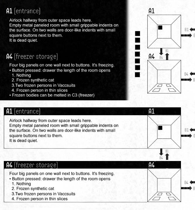
Same applies to the page 2. It's unfortunate that it was not smooth sailing, but I think it's absolutely crusial for discriptions and images to be side by side, cos players will jump around. Once this 'disconnect' is cleared, we are all good. I frankly doubt many will have this problem, hopefully not.

I get the want for more clarification on the intentions. I personally am fine leaving it mysterious, only the environment suggesting things. But there is a Easter egg, in case you did not notice. The 7 square blocks next to the rooms are Ai WaitWait font text, that might give suggestions on motives.

Even if I am critical towards some of the criticism, I appreciate that you have written down so many reviews, it is no small task.

All feedback is of course to be taken or left as people see fit, because it's your project. 

The reason I am very caught up on ordering of information is that I'm a news editor by profession, and news is of course all about ordering of information so people get the most clarity as quickly as possible even if they're only skimming. You're right that most of these issues won't hurt usability in the long run, but I'm big on reducing friction the first time someone looks at something.

Personally, I think it's possible to "have your cake and eat it too" when it comes to this stuff. It's entirely possible for a module to be easy to read sequentially and also to use at game time. For instance, with the interior spread I'm not saying don't put the descriptions next to the room images. I'm saying change the background so it looks like all one spread not three separate panels. The problem is the visual division between the descriptions and the images, which makes the descriptions seem like they're in a weird order until you realize they're next to the corresponding images. If they were visually connected to the images instead of separated from them, then it would be obvious at a glance that they go together.

(+1)

This is very quick-and-dirty and raises some other minor design issues that you'd have to fix (I had to cut a line from the A4 text to make the boxes the same size, for instance). But just to show you what I mean about connecting rather than dividing. It's not just the change of color in your version, you've actually got those little squares that visually tell the viewer "these things don't go together" when in fact they do.

Deleted 167 days ago
(2 edits)

Okay, I apologize. I'm not insisting on anything, I just thought based on your response that I hadn't been clear enough.

I can delete my replies if you'd like, or all the feedback. I did say up front on the Discord that I'd be happy to remove any feedback that people take exception to.

(+1)

Ayo! No need to delete anything, it's all good.