Indie game storeFree gamesFun gamesHorror games
Game developmentAssetsComics
SalesBundles
Jobs
TagsGame Engines
(3 edits)

Hmm! What happens when you left click on an empty cell (or one of the new cells that you've built)? Does a menu come up at all? If so, what's in it?

If you're building new cells, then the radial menus are at least partially working for you.

Edit: In case everything's working as intended, Exits live under the Resources submenu (they're where some resources come from), which the tutorial explains as seen below. The current active tutorial can be shown again by clicking the graduation cap icon in the bottom left.
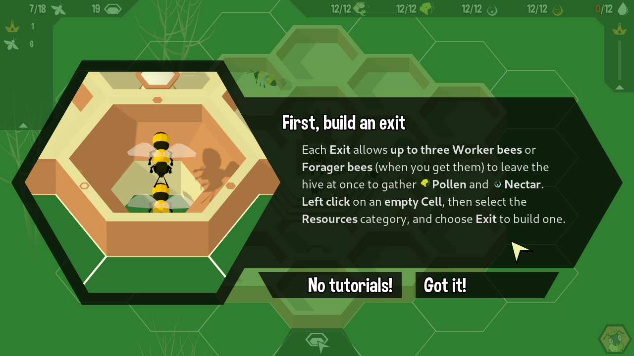

Oh, thanks.  I thought Resources told you how much Resources you have.  Or had something to do with stockpiling Resources.  I kept thinking, since the door is structural, it would be under the same menu category as Nursery and Workshop.  Looking at it now, I realize you had the ++ integrated into the icon.  Maybe consider renaming this to "Resource Production" or something similar?  I know short words look nicer, but this game throws a lot of concepts at the player at once that aren't handled the same way they are in other RTS games.  When you can't use existing tropes or genre conventions, you should be as specific as possible.

Role didn't make much sense to me, either, the first time I saw it.  It has a picture of a bee.  But you don't use it to build  bees?  You use it to build rooms.  Rooms don't have a role.  They have furniture in them.  After playing the game a bit more, I eventually understood that "Role" is short for "Rooms that require a bee to have a specific role in order to use them."  Except that the Nursery also lets you change a bee's role, or at least lets you influence the role distribution of newborn bees.  I'm not sure what else you could call it besides Role.  Maybe Job?  But that doesn't really change things.  If I think of a better solution to this, I'll let you know.

But on the subject of the radial menus, this is probably the most important suggestion I can make:  Don't make the player fight their own muscle memory when learning new systems!   Every single time I opened a menu after researching something, it felt like everything I'd previously learned went right out the window because now the things I have to click on are in a different place.  It's friction.  It's a reason players would churn out before learning the game.  And you'll never personally experience this for yourself because you made the game, you're not learning it from scratch the way a new player would.  You'll just have to take my word for it that this makes learning the game more uncomfortable than it needs to be.

The solution: Radials should display all the hexagons that will ever be there, and the ones the player doesn't have access to are just blank or greyed out or invisible.  That way, as the player builds understanding of games systems, they are also building muscle memory.  If you only listen to one suggestion from my post, please listen to this one.  It's the biggest obstacle to learning the middle of the game right now.

Glad to hear you're up and running and thanks for sharing your thoughts!

To make sure there aren't any false expectations, none of these things are likely to change significantly, though I'll tack "cells" on the end of submenu names to help reduce opportunities for false assumptions in the next patch. Even if players don't follow the tutorial's instructions, there are only two incorrect submenus to look through for any given build option, and I'm comfortable with that as being manageable for our target audience.

FWIW, we had around a hundred people with varying levels of game and management sim (this game's genre) literacy playing Hive Time prior to release, brought onboard in batches across the course of development. UI design choices weren't made in a vacuum and do take into consideration more than just our personal experiences/perspectives. Everybody has different preferences and tolerances, though - it's totally OK to not appreciate our choices here.

Regarding radial menu item consistency, you may find using keyboard shortcuts more comfortable (default modifier for displaying them is Alt, and there's an option in Interface Settings for permanently displaying them).

Hope that helps!

Well now this "Beesitters randomly stop working for no reason" event keeps killing my population numbers for no reason.  If the goal of this game is to subtly educate people about Colony Collapse Disorder, then good job, you knocked it out of the park.  On the other hand if the goal of the game is to actually be a fun strategy game where you build and research a thriving beehive, then I'd like to please be able to turn this event off from the main menu.

(Seriously. Population crashed from 70 to 6.  Absolutely nothing I could do about it.  The game just decided it was time for my colony to fail now.)

Hive Time is a management sim about exploring and discovering sustainable balances/responses that can survive fluctuations/disasters, not a strategy game per se (we've been specifically avoiding strategy labels and tags). While it intentionally bucks some management sim conventions, inviting players to respond to (and later plan for) dramatic shifts in dynamics is not one of them.

I haven't come across a situation before where previously working Beesitters stop working for no reason and there aren't any events called "Beesitters randomly stop working for no reason" that I can recall writing. If you'd like to send me an email (address is under the "Technical help" section here on the store page) with a better details-to-snark ratio, I'd be happy to look into whether something is misbehaving and give you some instructions for manually disabling individual events.

I don't remember what the exact text of the event is, I just described what it does.  The text was something like "Fewer beesitters are being born for some reason."  So I cranked up the number of beesitters to compensate.  Then all the bees died at once. 

The player experience was indistinguishable from "Beesitters randomly stop working for no reason" because all the nurseries suddenly sat empty.  Adjusting the sliders did nothing.  The game just decided it was time for my colony to die.  I feel like I did everything I could and it was ineffective. 

I'm sure this is by design, but I don't understand why you chose to design it that way.  I was trying to beef up my numbers so I could start working on Honey, when suddenly the game decided to kill my colony.

Do you get what I'm saying?  I had a ton of nurseries and a ton of beesitters, and the game suddenly announced the event and killed my colony.

I get the impression the description of the beesitter-killer event was deliberately vague about the cause because it's not designed to have any counter-play.  If this is not your intended design, please explain how a hive with 30 beesitters could avoid this event or account for it after it pops up.  What was the player expected to do differently in this situation? 

I needed more nectar so I built more nurseries because bees provide nectar.  There's literally no other way to get more nectar that I know of, other than by building more nurseries.

This is not an email, which is what I requested, and it is not really focused on details. I'm sorry to hear that you're not enjoying the game, and while I am generally interested in hearing about players' experiences, I'm not able to offer assistance to anybody who refuses to follow instructions.

There is no event that behaves as described. My best guess is that it's referring to a warning notification that is intended to help players identify that there's a potential population issue when the cause has been overlooked.

In case anybody reading gets the wrong idea, significant population declines are not the failure-state this player presents them as. When Beesitter populations are at zero, bee spawn rates return to what they were at the beginning of the game before any Beesitters had spawned. Learning how to recover from these situations and how to prevent them is a part of the game. Some people enjoy this, but it's OK to not. Keep playing if you're having fun. Stop playing if you're not.

I will add to this that even though I read that it said to click "resources" to build an exit, I was still confused by the tutorial because I thought "empty cell" meant a grid cell that didn't have anything in it yet (the green ones with white outline), and clicking on those there was no resources option, just "cell". I think the language used could be reworked to be less ambiguous.

(1 edit)

v1.0-16 v1.0-18 will have a note to further clarify that in the preceding tutorial.