Play game
D4taSnoop's itch.io pageResults
| Criteria | Rank | Score* | Raw Score |
| Did you make it in 6 hours (put 5 by default) | #1 | 5.000 | 5.000 |
| Overall | #5 | 3.650 | 3.650 |
| How much do you enjoy the game overall? | #5 | 3.700 | 3.700 |
| Gameplay | #6 | 3.300 | 3.300 |
| Audio | #7 | 2.900 | 2.900 |
| How well does the game fit the themes? | #8 | 3.800 | 3.800 |
| Visuals | #10 | 3.200 | 3.200 |
Ranked from 10 ratings. Score is adjusted from raw score by the median number of ratings per game in the jam.
How long was your dev time?
5 hours
Leave a comment
Log in with itch.io to leave a comment.


Comments
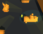
Fun game! It was a little hard to see where the lights were and they clipped through the back of their vision so it was a little cheap. Took a good few tries to beat, but it never got boring so good job!
Many thanks, really glad you enjoyed it! Hehe yep you are right I will admit I noticed that the vision cones were a little far back...but it kind of added a little challenge and I was running a little low on time so I left it in hehe. I would definitely fix that after.
So glad you had some fun with it. Many many thanks.
Cool idea and nice visual effects!
One thing I noticed was that the dash was unused and not really necessary.
Maybe the player could dash in the direction of the mouse or teleport to where the mouse is.
Then the dash would be more helpful
And welcome to the itch.io community :)
Many thanks JafCraze. When I did the first build the speed of the watchers was much higher too. So the dash was really needed to just help dodge them. It was probably not so important when I lowered the speed to make it a bit easier. Definitely something to add to my pile of "tweaks".
Thanks so so much for checking it out, for the feedback and for making me feel welcome :-D
Many thanks to you all :-D
good job, it was very good but after 50% it got kinda boring . none the less GREAT GAME
Many thanks. If I did it again, I would have the WiFi cycle on and off so you have to move quicker and more often. I would probably make the data download quicker as well to balance the added challenge. Thanks for checking it out.
A bit unbalanced in terms of difficulty, I basically stayed in the same house for the whole game. However for a first game it's impressive, congrats ! :D
Yep I get you. At first I had the WiFi points turn off once you had downloaded a certain amount of data from it. It mean t you had to go hunting through the rest of the neighbourhood. But I think at the time I thought it seemed a little too hard. Many thanks for checking it out though.
Can confirm that this is what suburbia is like-- just a bunch of guys hanging out on their rooves, turning off their wifi if anyone else is nearby just so a stranger can't use it.
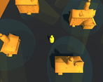
But jokes aside, this is pretty good for a beginner project. I like the moire-style effects that show up in the wi-fi and vision fields, and the bright orange graphics. It's kinda frustrating that you can get caught by the same house twice, even after it's shut off its wifi, but good job
:-D Hehe!!! Yep this is exactly what suburbia is like hehe. Yep I think I would change how the watching works after you get spotted. I definitely would have gone back to my original plan of having the WiFi not stay on all the time too. Many thanks.