Play game
Another Dodging Game's itch.io pageResults
| Criteria | Rank | Score* | Raw Score |
| Theme + Challenges | #13 | 3.952 | 3.952 |
| How Fun | #15 | 3.571 | 3.571 |
| Quality | #19 | 3.762 | 3.762 |
| Overall Performance | #22 | 3.524 | 3.524 |
| Audio | #23 | 3.333 | 3.333 |
| Gameplay | #31 | 3.238 | 3.238 |
Ranked from 21 ratings. Score is adjusted from raw score by the median number of ratings per game in the jam.
Game Dev Experience?
7 months
Leave a comment
Log in with itch.io to leave a comment.



Comments
Fun game, like the music!. Nice job!
It was really fun to play, nice job ^-^
Fit the theme of the jam very well and was fun to play. I really liked the music and the transition slide between scenes.
Cool game, cool idea, but why can't I move relative to the camera? Made the experience so much harder.
Simple concept done well. I would have preferred if the platforms were spawing right above you as sometimes you can be in a specific position without even having to move.
Cool and simple game! Had alot of fun! Great work!
Minimalist style, simple, fun. Good job!
I found the game to be a bit difficult. This is likely NOT an issue with the game but my brain. The rounds that I was able to last a bit were fun. The music was nice but a bit loud so a way to lower or mute it would be a nice addition.
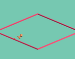
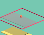
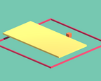
I absolutely love the isometric minimal style of this. This is very funky, simple, and very fun to play.
Ah classic! I dig the idea! well done :)
Nice game! Fits very well with the minimalist theme! I saw some other comments about the controls to be quite strange (wasd in an isometric view) but, for some reason, they feel quite natural to me (maybe my brain is quite messed up XD)! I liked also the work you put into some animations that uplift the game quality. The only small thing that confused me a little bit (sorry for my pedantry) was the direction of overall light (from the left top corner): looking at the shadows on the red outline box my brain continued to visualize it like a Möbius strip...
Thanks man!
I tought the rotated movement could be a cool idea mixing it with the isometric camera, but maybe I should change it on the future! Also, I didn't intend for the outlines to look like that but if it seemed kind of cool, it's staying that way haha!
Really nice game, only thing it’s missing is a game over scene. Well done!
Really well executed game, the rumbling from the explosions was a lovely touch. I really enjoyed the visuals & music for this one!
Thanks for the review!
This is cool! Maybe with a bit of polishing this could be a really fun game to play. My only issues were with the controls, witch feel inverted with the camera positioned this way. Good job nonetheless!
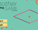
I really like the gameplay loop. It’s simple and effective. I’d describe the visual style the same way, simple and effective. I also appreciate the cool transition effect between the menu and game scene.
One thing I will say is the controls were a bit difficult to grasp.
Good game. :)
Yeah, I probably have to rework the controls to make it easier, and thanks for the comment! Maybe I could use all this tips for future projects
I like the game but the inputs are inverted and is so dificult get use to