
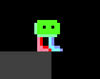
Play game
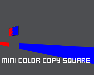
Mini Color Copy Square's itch.io pageResults
| Criteria | Rank | Score* | Raw Score |
| How would you rate the game's gameplay/mechanics? | #54 | 1.746 | 2.667 |
| Overall score | #55 | 1.746 | 2.667 |
| Overall | #58 | 1.746 | 2.667 |
| How would you rate the creativity of this game? | #59 | 1.746 | 2.667 |
Ranked from 3 ratings. Score is adjusted from raw score by the median number of ratings per game in the jam.
Leave a comment
Log in with itch.io to leave a comment.
Comments
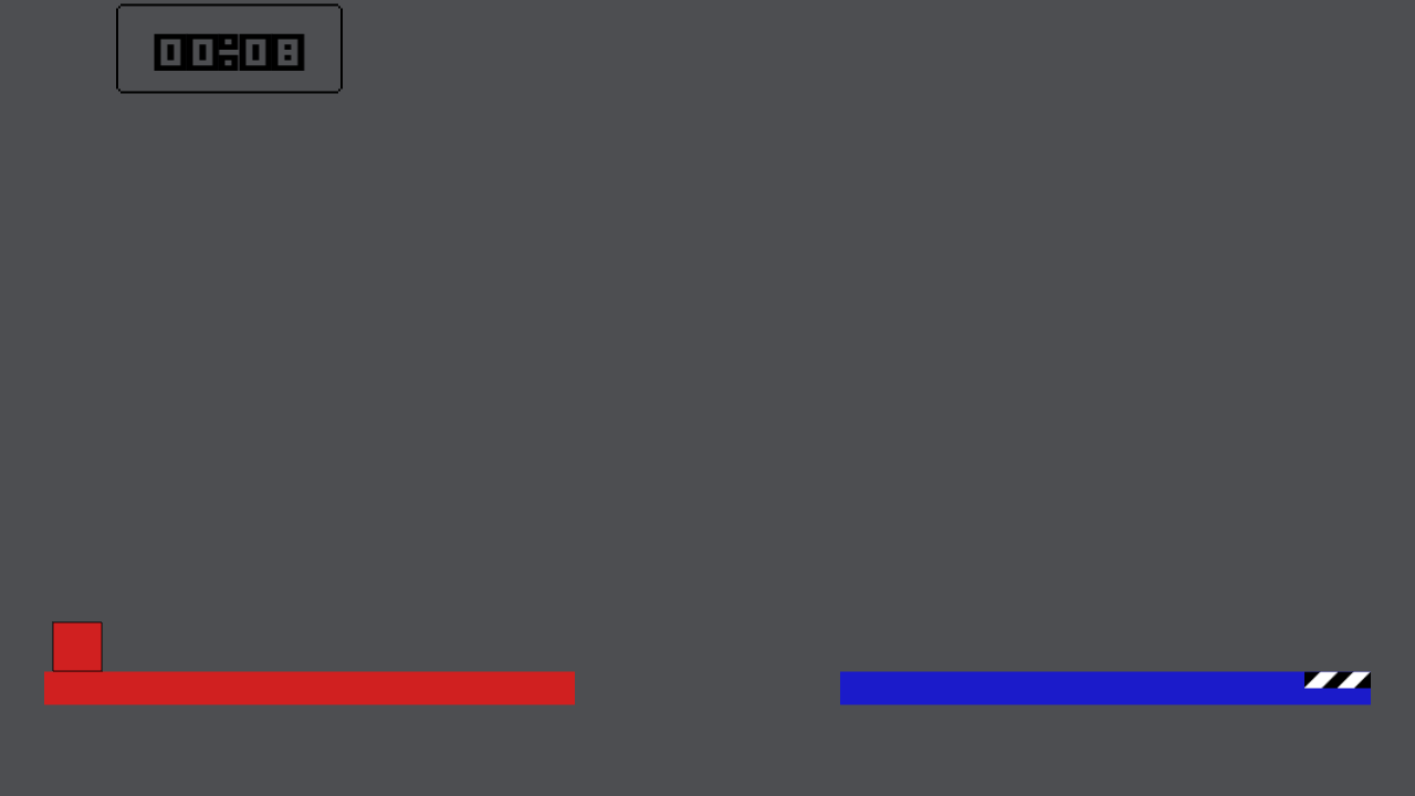
A fun prototype. The platforming feels smooth. I wish that the color inputs corresponded with the first letter of the color name (r = red, b = blue, etc.) because it was difficult to remember what color was mapped to which key.
I think that that would make the game much harder in later levels. ( Even harder than they already are ). I can understand having a harder time to remember which color is which, but I think that that can add to the desired difficulty. If I were to make more than 20 levels, and really expand outside of the jam, I would hope to design each level with the idea of introducing new colors as the levels progressed. I would try to hard wire the player's brain into remembering which color was which key, by getting them to use 2 to 4 colors a lot in the earlier levels.
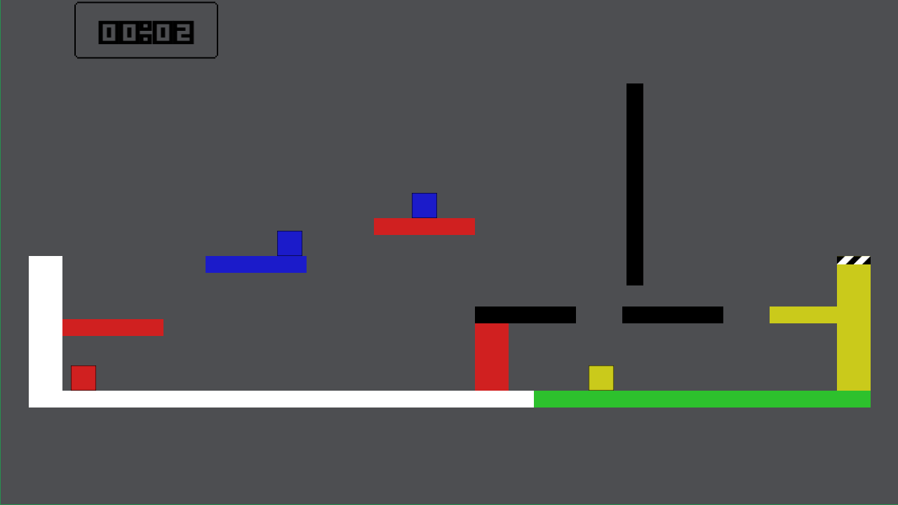
*EDIT* after a little clarification on things I was able to play it a little more. Felt good! Some of the jumps are pretty tough, namely... stage 7 I think I had a rough spot on.
I have to ask, does the symbol there give off the impression that you need to touch it? I may have not thought this out. It is supposed to just be the letter 'K', telling you to press 'K' to change your color. This may have been a bad design choice on my part. I'll have to make some adjustments. Thanks for bringing this to my attention.
It totally does! lol, because it was blue. If it were white it would have made me think else. I did try to press the entire keyboard and somehow missed it. Good feedback, lemme see if I can try it again now.
So further feedback, you die instantly if you press a color changing button while on the wrong color. So when spamming the keyboard I missed it because I died immediately. So while "exploring" I ended up dying and that plus the initial confusing was difficult.
If I may suggest that the stage 3, where color changing is introduced you instead start on a white platform, it may make it easier to notice that K changes your color (without instant death). As I understand platform games with high restart probability SHOULD have quick death animations to keep things moving, so I understand that part
Another thing I've read is rules of three where introducing new mechanics should come in packs of three since we subconsciously agree with that number. (I.E. white platform, blue, white, red, white yellow, in one stage when being introduced helps people "get it... from what I read, and from then on it's easier to the player because they had three shots of practice).
I tried thinking on how I would do the instructions (blue "k") without making it confusing, but I honestly couldn't think of anything. Turning them white would be silly. (thinking about it). If you could make them on a background (like a sign) or something that might make them stand out as instructions and not collectibles that might help. Maybe I'm the only one who misunderstood. Idunno! Just feedback my dude.