Play game
Color Sworn's itch.io pageResults
| Criteria | Rank | Score* | Raw Score |
| Overall | #16 | 3.145 | 3.145 |
| Relevance to the theme picked | #16 | 3.636 | 3.636 |
| Metroidvania | #16 | 3.545 | 3.545 |
| Execution | #17 | 2.818 | 2.818 |
| Sensory | #18 | 3.182 | 3.182 |
| Enjoyment | #22 | 2.545 | 2.545 |
Ranked from 11 ratings. Score is adjusted from raw score by the median number of ratings per game in the jam.
Theme chosen
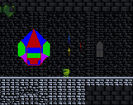
Classic. I took this as a retro feel and classic platformer elements
Team/Developer
Reft
Engine
Unity
Leave a comment
Log in with itch.io to leave a comment.


Comments
This is a very solid first entry. It's got some rough edges, but you've got a lot of fundamentals implemented in here. The next step is to polish them up. In terms of the project, I thought it was super ambitious. I was surprised you had one boss, let alone three. The map was deceptively large and looped back on itself in interesting / unexpected ways (the secret passage after the 2nd boss stood out in this regard). The jump movement was predictable and easy to control for the most part, and there was a good amount of feedback and SFX so that I usually knew what was going on in a combat encounter. The special effects on the third boss were the standout for me.
Some other feedback:
- As has been stated, the movement is pretty slow. Backtracking took a long time, and missing the double jump in the second boss's room was particularly painful. I also think the amount of distance you gain from dashing before the jump is not obvious at all, nor is the speed boost itself.
- I got locked into the shield position while facing away from one of those projectile shooters and took like 2 1/2 hearts worth of damage before fixing my positioning. It wasn't super intuitive how to drop the shield and turn around.
- I'm sure it's been said before, but some explanation text as you get new abilities or in-game control guide would be super useful. I stubbornly smashed on my keyboard until I had all the controls figured out (I didn't see the controls on the web page until after I had finished the game).
Overall though a very impressive start. You've got blocking, double jump, wall jump, these are all not easy to pull off. They're not perfect yet, but now that yuo've done them you can start refining them. Very nicely done, keep it up!
EDIT: Oh, I remembered another thing. Pleeease give a skip option on the opening text crawl if it's going to be that long. I got stuck at some point and had to restart the game and, oof... At the very end I found out holding the attack button sped up the text, but a "Hold X to Skip" or something is always appreciated.
Thank you so much for your feedback and kind words! Ambitious is right, I def learned a lot as to what would even be possible for me to finish within the Jam dates. I had a lot more planned, like upgrading each color to get more powers from them, like starting with just dash and needed to unlock double jump and wall jump. Another plan was to have combined color power after fully leveling each color. this def had to be put to the side to get the simpler concepts down first. The shield presented me with a particularly interesting problem control wise. With my testing i found that holding the down button to use your sheild felt best, but present issues when needing to move and shield at the same time, making it almost impossible for the players to strafe and hold their shield so I decided to go with pressing down kept it out until it was canceled with jumping attacking or standing. This gave the player the ability to scoot along without needing to be so precise with control inputs, the downside is how you mentioned pulling and using your shield became easy to use while out, but more cumbersome to movement.
On screen instruction are definitely to be a focus point for me, I feel bad you didn't find it, but if you held F during the opening cutscene it would scroll the text faster, held long enough it skips the intro (OH WHY DIDN"T I JUST PUT A TEXT BOX ON MY CANVAS SAYING "HOLD F TO SKIP" lol mb)
Tysm and really appreciate all the feedback. I'm curious that the softlock came from force from the down ward movement from the boss attack. I'll look at getting that sorted, think I know what's causing it.
Appreciate the kind words and thanks for playing was a ton of fun to make.
The bosses are cool! I like that you got each to attack in different patterns. The music is cool and varied, and goes well with the graphics style. I also liked that when I got skills, the game also returned me to where I needed to use them, I think this is good level design.
The combat was simple and felt on point, a lot with the classic theme.
Even with the retro style, it was very easy to know where I was in the map, and the map was short enough that the walk felt "cinematic" rather than annoying. I liked this game.
I'm so happy to hear you enjoyed playing! Thank you so much for the kind words and feedback!
Wow, this is awesome for your first game. Congratulations! My first games were not even close to that lol
Although it is true the movement is too slow, specially when backtracking if you are a bit lost, the music helped there a lot. I love the main track (or the initial one, not sure if it is the main but my favourite by far), so it felt fine just going back and exploring slowly while listening the awesome track. Still an issue, but great job with the music. The SFX for the charge attack felt really clever from your side, but I understand that it is easy to miss. Art also goes super well with the theme and the music, congratulations on that.
The level design is rather clever to follow your vision of now showing any information to the player. However, a tiny bit more of information might still fit into your vision and make everyhting easier for players. Maybe show a little diamond when you get the upgrades, health bar for the bosses or better feedback that you are actually progressing through the fight and not doing something wrong. Reading the previous comments, I realised that I actually got a bug and the objects where not turning red if they are destroyable when the player charges the attack; that would have actually helped a lot and being a nice surprise. Sadly I missed it, but figured out it anyhow.
I got stump a couple of times, for example outside the bird boss, but overall really good entry :) Congratulations again!
It brings me so much joy to know you enjoyed the music! Thank you so much. All the feedback is helping tremendously and I agree health bar for bosses would have been a nice touch
I'd love to know more about your color glitch. As my color system is tied into every display element of the game I'm curious if you were turning the other colors appropriately as well. technically all the colors on the screen have been converted unless you are seeing sprites that are blue, red, green, magenta colored, things should be working. Are you just staying the green color after attacking? cause if the attack power state is as least still going true it may be a timing thing where its just not on long enough. I have ways of permanently changing the base color of the player as well and the powers still seemed to work with my testing , if you are able to remake the bug try pausing right after using the power as well, the Mini-map should show the player as the color u turn as well. Have a feelin it might be resetting the color too quickly.
Really appreciate you playing and giving feedback thanks again for giving it a shot!
Honestly, I cannot remember a lot from it as I found out later, that the sprites that are destroyable also change colour. The combat was working fine, I think, as the player sprite was always going back to green after attacking in red. I might try again the game until getting the upgrade to see if I can reproduce it. I will let you know about it!
This is great! Very strong start for a new developer.
I got stumped a couple times, and had to restart after dying and getting stuck outside the bird fight, but I did end up finishing the game.
It could do with a littlle bit of tuning to make it a bit nicer to play - faster move speed, less health on the bosses, less precise jumps in the section at the end, etc - but tuning issues are to be expected in game jams.
all in all, good job!
Thank you so much I'm so glad you enjoyed it! Did the bird Smash you through the wall? I had put some checks to try and prevent this as it did happen A LOT more earlier on, but I suspect it still happens if you're against the wall? Admittedly I hadn't put in any saving features cause I hadn't figured that out just yet. Excited to keep learning and appreciate the kind words!
After updates open back up ill see about updating a loosened up movement update to make things feel a lil better for everyone, my target I think with the classic theme was to have a character that felt similar to the original Castlevania movement, realizing now with all the feedback that probably went a bit far and it just makes it hard and frustrating... like the original Castlevania lol.
Congratulations on your first game, really good job! This is definitely a strong starting point, and I hope you just continue to join jams and improve your craft. This was a delightful short game, I had a good time with it, and I found it very impressive that you even included full and fair bosses in your first project. I do wish the bosses had less HP and the player moved faster though. The pacing for a lot of the game feels too slow with the movement and bosses having too much hp despite their movesets not changing too drastically. But that's just balancing, and getting a feel for that is all about making more games and getting all types of feedback to your games
Very good entry!
Thank you so much! Really excited to improve and learn. I may release a speed patch here after the voting period to see how it feels loosened up a bit, the decision as u mentioned just came from lack of balancing between the world size boss movements etc. Would have loved a lil more time to put it other more elements and ideas I had for progression and lore. Excited to get at this again!
If anyone figures out the cheat code post a screenshot!
For your first ever game you should be unbelievably proud! My first games were nothing like this!
The changing music between areas is nice, the colour theme as a way to play with the 'classic' pallete while keeping it limited was a really great and creative choice! The movement felt a bit slow and frustrating (Especially while backtracking).
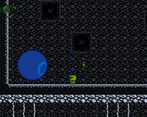
The use of 'down' platforms to have the player discover what the blue power did without instructions was excellent level design (Though the blue power doesn't totally protect me and I got hit quite a few times while using it)
The room transitions could be jarring if you didn't quite make a jump, you'd quickly go into one room and fall back into the first.
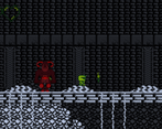
The enemies (and myself) aren't super obvious when they take damage. The red boss in particular I was hitting for a loooong time before I realised it had a crit spot.
I got the red green and blue powers but couldn't find where to go from there (I found a shortcut left of the red power, so I assumed that red crate was supposed to be destructible?)
I managed to somehow knockback this enemy through a wall?
Oh no! Skullie! So I left that on purpose to give ppl a laugh. Skullie is my first enemy ever and has some of the silliest tracking code. It's so goofy and interacts with the player so funny it makes me smile when he goes off to save his people I decided to keep em in for the lols.
Gameplay wise, the idea here was to force the player into areas that made them use their power to discover where to go next. I think with more time this could have been a but more polished from area to area. After getting the red power there should be a small indication that u can charge your attack. If u hold the button a sound starts playing. Which is supposed to help indicate the length u need to wait to destroy objects,l. Those objects also glow the same color as the charatcer when the power is activated. Revealing them to the player if they arent already known. Being slow was def a choice, but one im seeing is more furstrating than immersive.
Thank you for the kind words, just having turned in a project on time was a W for me this round. All the feedback and support has been really wonderful, can hardly wait to get started on the next one.
It seems is a very slow game, i though it was a bug. But after some time playing the feeling becomes better and it's less annoying.
I hear ya, I wanted the character to feel a bit slow until you unlock the dash to open it up a bit more, but i def went too far, but I have just updated the game and added a few QOL things. Hope you give it another shot! Thank you so much for your feedback!
Congrats on submitting your first jam game. You should feel proud of yourself.
I really like the idea behind this game, but I do have some questions regarding gameplay. How much more is there after the locked door on the right, after the spaced jumps? I explored everywhere that I could except I couldn't get past that door. I assume I can after fighting the first boss, but there are other issues that prevent me from getting back to that door such as the wall enemies rapidly firing projectiles. Also, the player moves reaaally slow. Was there a point behind that? Like later on in the game, does the player get speed powerups? The game mentions a dash, but it either doesn't work, or its a powerup I never reached.
EDIT:
Just to double check myself, I played the game again with the same issues, but I noticed that you get the ability to block projectiles if you press down, which helps navigate the rapid fire wall enemies, but the route with the spikes still prevented me from progressing. Also, as a general rule, if you acquire a powerup, you want to make sure your player knows they did. I knew I beat a boss and I knew I picked something up, but my hearts refilled and I just made the assumption that it was just a full health replenish.
Viewport sizing was a little weird to me as well. Fullscreen felt too zoomed in, but outside of fullscreen mode, your UI moves to an odd position.
Music and art meshed well together, which can be hard to get right sometimes, so good job there.
I know this sounds like a lot of nit picky stuff, but I like to bring up these kinds of issues, questions, and help you generate insight into your own progress as a developer. People did this for me during my first mvm and I improved vastly. I even come back to previous feedback to see if I'm repeating something that people didn't like in general.
Overall, its not a bad first jam game. If you can provide a little more information, I'll try to come back and progress further than last time. Other than that, congrats on submitting.! You have a lot of room to grow and you should be excited by that. Keep entering this jam, there's quite a few of us who participate regularly and its great to see how we all grow!
Thank you for the feedback sorry if there was a lack of clarity with direction of the game and a few things that isn't illustrated to the player to get certain concept across. I was trying to emulate the older style games that sort of make you discover what to do thru trial and error. More testers and feedback def make this easier so I do appreciate the detailed feedback. I reserved giving too much info as I didn't want to give away spoil it in that sense, but yes there is a dash.
There are a total of 3 powers each gives you a unique power. blue gives you a shield when you hold down. (I think to solve the lack of instruction here I may force the player to use a 1 way platform after receiving the power to force it be used essentially making it more obvious its a thing. This power allows you to gain access to the red Key that gives you access to the red boss. which after defeating gives you a charge attack. I needed to make a more obvious way to indicate the play can now charge after getting this ability, currently using a base attack after receiving it will color you and any objects that are destroyable by the power showing you where to go a bit.
The last Power will give you a dash, a double jump and wall jumping opening up the movement of the game. It was intentionally made slow to give it more. I was going more for a explore and figure out and think I stumbled on slow and frustrating, with lack of testers I just went with my gut on the feel for it. As far as view port stuff, I went a few rounds trying to get things to place correctly at full or not full screen (still nooby coder stuff I'm figuring out)
Means so much that you enjoyed the music and art. I've been doin music for a long time now and switching my focus to programming, so that means a lot!
No problem! Hope my feedback helps!
Updated the game to address some of the problems you addressed. Let me know if you give it another shot! Thank again for all your feedback!
I played it, and enjoyed for a bit. The movement and control feel was a little slow and unforgiving. May come back to this later and try to get further through it! Great Job! Will come back to this
Is this the game? Like previous comment. I agree with all things he said. The movement is slow and the jump is unforgiving with the platforms, I can't progress and the D key was explained as a Dash ability but this maybe I didn't discover this ability yet. Overall I have to rate it lower than other games I have played so far. Great job for a first attempt and keep working at it!
Yes the game has 3 powers to unlock. to get through the red gate you must find the red key. Slow movement was intentional, but lack of testers is proving I may have made to a bit too hard on that aspect. The game is completable in its state, it may just be a bit difficult. i'll try go balance this a bit and add some QOL features to make things a lil more obvious to players thank you for your feedback!
I have updated the game and hopefully have addressed some of the issues you've mentioned. let me know if you give it another shot. Thanks again for your feedback