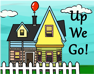
Play game
Up We Go!'s itch.io pageResults
| Criteria | Rank | Score* | Raw Score |
| Fun | #14 | 3.568 | 3.568 |
| Overall | #15 | 3.784 | 3.784 |
| Design | #26 | 3.405 | 3.405 |
| Topic | #26 | 3.838 | 3.838 |
| Originality | #33 | 3.676 | 3.676 |
| Audio | #35 | 3.135 | 3.135 |
| Graphics | #37 | 3.459 | 3.459 |
Ranked from 37 ratings. Score is adjusted from raw score by the median number of ratings per game in the jam.
Leave a comment
Log in with itch.io to leave a comment.


Comments
Really fun game to play, everything is grate and lovely.
Thanks :D
Cool simple game with tight controls. Nice work, watch the spelling.
Thank you, Im sorry if i misspelled something, English is not my native language but you can write what word I misspelled and I'll fix it :)
No probs, balloons instead of baloons. Have a go at my game if you like, quick warning, it is based around language, but the graphics are also fun.
Smooth control, satysfying collecting system, great sound effects and music. Love this game :)
Thank you so much! I'm happy you liked it :D
Literally the smoothest controls in the whole jam, I really hope you expand on this with better graphics it just felt really good to play and up is one of my favorites so yeah little biased here but great work.
Yea up is my fave too :)
Thank you so much for you comment it really means a lot,
I will try to improve the graffics and the backgrounds after the jam.
I'm really glad you liked it!
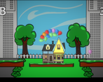
The game is a really cool idea and well executed! My one improvement would be that the house looks very different to all the other art sprites!
Thank you for your comment!
I'll try to make the forground more distinct from the background next time :)