Play game
Era's Time Delivery Service (prototype)'s itch.io pageResults
| Criteria | Rank | Score* | Raw Score |
| Audio | #7 | 3.341 | 3.571 |
| Originality/Creativity | #17 | 2.806 | 3.000 |
| Magical Girl Concept | #17 | 3.074 | 3.286 |
| Polish | #18 | 2.405 | 2.571 |
| Overall | #19 | 2.673 | 2.857 |
| Engagement/Fun | #21 | 2.405 | 2.571 |
| Aesthetics | #22 | 2.539 | 2.714 |
| Theme Interpretation | #24 | 2.138 | 2.286 |
Ranked from 7 ratings. Score is adjusted from raw score by the median number of ratings per game in the jam.
How does your game fit the Magical Girl Genre?
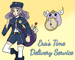
Our heroine can control time
Which theme(s) do you pick?
Service
How does your game fit those theme(s)?
Era offers her service to help people who need help on time-critical missions
Were the assets for your game made during the jam? Elaborate as you see fit.
Most assets made for the jam
Fonts Dancing Script and Manrope downloaded from Google Font
I intend to use Aekashics Librarium to complete some monster sprites we didn't have time to make.
Leave a comment
Log in with itch.io to leave a comment.


Comments
Played the jam version 0.1.1.
Good core, but obviously not quite a finished game at that point. I really liked the music being light and it is good in a loop.
Overall keep at it.
Thank you!
0.1.1 is really just a sandbox, but if you have time to play the 0.2.1, I’ll be happy to listen to your feedback, esp. on game balance (for the first 6 battles).
it's a working battle system. first step for a great RPG. the music is cute and matches the magical feeling
Thanks! Will try to upload a new version soon, then I’ll finally try some of the other teams’ games!
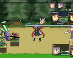
There are some neat ideas in here, but it's in a really rough state at this point that feels like a tech or mechanics demo. The music is pretty catchy and the sounds aren't bad, but the art is a clashing mix of good, polished drawings, rough concepts, and art that seems to come from a different game entirely. The UI is pretty sharp, but has a few issues like the info boxes for enemies being ambiguously positioned.
Given that it feels like a mechanics demo, I'll focus on the mechanics. It's not clear what the different abilities do: what's the difference between Damage 2M and Damage 2P? I think the biggest issue, though, is that the core mechanic that's supposed to be demonstrated never really comes into play here. The first battle only has Era, and in the second two, Rosemary is so overpowered that the battle is over in a few turns anyway. I never felt the need to swap order or rewind character state, and to be honest I'm still not sure how they're actually going to be useful. From that point of view, this demo is kind of a wash because it doesn't really demonstrate that innovative core mechanic.
I don't like being a downer, and I don't want this to come across as harsh. I had fun with this game, I really liked some of the art, and I think the ideas in it have potential.
Yes, this is still the tech demo as of v0.2.0 unfortunately. I’ve been working on properly setting skills and stats to balance each fight, I’ll try to upload this new version today.
As you noticed, there were several artists involved + free assets to complete enemies, in order to reduce the workload of each. Don’t expect too much improvement on this side though, as the artists are not in capacity to draw further sprites after the jam. For the same reason, it’s unlikely we get animated sprites in the future. I can however fix the most obvious issues myself, coloring the black & white so it doesn’t look too drafty. I also thought about some tricks to make the art more consistent by playing on colors and outlines, but there’s not much I can do about shapes and style itself.
I also noticed the enemy info box being too close to each other, I’ll see what I can do.
You have a composer, I'm already excited haha.
Oh no! It keeps crashing in the first scene if I wait to long reading through the different attacks o.O
Ooof, I just noticed the arrow pointing at the creatures to attack. In the future you may want to look into highlighting the monster or flashing them. I was clicking randomly hoping to attack haha.
But the music is lovely, the sfx are fun and the art is cute. Great job as a team to make this one happen!
Thank you!
Which version and platform was it? Did you just keep looking at the command box or did you try to move the cursor between Attack, Defend, etc. ?
The targeted fighter is highlighted. However the highlight intensity is not very high, and not fluctuating over time (i.e. there is no blinking). Maybe this is what you’re asking for?
(This is written based on the jam version,
I also tried the voting phase version but it seems like it won't open)Edit: It worked once I tried again the next day.I think this is a really cool idea for an RPG battle system, and I think it has a lot of potential. Even just in the original version I can see some of your ideas coming through, like buffing one person's stats and then giving them more turns, or reversing time on someone to remove their status effects. It would have been nice to explore a lot of that more, but it's understandable considering the time restraints.
Wish I could have seen more of this since it seems like a cool concept. It's important to have some pros and cons to some of the abilities to make it so that one strategy doesn't dominate the entire game as well. From what I played, buffing the test unit and giving it a bunch of turns was a pretty easy to defeat the encounters.
I also liked the designs of Era and the units in the screenshots so far, so I'm looking forward to the other types of characters we'll get to see in this.
Thanks! I’ve been working on new skills and will now focus on balancing and progression through enemy squads!
On which platform/OS did you try to open the voting phase version? I’ll try to fix this with next build.
Hey, just tried again to make sure, and it worked this time. Apologies for the false report! It was windows though, for what it's worth.