


Indie game storeFree gamesFun gamesHorror games
Game developmentAssetsComics
SalesBundles
Jobs
TagsGame Engines

komehara

652
Posts
59
Topics
490
Followers
590
Following
A member registered Mar 13, 2016 · View creator page →

Creator of

Recent community posts

(2 edits)

Hey, define wordcounter_uncounted = ["ic"] was very useful for me after installing Caption Tool for Ren’Py (https://npckc.itch.io/caption-tool-for-renpy) to exclude its word count automatically (or any other alt style accessibillity narrator really)

I got another request for you, which may be trickier to implement: excluding words surrounded by certain text tags, in particular {alt}{/alt} which I added, following O2A2 rules, for better self-voicing, but without counting actual extra words!

Example:

mc "...{alt}stays silent{/alt}"

It would also help me in the redundant text that I mentioned in my other comment on choices: instead of playing with string variables to get the true unique word count I need, I would simply write every line separately. Then, I would surround the sequence of words I manually recognized as redundant with {no_word_count} (or just {no_count} if “no_word_count” is too long, best is to let user customize the tag string). You’d need to define a custom tag so Renpy doesn’t complain about tag not existing though:

init python:

    def no_word_count_tag(tag, argument, contents):
        return contents

    config.custom_text_tags["no_word_count"] = no_word_count_tag

Example:

menu:
    "Yes":
        "{no_word_count}Yes{/no_word_count}"
    "No":
        "{no_word_count}No{/no_word_count}"

It’s not only useful for choices with redundant text between the displayed choice and the following sentence, but also general lines in different branches that share many common words. I normally use string interpolation to change just a few words, but it has two drawbacks:

  • harder to localize
  • Renpy skip will consider a line as “seen” even if user has not seen this particular variant (injected string variable having a different value than before)

Example:

if flag:
    "OK, I understand"
else:
    "{no_word_count}OK, I understand{/no_word_count}, but let's go anyway"

I realize this is probably only useful in O2A2 because writers won’t be super picky about word count in any other context… So if it’s too complicated, you may just ignore this.

I also have my own script to clean up text and copy it to Google Doc to count only relevant words, so I could also write my own REGEX for that…

EDIT: I got away by using extend:

    mc "I want to be {nw}"
    if goal_free:
        extend "free."
    else:
        extend "loved."

but I realized that {nw} (and {w}, and in fact any tags separated from words by a space like {i} word {/i} are counted as extra words!

Looks like I’ll have to use my custom regex preprocessor…

The trick is to attach the tag to a word (no space between), and add a space later.
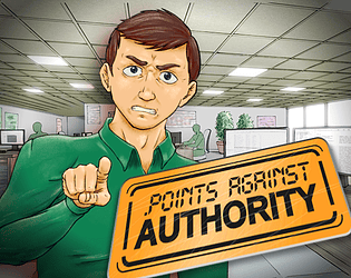
Merci ! Et voilà un autre jeu avec un boss ! Pas une comédie du coup mais bon : https://komehara.itch.io/points-against-authority

Je travaille encore sur l’intégration de la chanson et des améliorations de scripts, ça arrive bientôt !

(1 edit)

I saw this from the O2A2 page, not sure if I’m gonna use it or not as we have very anecdotical body movements that match the character’s mood, but at the same time they could bring a little more flavor and understand of the scene (“the boss points his finger at you”). Maybe I’ll run some A/B testing with a blind friend see which version they prefer.

Just a small “typo” / consistency issue on the text:

You should have seen a message saying “Caption Tool turns around”

instead of “Caption Bear”

EDIT: other things to pay attention to:

  • if you already use a splashscreen in your game, there will be a label name conflict on “splashscreen”. You can either merge both, or rename the plugin’s one “captiontool_splashscreen” then in your own label splashscreen:, call captiontool_splashscreen.
  • I was surprised to see scene black working out without defining a black resource. Turns out any name of invalid resource will default to a black background, so this just works, but apparently in a coincidental way (scene white will still show a black BG). If you don’t like this, or want to customize the color, just define image black = Solid("#000000") or another color

Wow, I didn’t realize. In fact, you’re probably the only user who keeps track of creators’ profile creation date.

Looks like we posted our first jam game in Jan 2017 (although it was made 1 year after Global Game Jam 2016). But I certainly created my itch account before that in 2026 to start building my collection. Interestingly, the first game I bought was https://polclarissou.itch.io/orchids-to-dusk in June 2016! Brings back memories… I was really on itch specifically to play those niche indie experiences.

I finally found the path to itch app’s butler:

In itch app, go to Preferences > Advanced > Components > butler > unfold to see full path to binary

Ex: C:\Users\USERNAME\AppData\Roaming\itch\broth\butler\versions\15.29.0/butler

(yeah, odd final slash on Windows - note that on Windows, file is actually butler.exe)

I just noticed the supported image formats are not indicated on this page. Basically PNG, GIF, JPG.

It’s a pity that itch doesn’t support webp yet… For big banners we have to choose between a big PNG file or a lower quality JPG whereas web (or avif) would allow a lightweight file with good quality.

Hey, looking at the General board rule, I see

SELF PROMOTION:

If you’re advertising a game, then don’t post here. Use the Release Announcements board to self promote your itch.io projects. Follow the rules there when posting.

So individual devs should post here instead: https://itch.io/board/10022/release-announcements

Although the thread title “LOOKING TO PROMOTE YOUR GAMES” suggests that the OP’s intention is slightly different, it is to get in touch with devs to promote them on their own channel. But the first post says a different thing so the intention is unclear. Please make it clear whether you want to promote your own game (then do it in Release Announcements) or are looking for partners.

(I saw your post on itch.io Discord, but you seem to have left it so reposting quickly here)

Maybe you’ve already left, but I’d suggest you to open a community thread forum and/or an issue on the itch.io GitHub (https://github.com/itchio/itch.io). This way, other people with the same issue can upvote, comment, etc. and the problem can gain more traction.

Even though ultimately itch support is not that great for this kind of issue, I want to keep an eye on these.

I agree, and also in the demo, the question “Did you change the values at the top of options.rpy?” could add “or generated this project from template)”

OK so I got the full explanation on a private channel, putting it here for other players:

My rule 2 was wrong. Not all profiles at the bottom are liked.

You have to drag-and-drop each profile avatar onto the current user’s avatar to trigger a like/dislike reaction which will display a heart or broken heart. Using this info, you can deduce the liked/disliked properties.

I got stuck on level 2, I think I haven’t understood the rules correctly. What I understood:

1 - the current user to evaluate, with the big avatar, has their own likes and dislikes of properties. It is binary, a property is either liked or disliked. 2 - the bottom-left area shows other profiles that the current user has liked 3 - those liked profiles must all verify the following: have at least 1 property that user likes, and 0 properties that user dislikes 4 - the player’s objective, for each user, is to select for each property if it liked or disliked, then Validate

The problem is that if properties are indeed liked or disliked in a binary way (1), then the wording of rule 3 is odd, as it would be equivalent to liking all the properties of a profile anyway. It would make sense if it was ternary (some properties are not liked nor disliked). In this case I would need to leave both checkboxes blank for some properties, but I’m not sure that’s the base (in level 1, I had to fill everything).

I following the binary logic anyway: I went through every liked profile and looked at all the features (Physical features from the thumbnails, Activity, Various from the description shown via hovering the thumbnails) and deduced that all the features found across those profiles were not disliked, and therefore liked.

In the end I marked all the features displayed on the right as liked and Validated, but it wasn’t the solution.

Am I missing something? Is it a ternary system? I tried that too but it was much harder to reason on (mostly soft deductions)

(1 edit)

Oh! That was meant to be my Master research project! It was based on Cyclic Dungeon Generation by Joris Dormans, to generate a Zelda-like dungeon with “keys” and “locks” where keys had to be obtained before being blocked by all locks - but a Metroidvania world works the same map.

I was however working with polygonal rooms and had some issues placing the rooms while avoiding collisions, so I ended up making a thesis on irregular polygon packing.

But I see how the last steps switch to a tile-based map, that makes things much easier!

I would generally ask for source code but it seems that this was done in ClickTeam Fusion so I’m not sure how portable that would be (I’m not familiar with this engine)

P.S.: next time instead of Metroidvania x Magical Girl Game Jam, we should have a crossover Metroidvania x PROCJAM

Ah, that was to be expected for an early submission. I’ll come back in one week when the jam is over…

Oh, very funny intro!

I.. didn’t understand the rules, though. The Duel rules button only gives explanations for the Duel that happens after a tie. For the general card battle, I assumed lower value won. But on my next run, higher value won. Except for grandchild vs grandfather, vs grandfather won. Is it some sort of rock-paper-scissor?

I would almost always win (or tie) in the upper game, but I would always lose during the duel, even if the sum of my card values is higher. I’m not sure about the difference with Play and Support role if all the values sum up at the end.

I wish I could see the ending but without understanding the rules, I can’t find a good strategy… (although I understand it’s mostly random so a strategy may simply be impossible to pull, but then I’d like to understand why I’m losing)

(2 edits)

999 SFX! I spotted you! (you should put any copyrighted assets you used in the Credits btw, even if you intend to replace them with original ones in the final release - so we know what is original and what is borrowed, and can also expect them to change by the time of release - also I like the level BGM so I’m curious where it comes from)

Gameplay and game feel

The game feel is pretty good, I see “modern” style movement as we’d find in games like Freedom Planet with high acceleration, easy wall slide/jump and simplified fly input (hold with gauge).

At the beginning when I saw the team selection I thought there’d be Sonic Advance 3 / Sonic Heroes style team moves, but not yet apparently, it’s mostly to swap characters. It makes showing all the characters on the level less important (we could just show one character and swap it when needed) except for Amy who’s… carrying… Miku.

The animated pixel art is nice although not too visible in-game due to camera being quite zoomed out (to enhance exploration). Considering your background in digital illustration explained on the video, it makes sense that you’re more comfortable with bigger character sprites displaying more their facial expressions.

The video was a bit long by the way, it’s nice to have a making-of but for the main video on itch I would expect from trailer / gameplay excerpt. With all the explanations and various memes in the middle I had to advance farther in the video to see what the game would look like, and it was apparently just the beginning of dev. In the end, playing the game was still the best way to do it.

Good job on integrating mobile virtual input! Although they do look a bit high on the screen, I haven’t tested them yet.

I also need to do it on my own Godot fan game (Super Sonic Heroes). I was interested in how you’d place buttons to swap characters since I also use Heroes team swap mechanic, but I don’t see such a button on the mobile interface. Are other characters supposed to be located near the top-left avatar, but it’s just not implemented yet?

999 SFX! I spotted you! (you should put any copyrighted assets you used in the Credits btw, even if you intend to replace them with original ones in the final release - so we know what is original and what is borrowed, and can also expect them to change by the time of release - also I like the level BGM so I’m curious where it comes from)

The game feel is pretty good, I see “modern” style movement as we’d find in games like Freedom Planet with high acceleration, easy wall slide/jump and simplified fly input (hold with gauge).

It’s fun to be able to bounce on the flying enemy twice as it has enough HP to survive a bit. I can imagine places where you exploit this to reach higher places (but the point of that trick would be defeated if Tails is in the team).

At the beginning when I saw the team selection I thought there’d be Sonic Advance 3 / Sonic Heroes style team moves, but not yet apparently, it’s mostly to swap characters. It makes showing all the characters on the level less important (we could just show one character and swap it when needed) except for Amy who’s… carrying… Miku.

Generally speaking, I feel like things are a bit wild in-game, you can do many things but also get past many things (esp. by flying with Tails, although the fly gauge has been tuned so he doesn’t go that far) and I’m not sure where it’s heading, but I suppose that’s to expect for a prototype: featuring many mechanics and level gimmicks and sorting out what works well. I’ll be waiting for the proper opening intro and 1st level to get a “cleaner”, more focused experience where I can indeed exploit all my moves to progress in an efficient way and find a good balance between rushing and exploring (like wall jump to reach high places, find collectibles or lore secrets… The opening was very short so I can’t tell how much the story will be important in this game).

Art

The animated pixel art is nice although not too visible in-game due to camera being quite zoomed out (to enhance exploration). Considering your background in digital illustration explained on the video, it makes sense that you’re more comfortable with bigger character sprites displaying more their facial expressions.

Promotion

The video was a bit long by the way, it’s nice to have a making-of but for the main video on itch I would expect from trailer / gameplay excerpt. With all the explanations and various memes in the middle I had to advance farther in the video to see what the game would look like, and it was apparently just the beginning of dev. In the end, playing the game was still the best way to do it.

Mobile support

Good job on integrating mobile virtual input! Although they do look a bit high on the screen, I haven’t tested them yet.

I also need to do it on my own Godot fan game (Super Sonic Heroes). I was interested in how you’d place buttons to swap characters since I also use Heroes team swap mechanic, but I don’t see such a button on the mobile interface. Are other characters supposed to be located near the top-left avatar, but it’s just not implemented yet?

P.S.: hm, it looks more on the dark/horror side looking at the intro but also the “monster” animated sprite lower in the list of screenshots on the sidebar. I remember I never played Sonic Unleashed because I didn’t like the werehog transformation, so let’s hope that doesn’t get in my way of playing it. Although I have no problem with having a darker mood in general (I like dark, but like stylish, I suppose - more like Shadow Generations’ dark powers?)

(2 edits)

Same issue, looks like the next dialogue doesn’t trigger (or there is some unintuitive object to click on that doesn’t look related to school). I had to trigger 2 mistakes on purpose to advance the dialogue.

EDIT: looks like the gumi was considered the part of school!

Thanks, I didn’t know about data export, I was actually wondering if there was a way to backup all my game metadata too so it could be useful for other things as well. I sent a query to download it, so later I’ll check if the format makes it easy to search though.

(1 edit)

Associated GitHub issue: https://github.com/itchio/itch.io/issues/1902

A regression introduced in April 2026, unless it’s simply the first time I take part in a jam with such a long name ;)

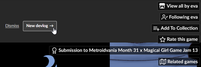
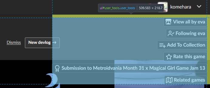
The user_tools <ul> block has the following bounding box (seen when debugging HTML):

I noticed when I tried to click on the “You recently updated this page” banner’s New devlog button that it didn’t register mouse hover on its right part, which corresponds to this blue area.

I would expect to be able to click through the user tools area (outside of its actual buttons, obviously), like this:

This is the local fix with custom CSS I made in TamperMonkey to make it work and take the screenshot above:

// ==UserScript==
// @name         itch: click through user tools banner area
// @namespace    http://tampermonkey.net/
// @version      2026-04-28
// @description  This fixes regression introduced in April 2026 and allows user to click through user tools banner area (e.g. to Dismiss, New devlog)
// @author       You
// @match        https://*.itch.io/*
// @icon         https://www.google.com/s2/favicons?sz=64&domain=itch.io
// @grant        GM_addStyle
// ==/UserScript==

(function() {
    'use strict';

    const css = `.user_tools {
  pointer-events: none;
}

.user_tools .action_btn {
  pointer-events: auto;
}
`;

    GM_addStyle(css);
})();

So this should be a good start for an official fix:

  • set .user_tools pointer-events: none;
  • restore clicking on its buttons by setting .user_tools .action_btn to pointer-events: auto;
(1 edit)

Related thread: https://itch.io/t/3263718/hide-able-user-tools-in-web-pages

(contains custom CSS to place the user tools at static position)

(2 edits)

Related thread: https://itch.io/t/1212824/user-actions-overlap-with-embedded-game-on-desktop

(contains custom CSS to completely hide user tools - or you could enter debug mode and delete it entirely but you’ll have to repeat this for every web game)

By the way, I tried the CSS for position static, it works, although it does create a ugly white space above the game banner & web view. I suppose this can be fixed by adding some background color similar to the game page’s background (unfortunately that means we need a dynamic script that parses what is already in the page, so more complicated… at least by scrolling down enough we can just put the whole area out of view)

(1 edit)

Note: I originally posted this on Questions & Support before realizing it was the wrong sub-forum for bug reports. I deleted the old topic to avoid confusion

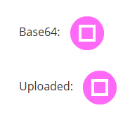
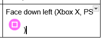
I have a table with controls in my game description and I find it more convenient to show gamepad input button icons that unicode characters, esp. for PS controller buttons. For instance with the square, I wrote this in a separate Google Doc:

image.png

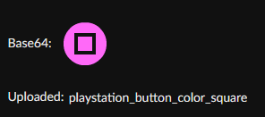
Or alternatively with a Markdown editor (Typora), I can also add an image both in base64 and local file embedded link format:

image.png

When copy-pasting the Google Doc content in itch page description, it seems to work:

image.png

When copy-pasting the Markdown editor (Typora) content in itch page description, the base 64 png seems to work while the local upload copy just displays file name:

image.png

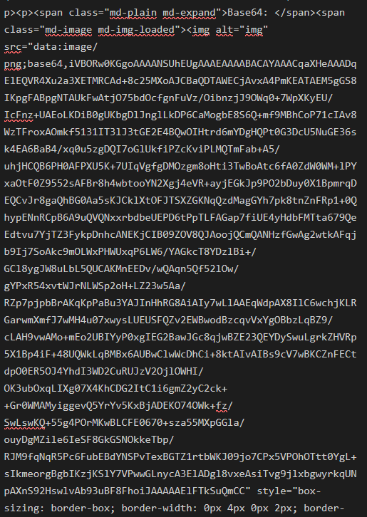
Checking the HTML view of the description editor, I do see base64 png indeed:

image.png

However when viewing page it just shows an empty square (in Firefox):

image.png

Showing the HTML reveals that base64 png is completely missing:

<img style="margin-left:0px; margin-top:0px" height="32" width="32" loading="lazy">

I suspect that this is for safety measures as some thread (https://itch.io/t/5783886/report-account-who-uploaded-a-virus) noted how base64 can be used for exploits.

However, in this case the editor preview should show in advance that the result will not match the preview and/or there should be a warning about pasting base64 png in the description editor.

Workaround

For now the best is to upload every image asset one by one. From here, itch will generate a perma asset URL which can be retroactively copied to my Markdown / Google Doc and the nice thing is that editors like Typora will keep showing the asset directly loaded from itch URL, and allow copy-paste back into description with the same URL with no extra upload effort.

That said it still needs to upload assets one by one. If I was able to paste images along with text a bit like pasting a screenshot in this very forum post editor automatically uploads and inserts an image, it would be great.

P.S.: it was pretty hard managing all these pasted pictures in my post because there is no Preview mode in forum post editor. Would be nice to have Preview mode as in GitHub issues.

P.S. 2: as a comparison I tried to paste Markdown from Typora in this very post and the base64 png was also stripped

(1 edit)

I originally posted on View full community posts history (older comments) https://itch.io/t/6218205/view-full-community-posts-history-older-comments but it was the wrong thread (the principle is the same, showing older entries, but for notifications, not community posts on profile)

I also opened a GitHub issue: https://github.com/itchio/itch.io/issues/1901

Issue

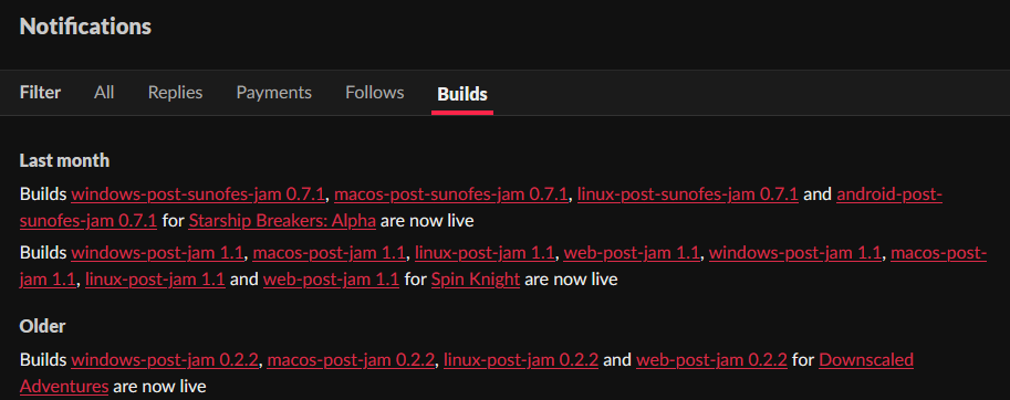
When logged in, in one’s Notifications page (https://itch.io/notifications), in the tabs All and Replies, the read entries are only displayed up to 2 months (~60 days) ago (the last section is labelled “Last month” but apparently it goes a bit further in the past).

On the Follows tab, there is an “Older” section which shows Follows up to 120 days ago (although still not all of them).

On the Builds tab, there is also an “Older” section which shows Builds up to 1 year ago (although still not all of them).

For Payments, I can’t tell because I haven’t received any payment yet.

Remark: the issue only applies to read entries. Unread entries will be all displayed the first time you open the Notifications page. However, it’s easy to accidentally refresh the page, or close your browser and come back later, in which case entries will be considered all read, so old ones will be hidden after refresh.

Feature request

Add a pagination system to all the Notifications tabs to allow showing as many notifications in the past as needed.

Alternatives / Extra options:

  • a filter to show notifications within a certain time range (compatible with pagination) (for instance, I know I have to catch up 4 months of notifications, so I could just set that to show all the ones I missed, but not so many that)
  • let the user set their preferred number of max Notification entries displayed in current tab

Current workaround

Since Replies are the ones with the stricter time limitation, user can enable email notifications for them to make sure you always have a permanent record of the event: https://itch.io/user/settings/email-notifications => check People reply to my posts and topics

However, that does add extra emails…

(3 edits)

This is a reboot of https://itch.io/t/6218205/view-full-community-posts-history-older-comments since I realized I had posted it the community sub-forum (ambiguously named “Questions & Support”).

I also opened a GitHub issue: https://github.com/itchio/itch.io/issues/1900

Currently, when looking at a user profile (itch.io/profile/[username], which is the default landing page for non-creators but can be accessed by clicking on the top-left link on creator’s pages too), there is only a Recent community posts section that only shows posts until a certain period (currently the oldest displayed on my profile is 48 days ago so I suspect the limit is 2 months).

There is no pagination system nor “Show more…” button so I cannot see older comments than that.

While I understand the feature may limit old history view to prevent people from digging too far into other users’ history, I mainly use the feature to check my own comments and remember on which games I have already commented, so if there’s a privacy reason, the full history could simply be shown for the currently logged in user. And if the reason is technical, it could be implemented for everyone at once.

Basic features:

  • Pagination (I prefer this over “Show more…” button which may imply having to click on it many times, Dropbox history style, causing social network style scrolling of hell)

(While we could show the whole history at once, I suspect that you initially limited the timespan (or number) of comments displayed to avoid loading too much content on the page, so pagination would avoid this issue.)

Extra features:

  • search post by content text (make sure to search “All words” by default to avoid the “Exact phrase” issue currently in forum search: https://github.com/itchio/itch.io/issues/1591)
  • search post by game title (same remark)
  • filter posts by time range
(1 edit)

Indeed, that seems better on Ideas & Feedback or even, as I usually double-post for important issues, the GitHub issues. In fact, I’m not sure why I posted that first post in Questions & Support, since it’s a bug report (Feedback) x feature request (Ideas). As you said, the name “Support” is probably misleading and makes me want to put bugs there sometimes. Even Ideas & Feedback is not ideal to me, as some people will not consider bugs like “standard feedback”. Ideally I’d have sub-forums like Issues > General website issues (for everyone), Issues for creators (so visitors don’t have to care about creator-specific issues), both with itch staff looking at the posts, and a separate Community forum for less important things.

Also, I realized I put that second post on the wrong thread: my first post was about showing comment history (so things the profile posted), whereas the second post is about notifications specifically (so replies from other people to my profile).

While the first part with comment history is more “social”, the second part about notifications is more technical as it features all kinds of notifications (including important comments about my game not working, etc.), so I’ll reopen threads in the appropriate places for each issue.

EDIT: I opened the threads:

For community posts: https://itch.io/t/6393158/view-full-community-posts-history-very-old-comments-of-a-given-profile-at-least-mine https://github.com/itchio/itch.io/issues/1900

For notifications: https://itch.io/t/6393294/add-pagination-system-to-notifications-all-replies-to-see-read-entries-older-than-2-months https://github.com/itchio/itch.io/issues/1901

(5 edits)

I tested again today and it looks like only the All and Replies filter are concerned, and their limit is Last month (so 1 month, not 2 weeks). Follows and Builds category show an Older section.

image.png

For Payments, I can’t tell because I don’t have a commercial game on my profile.

So basically we’d just need a “Show more…” button or pagination for Replies (or All) display. Since there can be many Replies, I understand the point of not loading them all at once.

Note: the exception is if you haven’t checked your notifications for a while, in which case all the new notifications will be displayed with the “new” indicator. However, next time you refresh the page, the entries older than 1 month won’t be displayed. That can be an issue if you clicked your notifications to check a few of them, then don’t have time to check them all, come back the next day (or after an accidental refresh, or simply navigating to one of the notification hyperlinks and then click back on notifications page without keeping it open all the time), as you’ll lose information about the older reply. In my case I had many notifications to catch up so it took me a long time to get through time, I had to stop at some notification 112 days ago (3-4 months ago). That means that I potentially missed numerous replies that happened 2-4 months ago.

But wait, I just checked the Replies “Last month” section and the oldest one displayed is from 53 days ago. So is the section label lying? It seems to indicate “Last month OR two months ago” or “Up to two months ago”. That’s better, but I may still have missed Replies from 3-4 months ago.

EDIT: One workaround could be to enable email notifications to make sure you always have a permanent record of the event: https://itch.io/user/settings/email-notifications => check People reply to my posts and topics

but the point of disabling it is to reduce email load, as I know I regularly go to itch to check my in-site notifications anyway…

I see the Windows logo, and install from itch app is working now!

I just discovered this jam: GoedWare Game Jam Boss Battle Edition where “You are the Boss”: https://itch.io/jam/goedware-game-jam-boss-battle-edition

This is in a broader sense where you could be managing a team or be a dungeon master. However, they also require a boss fight. I think it’s okay if you destroy a wave of heroes, but if it’s 1-to-1, that may be tough to get good gameplay if your boss character only has slow, heavy moves (the reason why Queen of Mortholme works best as a narrative game). An agile boss character like Brevon in Freedom Planet would be cool to control, though.

Odd, many people downloaded it even before the Steam release (until it was web? I can’t remember), was the download count reset on the new release? What is warning you in the first place, something on itch or a 3rd party tool?

Anyway, in general, if you want to be safe with free games you can install itch app and enable the sandbox mode (https://itch.io/docs/itch/using/sandbox.html). Although I use it mostly for more obscure games with no screenshots/videos and no comments (that no one played before).

Wow, it looked very simple but was actually very funny!

You have strong horizontal air control (like Super Meat Boy) and you can even spam jump on an edge down to 30 degrees to get back up! But with the pentagons rotating counter-clockwise it’s not that easy and you need to still aim to land on the top if possible.

Cool “I was about to get it! One more time!” factor, would be nice for streaming too.

I just discovered this jam: https://itch.io/jam/otome-assortment-2025-demos whose banner is a 2000x1124 png of 2.9 MB. Despite my good Internet connection, I could literally see it load and gradually appear, top to bottom.

A quick conversion to webp quality 90 reduces the file size to 320 KB with no visible loss in quality.

I see, I’m myself learning Vietnamese again years after my first lessons as a child. I was used to pronouncing names when meeting my family, but couldn’t make any sentences, so I’m studying that now. I’ll try to get some time to finish this game next!

OK, je l’ai refait en regardant bien la map et là j’ai pu bien naviguer ! En refaisant des runs c’était de plus en plus clair !

J’ai pu faire les 4 endings. Globalement si on essaie de faire toutes les “side quests” on est en retard et on se fait virer… mais au moins dans une des fins on peut voyager. J’aurais aimé une alternative où on ignore l’appel téléphonique jusqu’au bout pour se déconnecter complètement, mais bon.

Par contre c’est bizarre que Bella parle de signer le document alors que c’est l’autre, celui qui a perdu son stylo, qui signe vraiment, ça m’a fait perdre du temps sur une fausse piste. Par contre, la confusion avec le boss tout en haut, qui au début je pensais être une erreur, est faite exprès vu la blague “THE BOSS” que je trouve assez drôle.

On devrait travailler ensemble sur une comédie de bureau / slice-of-life mais genre super polished cette fois. Enfin, j’aimerais déjà retravailler Sidetracked! avec de nouvelles illustrations et des améliorations de scripts (avec encore plus de sidetracking), mais je n’ai pas trop pu m’y remettre.

(1 edit)

I found your profile after Ren mentioned Where is Mabel? and since I took part to the Metroidvania x MGGJ I was also curious about this one. I didn’t have time to play it during the rating phase, so just posting my late comment here.

Battle

A lot of work on the monster battle game, and cool presentation! Dragging the creatures on their slots and then effect cards on the creatures felt natural.

I could also click on a creature to highlight it but it did nothing.

About mana cost: I thought it was just hardcoded to 2, and only now after playing, I realize that the two “water” drops in the top-left corner actually represent 2 mana points and that the “water” is actually the same as the “spirit” icon in the top-left HUD.

Because all illustrations are animals, I also thought every card was a creature, then noticed the creature icon. Well, some Magic the Gathering cards have the same issue with illustrations, and you need to read card metadata to know their nature anyway, and the descriptions make it clear too, so I guess it’s okay.

I realized you could draw by clicking several times on the deck. I thought it was just to show the next card preview. It’s odd that we have to do this manually, unless there is some tactical reason (that is, always drawing full hand is not the optimal move sometimes?). Or is it just to give the “material feeling” or drawing?

Generally speaking, I think action flow and feedback could be improved. I wasn’t too sure how the battle damages were applied. I managed to get a total of 7 attack points in one turn but attacking the opponent at 10HP would do no damage at all instead of reducing their HP to 3. Is there some summoning sickness to prevent dealing damage too fast? Also unsure how defense works when creatures attack each other, is it stamina that recovers at the end of the turn as in Magic?

I think there should be more interesting decisions. For now, I see that the main decision what whether to increase attack instead of defense at the risk of losing a unit next turn if opponent attacks with their own creature (in which case it’s very important to know if summoning sickness is applied or not).

This could be helped with cards having more varied (but balanced) attributes, such as a big creature that costs 3-4 mana but is much stronger than the others. Looks like max mana increases by steps of 2 every turn with full refill, so that’s an opportunity to have cards with higher cost, otherwise you end up throwing a bunch of weak cards at the end, which is cool for stacking but a bit monotonous.

Bug: after opponent creature dies, stats remain

image.png

Bug: I spammed Space to quickly play advancing turns, but without monsters I got defeated. Then the game froze.

(I know, fixing bugs late like this is not funny… Well, I’m still fixing the level for my own entry, so nothing is impossible)

Art

Cool design based on cards. A funny twist is that the Magical Girl of Heart is definitely not the “heartiest” character. The heart and diamond costumes unfortunately both overlap on pink/red but that’s how the card symbols are done… They still differ in shapes, with roundy vs diamond shapes, so it’s OK.

Music

It’s cool!

Visual novel

It’s not super clear what happens between battle phases. Between phase 1 and phase 2, the character’s max mana suddenly drops to 2. I suppose it’s just a technical reason as the fight restarts, but it gives the impression that character has weakened and we don’t really know why. Generally speaking, I think the lack of animation and narration makes it hard to understand when the opponent takes an advantage, and it often desyncs with what you see in battle (the characters keep talking about “how can he survive” but to me I just reduced their HP and I was in a good shape, etc.)

Voice acting: Unfortunately, apart from the antagonist, the voices seem to have low bandwidth or even saturate when characters are shouting. I understand the importance of mic and recording quality now.

The antagonist’s voice is really good. But… he laughs a lot. He laughs when the script shows laughter. And he even laughs when there is no laughter in text. And he laughs for a looong time before his huge attack, I thought the voice files were mixed up and I skipped the text short after the end of the laughter, only to notice that he actually started saying the attack’s name and accidentally cut it. Apart from that, I made a point of playing the full voice audio anyway, which led me to sit in front of my screen hearing incessant laughter, and people around me wondering what I was watching. But it made me smile.

To sum up:

image.png

Aha, so it’s like a rhythm/runner but the first person view with a super curved horizon makes things appear at the last moment and requires more reaction and planning!

I just hit the nice lady at the beginning, just in case, but apparently it reduces my score. I don’t see why.

(1 edit)

Aha, sounds like Scott Pilgrim vs the World x River City Boys influence here!

Could you tag your zip as Windows so itch app recognizes it and allows direct game installation?

It also allows me to run itch app sandbox game so I can play many games from many sources in a safer way (esp. when I see no gameplay screenshots).

Speaking of which, adding gameplay screenshots would really help me see which games I want to play among the different ones you made (and among the many games made by various creators who followed me).

Oh, another layer switching game!

On QWERTY keyboard I had to press W to switch character. Did you setup the key to Z in physical layout on an AZERTY keyboard?

It’s quite tough that the character who sees purple platforms doesn’t have a lamp / light cone vision sometimes.

In the first stage, after the many jumps I had to switch twice to finally see the purple platform.

At the end of stage 1, there were spikes on a high ground and it didn’t seem jumpable but you could jump over them

Oh, I just finished the game! The perfect length for me (testing games quickly from various people after GodotCon Amsterdam).

The Super Light wasn’t as impressive as I thought, I thought it’d paralyze the monster or lighten backward as well, but it only increased intensity a bit, giving no new information.

It looks like your next game is a Metroidvania with the same title so based on the same principle. A horror Metroidvania?

Just enabled it, I noticed the setting a while ago but must have forgotten to enable it on my new computer. I’ll copy my existing saves around to the new folder if needed.

I didn’t find a “program” folder along the itch app to find butler, but I did find a butler.exe (along with 7z.dll etc.) in this path:

C:\Users(username)\AppData\Roaming\itch\broth\butler\versions\15.26.1

It’s still easier for me to user the one I installed via itch app in a custom folder since it wouldn’t feature the version number.

Aha, I just tested the game again with a gamepad and found out that there was no deadzone for the stick. So the character can walk… very… slowly… and the animation speed matches that too! Which is pretty odd since MetSys (playing the sample) originally had stick amplitude speed yes, but also stick deadzone, but not dynamic animation speed. So it means you have spent some time on extra code to support gamepad stick but also lost the deadzone in the process… ?

This was also our first metroidvania (but not first platformer) and I think it would have been feasible with MetSys. But I learned a lot coding the Metroidvania features (following a tutorial for level transitions and save/load, but doing my own stuff for unlocked abilities), so I’m still not sure if we should have just gone with a framework and focus on making a really good game for the jam, or spend time learning at the expense of polish. Like we have fading/swipe transitions between rooms but players don’t seem to care (since nobody complains about instant transitions, not just in MetSys but also in most jam entries), but one player did complain about fading. But at the same time it’s definitely useful to have in a bigger game.

Oh, I didn’t know that! I see good browser compatibility (except some on mobile).

itch’s custom CSS must be older so I suspect that it’s using its own preprocessor?