Play game
Halcyon Beguiler's itch.io pageResults
| Criteria | Rank | Score* | Raw Score |
| Overall | #1 | 4.333 | 4.333 |
| Sound/Audio | #1 | 4.500 | 4.500 |
| User Interface (UI/UX) | #2 | 4.333 | 4.333 |
| Fun | #3 | 4.167 | 4.167 |
| Visuals(Graphics) | #3 | 4.000 | 4.000 |
Ranked from 6 ratings. Score is adjusted from raw score by the median number of ratings per game in the jam.
DevLog Link
https://spiritcorgi.itch.io/halcyon-beguiler/devlog/570050/new-mapping-new-chapter
Developer Feedback Questions
Do you think the game works as an rpg with a navigateable map or do you think the game should just transition to a visual novel with deck building combat?
Leave a comment
Log in with itch.io to leave a comment.




Comments
Why so enjoyable? It is not legal!
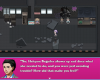
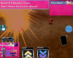
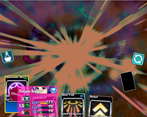
Screenshots are spoiling the bosses.
A strange cumbat system. The Hand is refreshed every turn, so all the tactics is to use every card in your Hand without thinking about which card to use now and which to save for next move. I'm not sure it is good or not, the game just works this way.
WHY SO ENJOYABLE??? IT IS NOT LEGAL!!!
I'm glad you enjoyed it!
The deck building feature can take a little while to get used to, but it has a fun energy I always enjoyed, so I hope I can make it enjoyable for everyone!
I redid a lot of assets so I need to update the screenshots, so I'll keep that in mind and probably just high light the earlier battles.
Thank you!
That was fun! I haven't played many deck builder games. I only was able to spare the time to play a brief portion of the game so I didn't actually get to any of the actual deck building parts, lol. I had to call it after beating the first boss.
I felt the combat system was interesting enough to make this stand out from other RPG Maker games. I've not played very many of those either, but a few here and there. So the battle system is very appreciated. The animations all looked pretty good and the Quantum Star was appropriately very cool and satisfying to use.
The music selection was great as well.
I glanced through the other comments here and I have to agree that your idea to leverage the therapist session at the beginning to influence the starting deck is a great idea. It may also be a decent idea to give the player a few extra cards after the first battle as loot, but also to start that deck building part early as well.
Thanks for giving it a chance!
I hope to expand on the selection of cards to go into the deck now that I have a better grip on balancing the encounters.
I'm glad you liked the music and the animations! A magic girl needs her finishing move to be flashy and fancy!
Hey Sprit Corgi 👋,
What Stood Out (For Me):
Lively Towns / Cities:
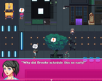
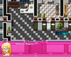
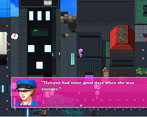
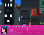
I'm not sure how RPGMaker (This utilizes that engine right?) works, but the way the cars are driving around, and people are walking about and conversing with each other, and the presence of the police, etc, helps immerse me into the world.
Battles: I'm not big on heavy dialogue games, but the presence of battles helped balance this dialogue, and this was my favorite part of the game.
Characters have personality: The dialogue showcases some personality in characters that makes them feel more alive rather than just fulfilling a role.
Feedback:
Get the player making choices sooner? (Just a thought):
The heavy dialogue sequences at the beginning of the game may put off some players who would come to really enjoy features such as the battle system. If you could perhaps shorten the duration between scenarios where the player isn't able to make any interactions with even a few choices (to make the player feel they are part of the story), could help.
Battle Indicators:
There were a few times at first where I was unsure why the card I was clicking, wasn't activating. The dialogue at the beginning seemed to place importance on utilizing quick attacks at first but I noticed I couldn't use them at the start of battle (later I found out I need specific points to activate the quick attack).
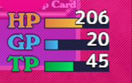
One issue with the colorization of card points to indicate TP vs. GP is that when these bars are empty you can't discern the color of the points and thus, it's difficult to know which cards reference which points.
Is it possible to change the UI to something like this to be more indicative of cards and points?:
Battle UI:
The Character Stat UI is generally in front of the first card (from left to right), perhaps changing the interface to where all cards are readily visible could be helpful.
Also a battle question:
Do you know why I was not able to use this card, is it not a 30 TP cost?
Well done Spirit Corgi, it seems like a lot of effort has been placed into the game so far. Keep it up 👏.
Thanks for the feedback!
I'm still trying to get a complete grip on the UI and making cards show both of the requirements. Quantum Star requires both TP and GP, but it only shows one. Matching the colors of GP and TP sounds like a great idea!
I'll see what more agency I can think to add to the visual novel elements of the game
I do now have the idea to add some questions to the therapist scene and those questions could impact what cards the player starts with.
Awesome idea, Spirit Corgi 👏!
I never played this type of game with cards before. It's been fun so far and I see the potential of it if the future enemies become more complex thus making decisions more complex. The dialogue is very engaging and I do like the music. The game has froze a few times when I was navigating through the city. Great work!
Thanks for the feedback! I'm glad you enjoyed the combat and dialogue!
Did the freezes happen because you interacted with something or do you think there might be a file missing?
Freeze happened moving to different areas in the city twice. Couldn't bring up menu or kb mash my way out of it.
This sounds super intriguing and I want to try it, but I can tell just from the description that it's going to be a longer experience that I don't have time to dig into just yet. I will try to take a look at this at some point post-jam.
I definitely understand the time, but I'm glad you find it intriguing! I would love to hear your take on the game and story!
I think this works as an RPG with a map, although I do miss top down RPG games in general so it might just be a personal play style preference. I thought the combat was fun though, once I figured out how the card system worked I started to really get into it. I also enjoy the narrative so far, can't go wrong with the hero's journey story arc lol always makes for a compelling tale. Art is for sure the star in this one I really liked your enemy sprites and dialogue boxes. Overall very cinematic and polished, if I were to have any noted it would be to maybe up the resolution on the human sprites to match the enemy art (just a little less pixelated and more illustrated)... but it's not enough to really detract from the experience. I didn't have time to sink my teeth into the story completely yet but I could see playing this one through for a while to see where it goes. Nice work overall!
Thank you very much for playing the game and giving some good feeback! I hope you have time to play the rest of it and I plan on adding more content in the future!