Indie game storeFree gamesFun gamesHorror games
Game developmentAssetsComics
SalesBundles
Jobs
TagsGame Engines
A jam submission

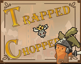
Trapped & ChoppedView game page

Submitted by DrgCandle — 1 hour, 10 minutes before the deadline
Add to collection

Play game

Trapped & Chopped's itch.io page

Results

CriteriaRankScore*Raw Score
Style#7304.0034.154
Overall#27793.0893.205
Creativity#33243.0393.154
Enjoyment#50122.2242.308

Ranked from 13 ratings. Score is adjusted from raw score by the median number of ratings per game in the jam.

How does your game fit the theme?
We need to construct a path to the enemy, making the places we can walk more numerous and also making ourselves stronger. As the map expands, so does our capabilities.

Development Time

96 hours

Leave a comment

Log in with itch.io to leave a comment.

Comments

Submitted

I think the thing that's confusing people as far as tile placement is concerned is how to connect doors and how to determine what rooms contain. Your doors aren't clear enough for people to naturally understand them and line them up. For an idea of how to solve this issue, you can look at Betrayal at House on the Hill as an example.

Betrayal at House on the Hill

Each door has a bright yellow rectangle, making it easier for players to see them and understand them. In addition, the square is labelled with a symbol (also bright yellow) and text describing its function. Using these tricks in your game will make it more functional.

Submitted(+2)

I didn't really undersatnd how to play :(
I also don't understand how the game fits the theme

Submitted (1 edit) (+1)

Okey, I'm amazed.  First of all the game is incredibly polished. All the art is really good, it has A LOT of mechanics and potential. It lacks a tutorial, so it's hard to get where you can place tiles and where you can walk. I didn't get what the locks do either. But I think it's fine. I see how it can be expanded into a full game. Well done!
Edit: and the sfx are really damn good!

(+1)

Beautiful art!

Submitted(+1)

Love the Art style, sadly i find the gameplay not really understandable, biggest problem is that you can not really tell , where you can put the next tile :)

Developer

"biggest problem is that you can not really tell , where you can put the next tile"

That's true.  This is what I'm trying to say, our art looks good but it serves no purpose. It's just a meaningless pile-up, only good for looks. I mean, we really messed up.

Submitted(+1)

oh no you did not mess up ! one thing which would alread help would be , just take the black borders from the doors , so you know these two doors i can connect, or make diffrent colors for the borders to tell what fits together