Play game
CreaChip's itch.io pageResults
| Criteria | Rank | Score* | Raw Score |
| IDEA | Was this game super interesting or innovative | #71 | 3.000 | 3.000 |
| AUDIO | Did the game have great music or sound design | #83 | 2.750 | 2.750 |
| Overall | #129 | 2.150 | 2.150 |
| FUN | Was the game satisfying to play or did it bring you joy | #142 | 1.750 | 1.750 |
| MOOD | Did the game have atmosphere or make you feel something | #146 | 1.750 | 1.750 |
| VISUAL | Did the game have nice graphics or art direction | #170 | 1.500 | 1.500 |
Ranked from 4 ratings. Score is adjusted from raw score by the median number of ratings per game in the jam.
Leave a comment
Log in with itch.io to leave a comment.


Comments
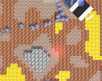
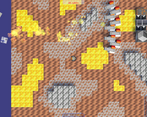
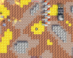
This looks really cool, but it needs instructions. I couldn't figure out what any of the buttons do except the one that places turrets. After placing a bunch of turrets they were killing all the enemies before they even appeared onscreen until the very end when I got swarmed by a bunch of grey cubes that seemed to ignore the turrets shooting.
Well, I'm already doing a tutorial level for this game!
Gray bots don't ignore turrets, they're just too fast for turrets, so I'll probably make the bots slower in the next update.
Seemed like an interesting concept. Music was cool. I would like to see more development from this.
Notes:
I never saw any robots spawn to attack me until like the very end where it was probably like a 100 of them that came and a bunch more when the boss spawned.
I wished I could hover over the icons to know what they do.
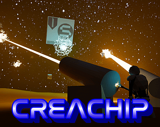
I really liked when the timer hit 0 that a boss appeared and the music changed. The boss looked cool, but I wish the rest of the game was in that style because it was 3d and stood out more from the rest of the game.
The map may have been too big and could probably be shortened for a better survival and defending experience while still having sand box elements.
Overall, nice work though!
thank you for rating the game, all criticism is taken into account, but there is one point, my friend after playing the old version told me that he did not like the fact that the map is so small in the game, and he would like it to be bigger. In short, I promised to enlarge the map and I enlarged it in the current version, so I can't shrink the map.
Needed a little more direction on what things were and how I could and mainly could not place them, liked the concept though nice work <3
Thank you, all criticism is accepted, and if you have any ideas about what you can add to the game, be sure to suggest it!