Play game
UltraFighter RX5000 / The Girl Next Door II's itch.io pageResults
| Criteria | Rank | Score* | Raw Score |
| Community Choice | #41 | 2.843 | 3.091 |
Ranked from 11 ratings. Score is adjusted from raw score by the median number of ratings per game in the jam.
Judge feedback
Judge feedback is anonymous.
UltraFighter RX5000 is, I would say, a pretty standard feeling & uncomplicated bullet hell game. It has a pleasing veneer of polish, but it feels a little lacking in a few important departments. While it feels more you're like riding along on the bus than experiencing a hectic thrill ride on a suped up motorcycle, it's a sterling effort in making a game that is actually playable and understandable, and still gets you to a destination - that deserves a lot of credit.
Liked
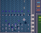
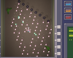
- Bullets very clearly visible & colour coded enemies helps decision making
- Controls are good & gamepad support
- Ingame polish with tutorial, particles and level transitions
Needs Work
- It's important to be able to see the enemies too!
- Would benefit from being more fun and having more mechanics
- The theme use is lacking
So, preface: I'm not a bullet hell or shooter aficionado, I don't play these games a whole lot. The difficulty wasn't too bad for me to deal with, so, I think you dodged the 'made game far too hard' bullet, although I did use a controller. After playing it 2-3 times I was able to run through the whole thing without dying (my high score was $19780) but, if you do die, you do have to restart the level - for a jam game, maybe just resetting the score and coming back to life in situ would be better.
I found the game pretty dry, honestly? I pretty much just kept shooting the puny gun until I won the levels. I'm not sure what direction would be the smart move to improve it, but, getting music is, I'm sure, high on your agenda. Despite the colour issues in the regular levels, the game does look pretty functional - I like the polygonal ships and buildings, and it's pretty clear what everything is particularly in the 'sequel' level. In the original levels, the Blue ships on the Blue sea, and the Black Ships on the Black void of space were not particularly great choices.
According to the credits, this was a solo project. I think if you'd had maybe another week on this or some extra hands, and had really focused on juicing up the framework you have here, you'd have a really decent game - forgetting the theme ultimately, but, let's focus on the game here. You could maybe get some weapons and health restores in there, give some of the bosses some difficulty phases, maybe slap a corny ingame story in as well. Think of ways to make use of those 3D models too: maybe have some buildings topple over or have the ships you defeat flip and tumble out of the sky, have bullets bounce off of things etc - the engine should be able to help do those things for you.
Elevator pitch
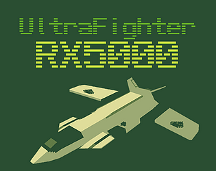
Retro style sci-fi lowpoly pixel art bullet hell shoot-em-up. With frogs.
Describe how your game adheres to the theme
This is a sequel to the classic YouTube video "The Girl Next Door" (which sadly has been removed from YouTube).
Leave a comment
Log in with itch.io to leave a comment.



Comments
Afraid I'm similar to others in that I dont play shmups much, but this one felt good and looked great.
Only thing I'd suggest is you need some kind of impact sound for hitting enemies/bosses I'd say, otherwise it's kind of hard to tell if you're damaging them.
Nicely done; good shmup feel even in a 3D setting which is hard to pull off. Lack of enemy model variety, but these games are mostly about the bullet patterns anyway.
Difficulty wise, it's fine, though personally I feel like the ship itself could be more responsive.
The laser enemies were pretty cool.
Thanks! I forgot to test it the last time you mentioned the responsiveness, but I increased the interpolation speed on the movement a bit, and it feels a bit better to control.
Pros:
Cons:
Here & There:
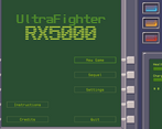
I don't usually play shmups, but when I do, they're a part of these jams. Therefore I don't really know what makes shmups good, but this seems like a good shmup. The enemy behaviours are widespread and varied, it has that familiar thing of symmetrical spawn patterns, and they're distinguishable enough by their colour. Having different models would have been nice to develop the uh, visual vocabulary (???) of the game, but it certainly functions without it. The bosses are a bit samey, especially because of the previously mentioned point, and overall the game is quite difficult, namely level 2. I never beat it. I did go and play the Sequel level and defeated that ol' familiar frog, but the lack of an ending was a little let down namely because of the nicely written Information section in the start menu. There's also a lack of juice which I think this game might really benefit from. The sparks off the enemy ships and your shield on hits are fine, but they don't produce much of a palpable sensation. The UI in game is entirely static which could have added some impact to various situations. The hitbox of the ship is also not distinguishable visually, and has to be learned through feel and experience which feels a bit unfair because there are no checkpoints, failure means restarting the level. Minor gripes aside though, this is really solid and I certainly enjoyed it when I wasn't getting annoyed at myself.
I was planning on having more enemy models and more dynamic UI elements, but had to turn down the scope a notch. Regarding the juice, yeah, I think the player getting hit event in particular needs to feel more "severe". I probably should have used more screen shake in some situations. Also, It shows a representation of the hitbox in focus mode, but I don't think I made it clear enough. The ship model could probably use some detail on the center for the player to focus on.
Thanks for the detailed analysis. You've given me a lot to think about.
Really hard, I couldn't beat it, sorry. Fun though! I like the UI and particles a lot a lot. The particles when shots hit robots are neat. I really like the look of the "border" to the game screen, and the HP bars on bosses and mini-bosses were really clean.
I think it's a little weak on theme, though? Seems like just a shoot-em-up.
Thanks for playing it. How far did you make it? There are three levels, and the last one (also accessible through the sequel button) is the only one that's kind of theme related.