
Play game
Spaceship Runner's itch.io pageResults
| Criteria | Rank | Score* | Raw Score |
| Fun | #15 | 3.714 | 3.714 |
| Overall | #25 | 2.857 | 2.857 |
| Most improved | #26 | 2.571 | 2.571 |
| 90's | #30 | 2.286 | 2.286 |
Ranked from 7 ratings. Score is adjusted from raw score by the median number of ratings per game in the jam.
Leave a comment
Log in with itch.io to leave a comment.
Comments
A nice game, requires fast thinking. The Sonic rings sound effect was an interesting choice, but it made me feel like I'm losing, before actually getting a game over.
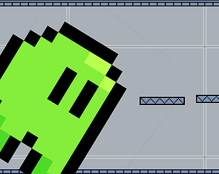
The flipping gravity mechanic made for a very fun challenge, nice and tricky and forced me to think fast!
Improved: I’m guessing you made the whole game during the jam.
Fun: More fun than most of the games I’ve played so far from this jam, but probably just average compared to what I’ve seen in some jams before this one, or maybe I just don’t find anything very fun right now (when I’ve played more games from this jam, I will try to adjust the scores I give them to compare them to each other rather than to my usual scales).
90’s: I felt like this game could probably run on a 16-bit console, maybe even on an 8-bit one. But I guess that’s at least as good as those games that do things 32-bit consoles couldn’t have done.
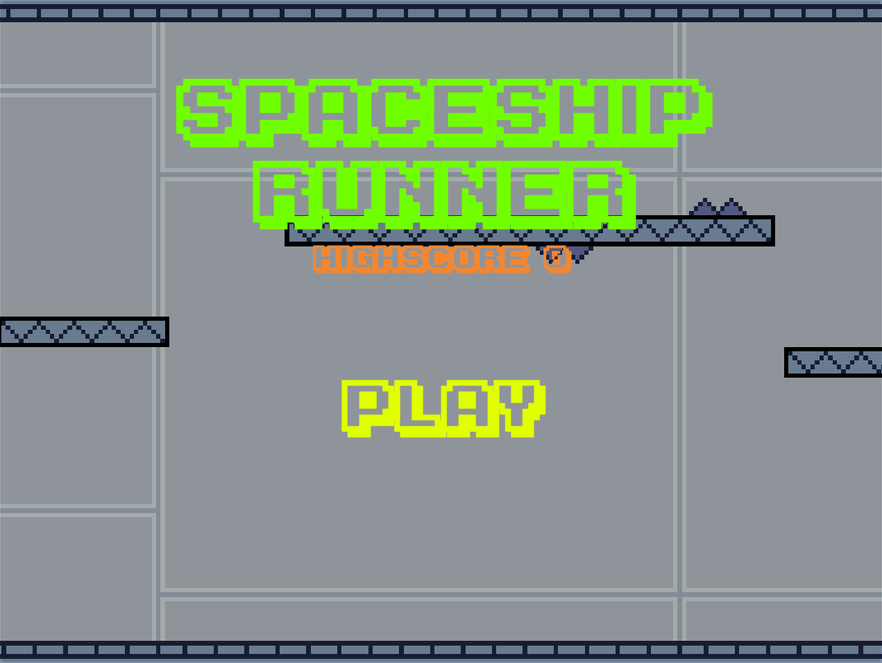
The three different font sizes could maybe be done with sprite scaling, but I think there’s few enough characters that they could probably also just be separate pre-scaled sprites… assuming there is some underlying pixel grid that’s shared by all the font sizes.
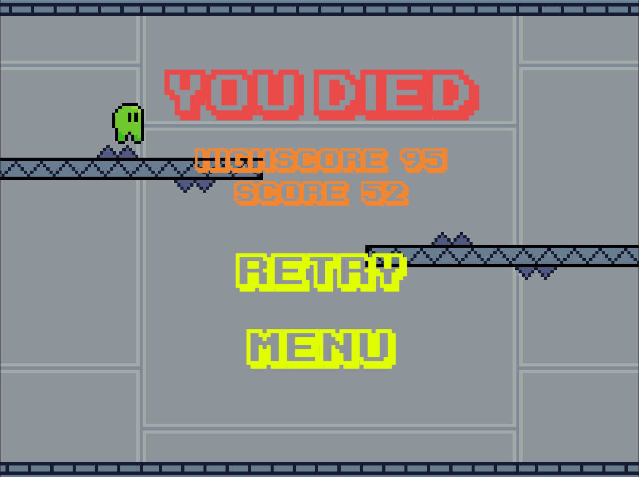
On a closer inspection, the pixels that the text is made of don’t align with the pixels in the background, and there’s some anti-aliasing that kinda looks like you used a TTF font in an engine that didn’t apply its hints. I guess you could try fixing it with a shader but yeah, it’s not very noticeable. But maybe the score should be shown a few pixels further down so it doesn’t partially overlap with the roof: having such an uneven background can make the numbers a bit harder to read. It would also maybe make sense to draw the actual numbers rather than the outline,but I guess that would be inconsistent with how text shows.
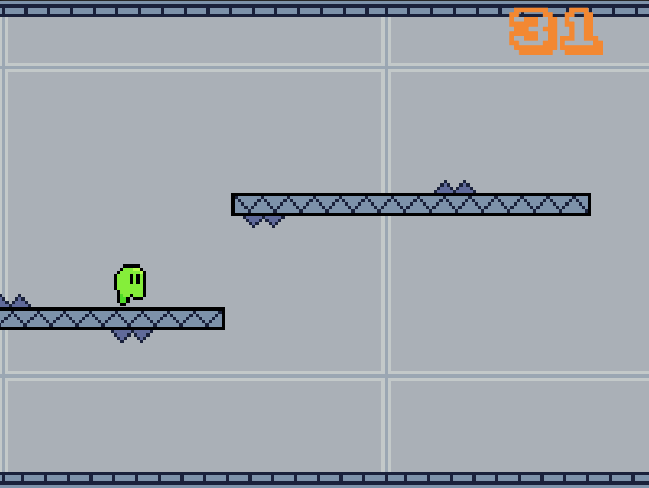
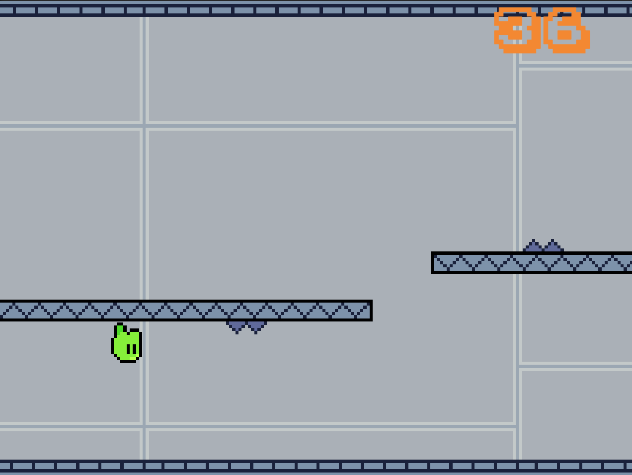
Overall: The view feels a bit zoomed-in, meaning I find it hard to see enough of what’s ahead to plan jumps and flips. And sometimes there’s leaps I wonder if they’re even physically possible to land. They’re probably not impossible, but especially when they happen right at the start of a run they feel somewhat unfair.
And I like the music and the simple but readable art.