

Play game
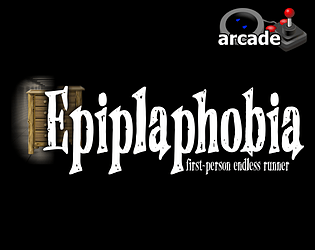
Epiplahobia - Finger Runner - Endurance Test (+ Virtoojin Arcade Edition)'s itch.io pageResults
| Criteria | Rank | Score* | Raw Score |
| Most improved | #32 | 2.028 | 2.400 |
| 90's | #34 | 2.028 | 2.400 |
| Overall | #35 | 1.859 | 2.200 |
| Fun | #36 | 1.521 | 1.800 |
Ranked from 5 ratings. Score is adjusted from raw score by the median number of ratings per game in the jam.
Leave a comment
Log in with itch.io to leave a comment.
Comments
Never saw something like this before, but it is a really cool idea to run with fingers.
Also you can get a nice finger workout :)
Improvements: I can’t see the pre-jam version, but I can see a devlog from before the jam where you wrote that you’d added music back then. It’s hard to rate a game in the “most improved” category when I can’t see what it’s improved from. And the game description doesn’t say either what you worked on during the 32-bit Spring Cleaning Jam.
Fun: I don’t mind one-button games but I’d prefer if there was some other criteria than just pressing it over and over as fast as possible. Think of how Flappy Bird requires the player to sometimes let off the one button for a little while rather than just button mashing.
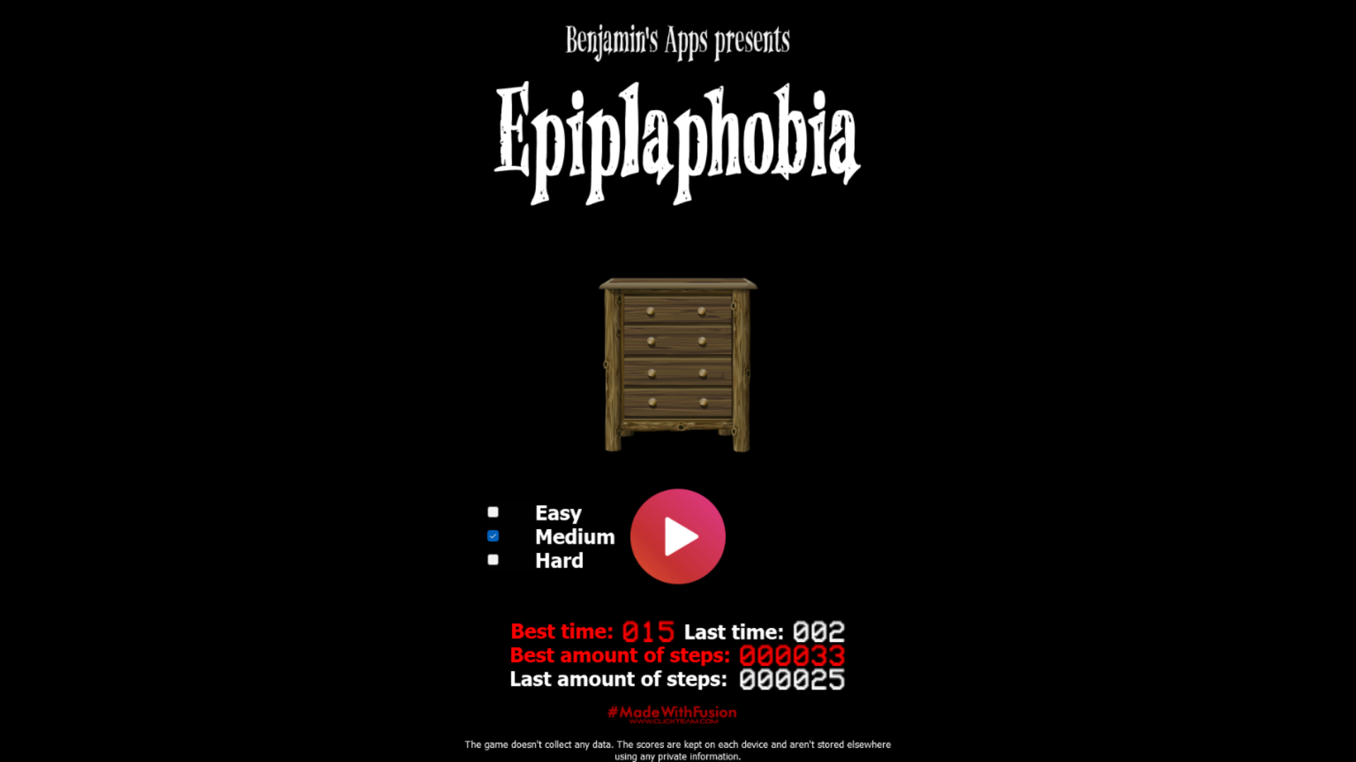
90’s: The play button looking like a modern play button (well, at least it has a gradient, but back in the nineties you’d have had a more visible gradient and probably a border around the button, and it would probably have had the word “PLAY” in capital letters written on it. I also think if the speaker icon is black and white maybe the play button should be so too or both should use colour. If it’s black and white, maybe the lack of a border will be less noticeable.
Also, look at this text:
(The image is scaled to make the pixels easier to see.)
The font has thick and thin lines, but the thin ones are thinner than a pixel, making them grey instead of white. The lowercase e barely has a horizontal line in the middle. In fact, the letter e appears twice in the text but if you compare the two instances of it they don’t look pixel by pixel identical. On 32-bit consoles, text was usually either hand-painted or rendered with pixel art glyphs or if it was a vector font it was either large or hinted. Here’s an attempt at manually brightening the lines to make those words easier to read while also restricting the image to 16 colours that the PS1 should be able to display (it could display more colours, but palette reduction was often used to compress fonts)
Implementation: I like the music, the logo, the speaker icon and the dresser. I don’t like the pieces of overlapping text or the very-modern play button. I think the lighting on the dresser that gets darker when further away is a nice touch.
Overall: it’s hard to rate how much the game has improved when I don’t know what to compare it to or which parts of it to pay attention to. The art is nice, and if we ignore the glitches and thinner-than-a-pixel lines, the fonts are nice too. But the gameplay is a bit sameish and I stopped button mashing to avoid hurting my hands.
The game was meant to be a bit more inspired by 90s PC games and the main difficulty spike was meant to be the finger running being a bit painful after a while (it's basically finger training).