Play game
Mahou no Shoujo: Between the Worlds's itch.io pageResults
| Criteria | Rank | Score* | Raw Score |
| Judge's Choice | #1 | n/a | n/a |
| Gamer's Choice | #1 | n/a | n/a |
| Sound Effect | #14 | 3.334 | 4.250 |
| Games for Impact | #15 | 2.942 | 3.750 |
| Graphic Design | #15 | 3.138 | 4.000 |
| Creativity | #16 | 3.138 | 4.000 |
| RPG Maker Game of the Month | #16 | 2.353 | 3.000 |
| Overall | #16 | 2.824 | 3.600 |
| Storyline | #16 | 2.942 | 3.750 |
| Developer's Vote | #17 | 2.550 | 3.250 |
| Music | #17 | 2.746 | 3.500 |
| Character Design | #18 | 2.550 | 3.250 |
| Fun | #19 | 2.550 | 3.250 |
Ranked from 4 ratings. Score is adjusted from raw score by the median number of ratings per game in the jam.
Judge feedback
Judge feedback is anonymous and shown in a random order.
- Love the applications of the various plugins. The lighting is fantastic. The writing and the visuals play a duet that draws everyone into this amazing game
- Great story, ideas and lighting effects. Most of the character design are good enough and tileset is great. But more or less scary to play it and battle is very creepy and astonishing.
Which RPG Maker Engine are you using
RPG Maker MV
Leave a comment
Log in with itch.io to leave a comment.


Comments
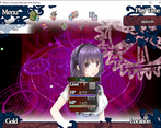
-Love the stuff you got from Moghunter! Especially the fact that you customized things like the menu icons (I used pretty much the same scenes).
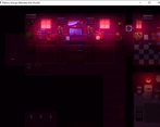
-The tiles and maps were really beautiful, although I found exploring the maps a bit headachey (by design?) due to the horror blur effect every few seconds. Good music to go with it too. The lighting, fog, and general ambience were perfect for a creepy game.
-There are many hotkeys. . . very easy to forget how what some of them are. Some screen overlay or menu refresher would be nice.
-Magnifying glasses over things you can check! Thanks for helping me avoid wasting time checking a million things.
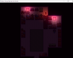
-On the second floor of the house there is this zoomed in map. . . there a re a few pixels off. I think the sprite sheet's feet appear above her head when you are looking left, right, or up.
-Very creepy battle. Love the artwork, and love the twist with the celestial.
-Yay, boss HP meter and visible enemy drops!
-A few typos throughout, and the dialogue could use a little bit of smoothing out.
Hi,
thanks for the Feedback. The next Update wil fix al lot the issues. :)
Neat game. I had a few thoughts while playing:
- Animated title screen is pretty neat. It's always nice to see a
customized title!
- Oh, yanfly's options core! Also nice to see. A tip though: you can delete
commands/sections if you look at the plugin's options. Since Controls
doesn't have anything in it, I'd suggest removing it so the menu looks
neater.
- This is probably just me, but I really don't like the text noise. Kinda
hits the same level of unpleasantness that the sound of rustling plastic
bags or popping candy does. I know this is really weird to point out, but
I'd prefer if it was lower-pitched and less "clicky" sounding.
- The text for the quest window hud is very small. My PC is running at a
pretty low resolution (1360x768) and I'm struggling to read it. I highly
suggest you increase the font size.
- In the status menu, you have red text on a pink background which is
difficult to read. I'd suggest a different text color or a darker outline
for the text.
- The transition to the pharmacy made me jump! I didn't expect it the tone
to escalate that quickly lol! This isn't a bad thing, I just thought I'd
point out that it genuinely surprised me.
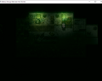
- The atmosphere in general is great. The fog, colors and sound lend a Very
spooky and ominous feel. Great job with that!
- Rias' shocked portrait after you are teleported to the next area looks
kinda bong-eyed lol. Not a big deal, but kinda made me chuckle.
- Not sure about using the word "Materia". Unless there's a reason for it,
I'd suggest changing it. It's a bit too iconic imo.
- I like the stuff you can inspect in Rias' house. Adds a bit of needed
backstory to her.
- "Toys for Adults" ( ͡° ͜ʖ ͡°)
- The Camille Saint Saens song felt a bit... absurd? Out of place? The
other music tracks are much more understated so it doesn't really fit.
Don't feel like you need a new music track for each screen of the game. The
music you get in the town on the next screen would have fit fine.
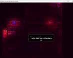
- I know it's a horror game, but the coffee shop is way too dark. Having
friendlier looking areas mixed in with the scary ones can greatly increase
the impact of the latter. For example, the save rooms in Resident Evil
serve this purpose.
- Transitioning to new maps is jerky and slow. There's also a noticeable
pause before the text displays in dialogue. The game is kinda laggy in
general. I assume it's because of all the fancy lighting. It's not game
breaking, but it is pretty distracting.
- The quest log doesn't update after meeting your friends. I feel like it
should add a new entry that tells you to go to the pharmacy. Just a small
nitpick and I only mention it because it felt like an error.
- The distortion effects in the pharmacy basement are really neat. Super
spooky.
I liked the concept and atmosphere a lot. The battle was alright, pretty standard. I was hoping there would be more interactions with the fear meter, but I guess you didn't have enough time to expand it further. Anyway, it's a promising start. Well done!