On Sale: GamesAssetsToolsTabletopComics
Indie game storeFree gamesFun gamesHorror games
Game developmentAssetsComics
SalesBundles
Jobs
TagsGame Engines

Programmer vs Artist steam capsule

A topic by The Workshop Geek created 40 days ago Views: 229 Replies: 9
Viewing posts 1 to 8
(3 edits) (+1)


Quick background, I commissioned an artist but wasn't too happy with the result (no, the title wasn't a placeholder), and especially the communication.

So I gave myself 1 week to see what I could before commissioning another one.

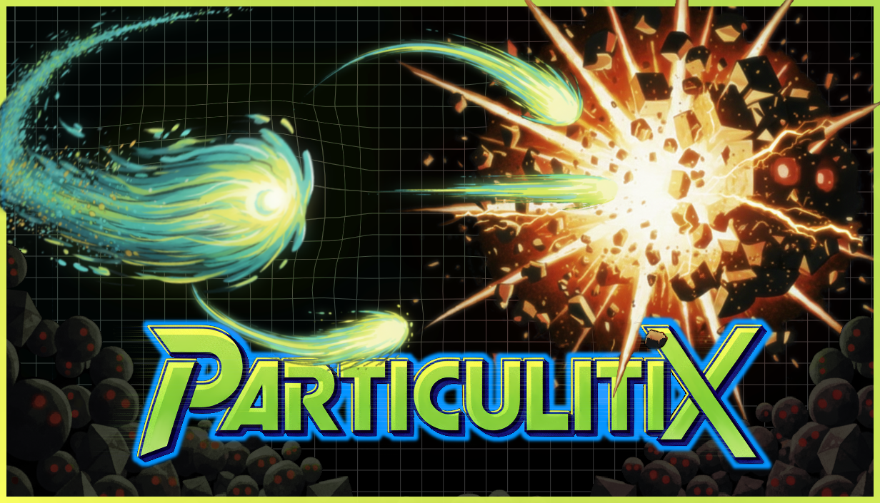
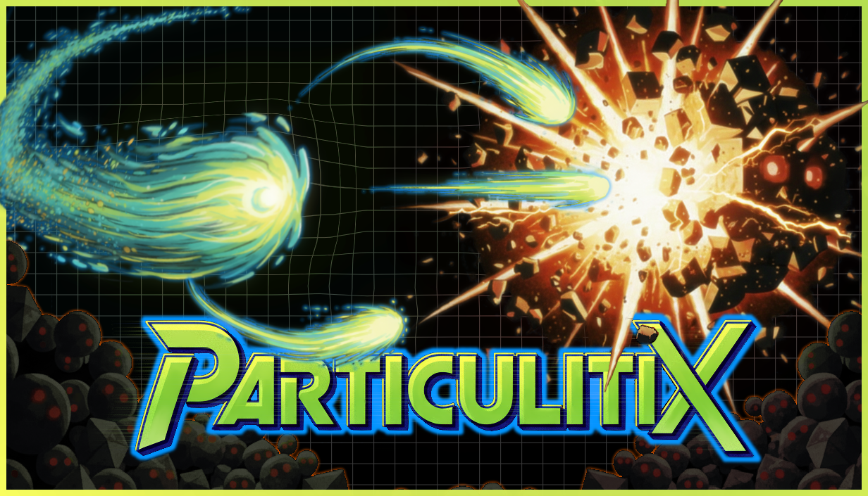
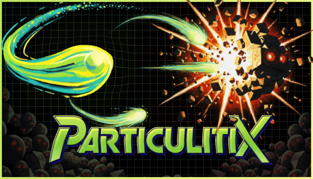
Which one do you prefer ?

The one with the black background is mine. Any feedback is welcomed, and you can say it's crap if you want :D

(+1)

Honestly, I like the one you made much more, it gives me that vibe, of the covers that used to be made for games that came on cassette like Sega Genesis 😸

(1 edit) (+1)

Thanks for the feedback ! You're spot on !
I was with a black background, then I thought about the grid that I have in game, then I was Hoooooooo ! Genesis style !

(+1)

The one with the back background is the best! I like the grid distortion around the big comet; it's the typical representation of space-time distortion around a massive object.

(1 edit)

Thanks, glad you like it !!! :) It's nice to know it's just not me that prefers this one

So still messing around with it. 

From this


To this


Bumped it to this 

My favorite among the 3 last ones is your 2nd iteration.

Definitely yours.

The commissioned art looks like a clever but unfinished draft.

FWIW, I prefer the smoother fireball. It has a more graphical look, akin to a logo, and is more readable. This pushes it into the forefront more for me. A little bit of flourish might be fine, but I think less is more here, especially at capsule size.
I also don't prefer that the second revision breaks out of the frame like that. I think it's best to pull that shape wholly in the frame.  Overall this feels like it's moving in the right direction. I like the colors and it's eye catching.