Hey guy's I'm back. Continuing on to the Zelda inspired Mockup series we will be drawing some boulders. If you haven't started from the beginning of this tutorial series, I'd recommend that. We will need some space to draw the boulders so I'm using 128x128px for the canvas, but we can also have some grassy details in our scene.
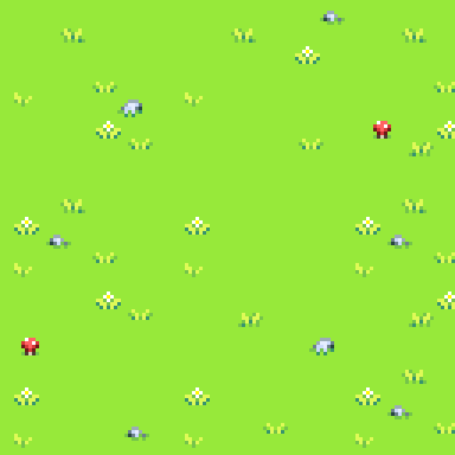
Drawing boulders is easy to start but a bit tricky to texture, so it helps to search up reference. Pretty much any realistic rocks or boulders you find on the internet are worth studying, but it's also a good idea to search up "rock texture" specifically so you can focus on just the texture as well. My boulders are going to be gray, with some slightly bluer shadows. I'm going to start some sketches. For now they're just simple boulder sketches with polygon shading. I'd do this on a new layer.
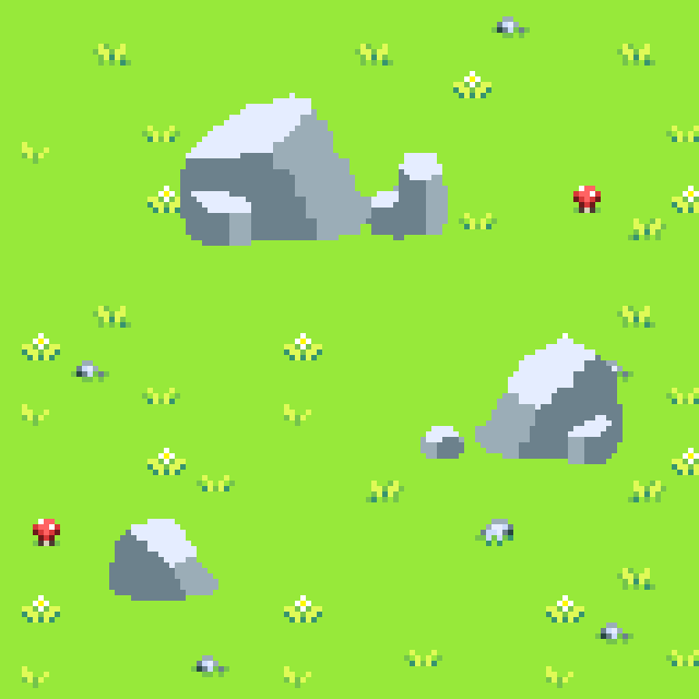
Just like the tree from the previous tutorial, we'll add some grass along the base of these boulders.
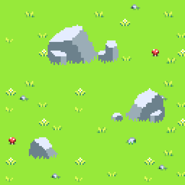
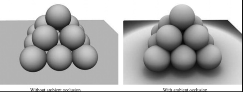
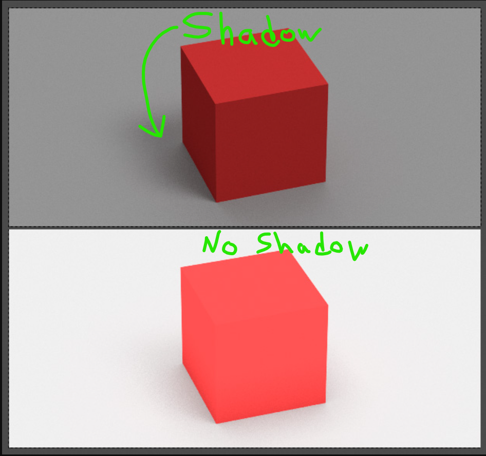
So this is ok, but it looks odd that we don't have shadows on our boulders, specifically at the bottom. If you search up "ambient occlusion" and "cast shadows", this might be a lot easier to grasp. Mainly right now we don't have shadows and that's the problem. These boulders being embedded into the grass would cause shadow to form around the base. Not just on the grass, but on the bottom of the boulders as well
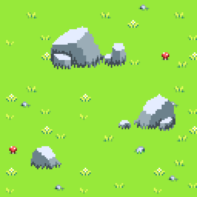
Notice how this already looks better on the boulders, even without editing the grass yet. I'm also considering the rough texture a bit as I'm sketching here so that's why you'll notice a bit of rough texture.
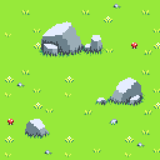
And shadows applied to the grass:
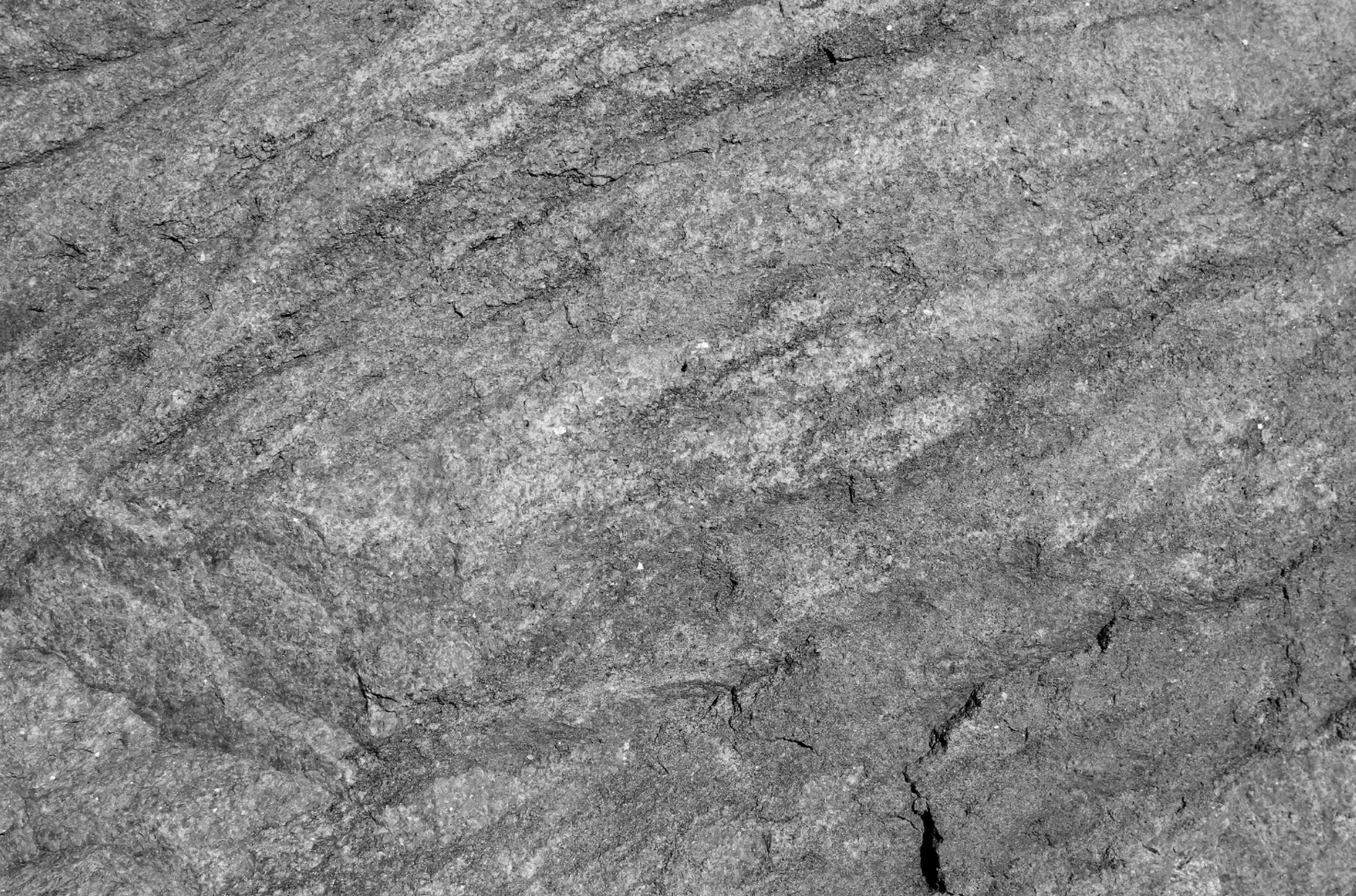
Alright, looking good. Now we should figure out the texture. I will admit this part is a challenge, even for me, but I've had some practice with it. I will provide some reference which I think would look great on these boulders.
Notice how the rock texture in these first 3 examples have seemingly parallel formations of bumps and crevices.
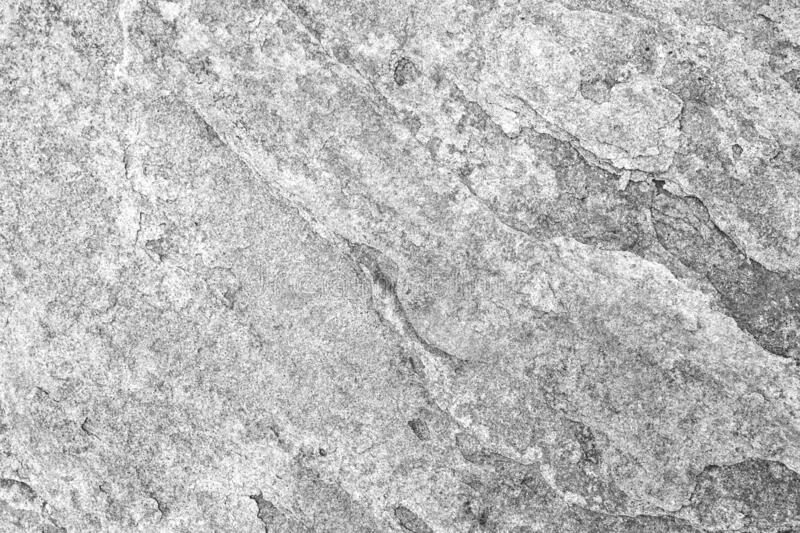
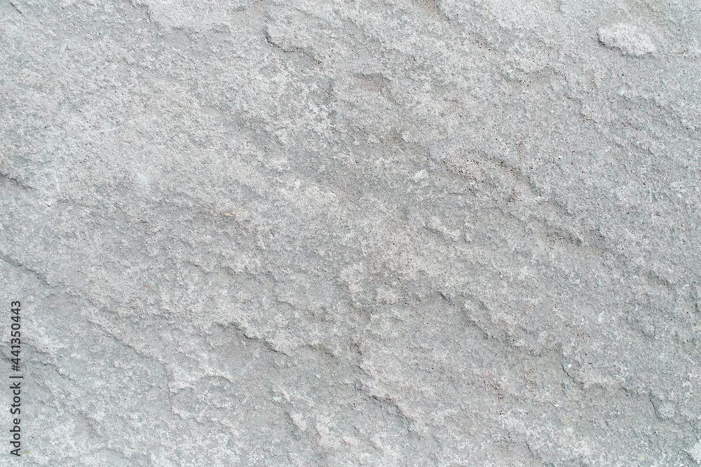
Then notice how these ones are more random.
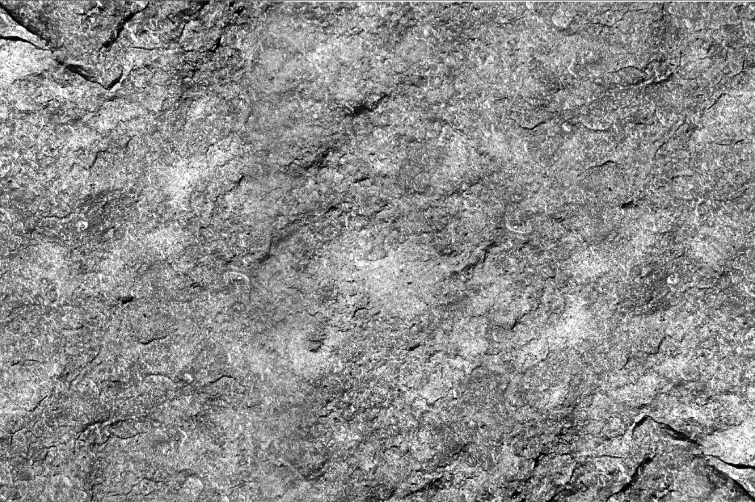
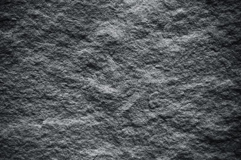
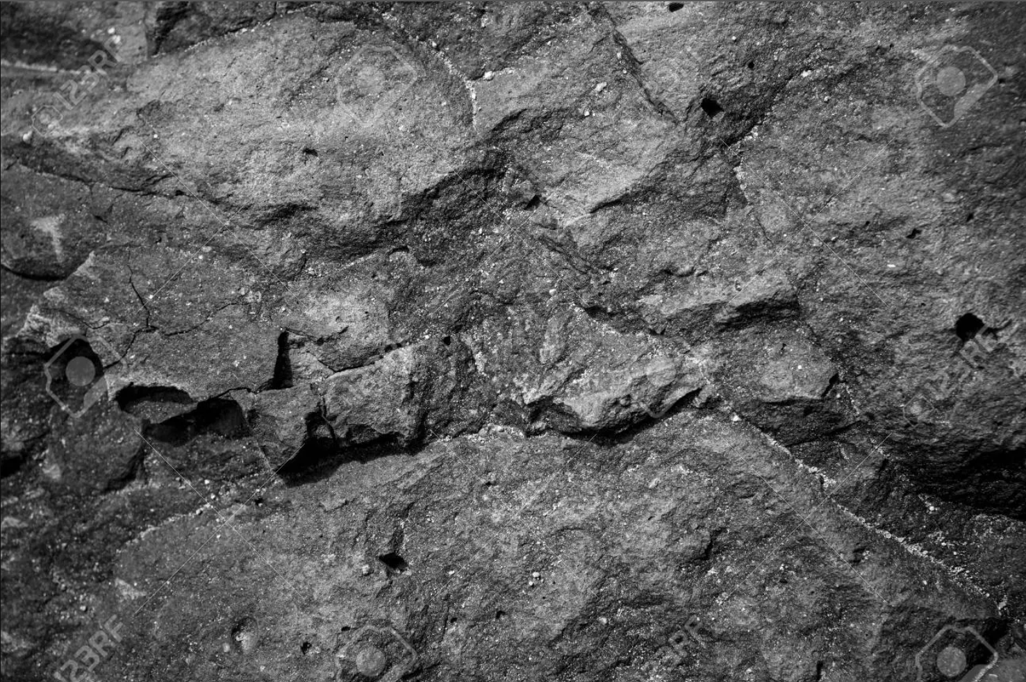
Those are just some things to think about as you're trying to illustrate the texture. Maybe you can even try a combination of those 2 ideas. Try to keep the texturing very subtle or it can easily get very messy. To pick colors, I'd start with the current rock colors we have for our brush, then modify the colors with the HSV/HSL color sliders. It might be a good idea to have the tree from the last tutorial visible as you're drawing this to try to match the style.
So for the texture example:
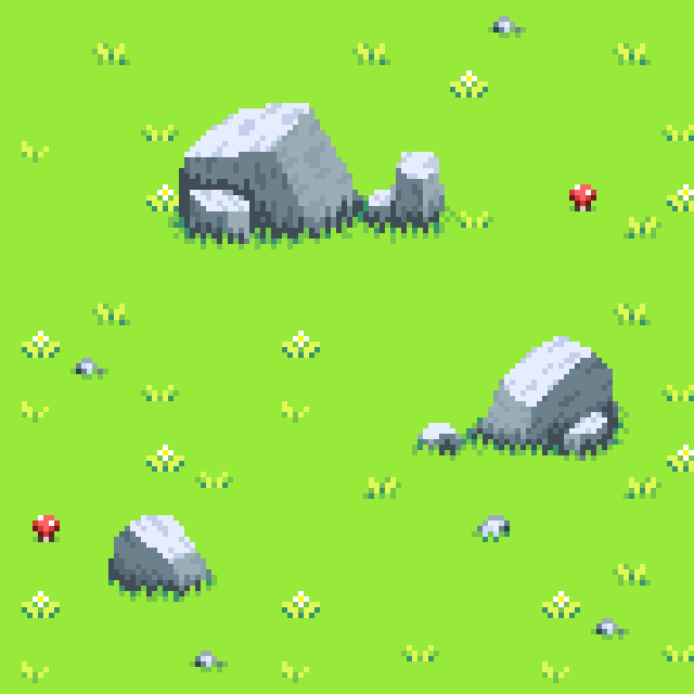
And I could see how it would look with the tree on screen.
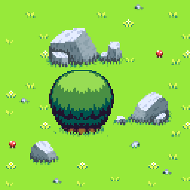
Notice how the tree has a cartoony outline, but the rocks don't. I'd fix that by adding a soft outline around them
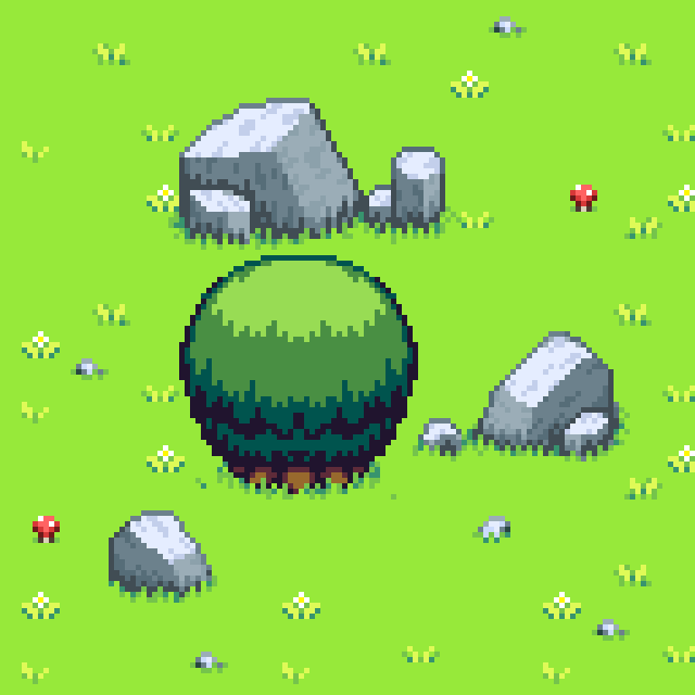
And I'd copy the strong shadow color from the tree, so I could just take that color from the tree actually and apply it to my stones here.
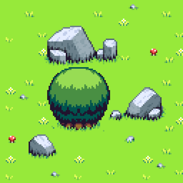
So this is pretty good! However I feel like some of the stones look too sharp and flat-faced, so I would give them rounder and bumpier shapes and bevel some of the edges, but some of these rocks are ok already.
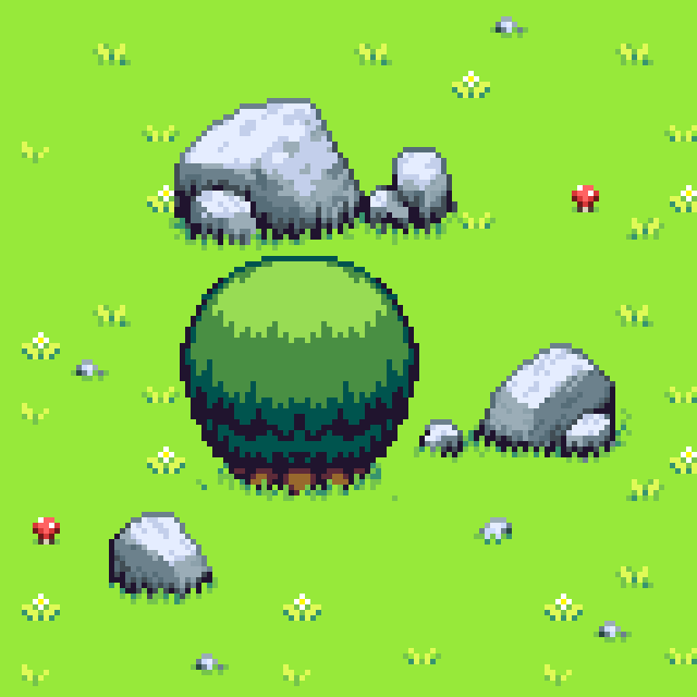
So I'm satisfied with those. Thanks for checking out the tutorial, and part 4 will be coming soon!

