Indie game storeFree gamesFun gamesHorror games
Game developmentAssetsComics
SalesBundles
Jobs
Tags

Should I try to keep the style similar to the Famicom?

A topic by Bon·is·Dead created Aug 08, 2018 Views: 404 Replies: 5
Viewing posts 1 to 4

Or is that irrelevant?

It can be fun to do, especially working within the NES palette, but it's not strictly required! Up to you. 😜

Thanks for the tip. I'm horrible with picking colours, so intentionally reducing the number of options will probably help me.

You don't have to. Feel free to try though, if you think it might be a fun design restriction then go for it!

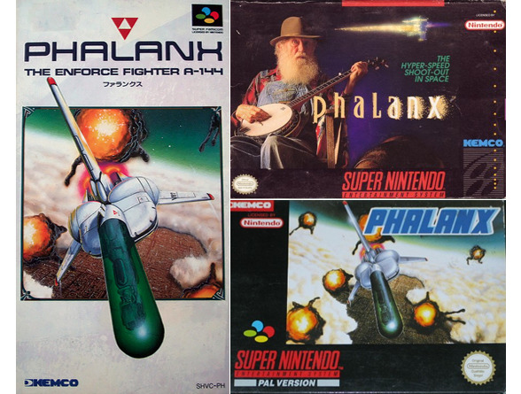
I've always thought the most possible classic way to go about this is to intentionally misinterpret the cover and do a reverse megaman 1 us boxart situation. As if the boxart for your game only barely hints at what the game is about. But I don't think japan had that problem as much.  But this is one of the many approaches to tackle this so it doesn't matter.

That's a great way to look at it.