Indie game storeFree gamesFun gamesHorror games
Game developmentAssetsComics
SalesBundles
Jobs
Tags

Are these backgrounds too much?

A topic by loekw created Nov 27, 2022 Views: 437 Replies: 9
Viewing posts 1 to 8
(1 edit)

We are trying to make some background art for our mobile game. How much can we put in the background without disturbing the gameplay. 

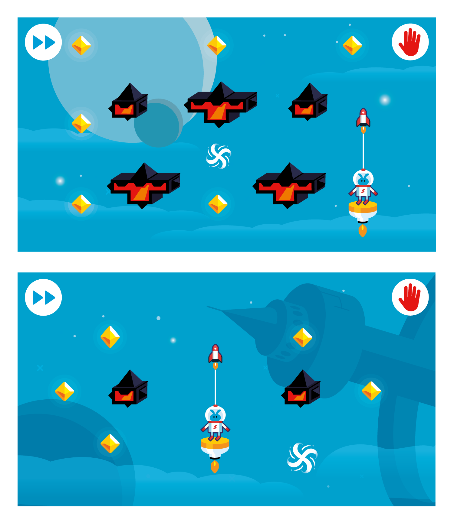
Although I'm a member of the team making this game, I want to share my thoughts here a well. I personally like the backgrounds, but the items that have too much contrast feel tike they are a part of the game (puzzle) and could distract the player. Like the dark moon in the first screenshot, and the space station in the second are on the edge for me. Very curious what others think.

I like the clouds and stars. I think this game should decorate the background, and not the other way around.

I think the BG is fine. It has a totally diffent colour than the objects. Also it has low contrasting colours in itsself, so it's not loud.

Maybe just make the whole BG a bit darker? And maybe a more grey-ish blue too?

They look fine to me. They seem a little childish and the colors look cold, but that can be a good thing, depending on what feel you're going for.

I like the backgrounds; your foreground pictures stand out clearly. 

I'd suggest you change the colour of the character's face, because it's almost the same colour as the background.


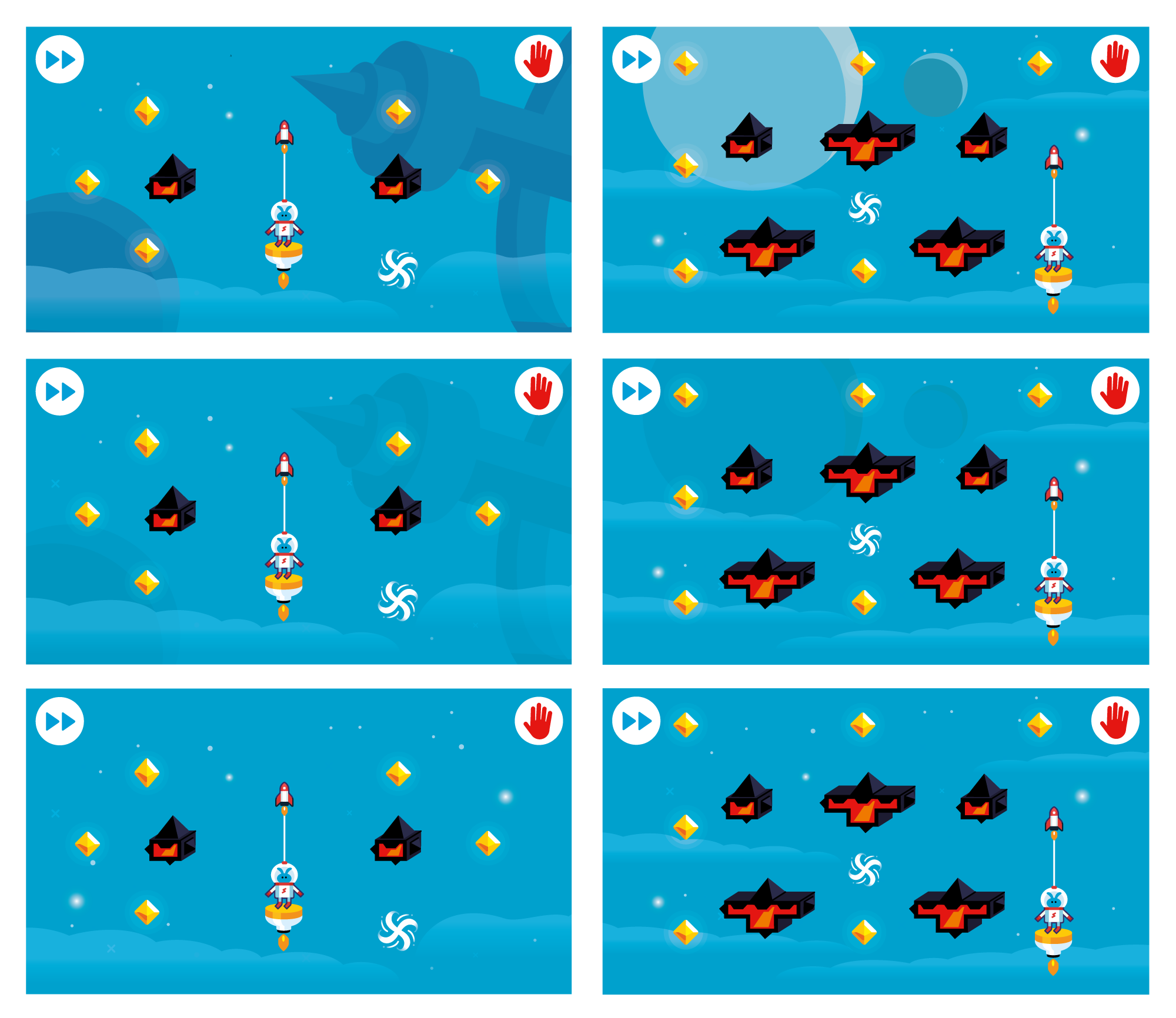
Thank's all for the feedback! We have made a few options for the backgrounds based on the feedback. We think the top ones gives the most graphical interesting image. Which one do you like the best? 


(+1)

The first one is the best.

was thinking the same, 

We've played around with the higher contract elements a bit. It seems to be a matter of finding the right balance. We've recorded a little video of the game with a background we think has this balance. Curious for your thoughts!