Indie game storeFree gamesFun gamesHorror games
Game developmentAssetsComics
SalesBundles
Jobs
TagsGame Engines

Feedback for Point and Click Title

A topic by wolfmakesgames created Apr 10, 2021 Views: 656 Replies: 22
Viewing posts 1 to 10
(3 edits) (+2)

Howdy!

I am working on a point and click game - The Road to Draksten. It's set in a medieval fantasy world and is lighthearted and occasionally funny.
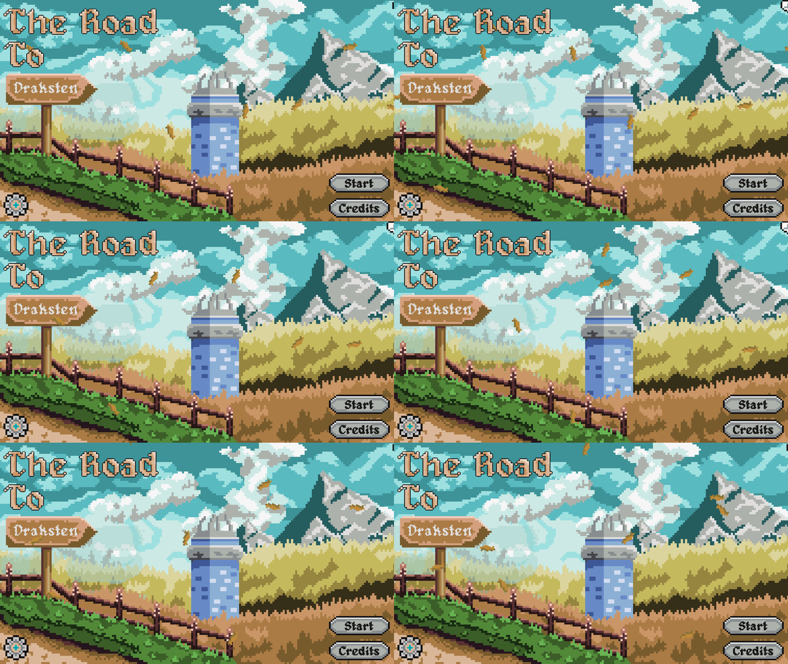
Would love to get some feedback on the title screen.

You can play the demo here - https://wolfmakesgames.itch.io/the-road-to-draksten
Cheers!
 

Very relaxing title screen!

Thanks Ice Crown! That was the vibe I was going for

Title screen looks great, and your game page too. :)

Hey Alexanda! Hearing that makes me so happy :D. Thanks for the kind words!

Please follow my devlog if you're interested in checking out the demo's release soon.

This looks really beautiful and relaxing. The color palette is well chosen and the screenshots on the game page look lovely as well! I'm pretty sure, that this game will be fun. One tiny suggestion, though: Right now the leaves are moving very linear at the same speed - if you'd make the movement a bit more "wavy" and maybe try to alter the (rotation) speed of some single leaves, it would add an even more natural feel, I think. Anyways, good job, I'm looking forward to play the game!

(+1)

Hey bobfox, Thank you so much for the kind words and the advice! I was actually looking online for help on implementing wavy trajectories in a particle system. And this post was timely haha - will be implementing that. And the demo is coming out in a couple of days!

You're welcome, I'm glad it helped a bit. Neat, I'll definitely check the demo out! :)

(+1)

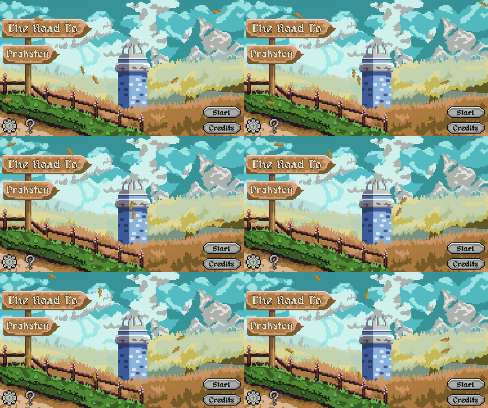
Thanks to bobfox's suggestion, the leaf pattern is edited.

But more importantly, the demo is out for the game! Check it out here: https://wolfmakesgames.itch.io/the-road-to-draksten

Please let me know what you think about it!

Just a quick update, I have the WebGL build out on my page. There are a few hitches with it, but do let me know what you think!

(1 edit)

Hey Wolf!

here's my feedback!


Points I liked:

  • Like the atmosphere. Reminds me somehow of "Monkey Island" but in medivial age.
  • Like the music and the art style.
  • General concept and ideas. Your dialogs are creativ and I like your kind of humour. =)


Potential Points of improvement:

  • When I clicked the "credits" entry in the main menu and I tried to open the link under "surprise" in the lower left corner I got a message, that Youtube refused to let me open that link and it closes the WebGL application. I'm still curious, what this surprise might be ^^
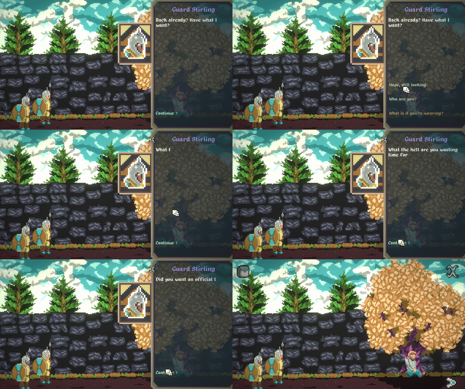
  • When the dialog box opens, and a character is telling their story it would be nice, if I can instantly display the whole text with one mouse click. Otherwise I have to wait the whole time until the dialog is completely spelled out.
  • I cannot exit the dialog so I have to finished entirely. Especially, when I accidently clicked for a second time on the same object/person.
(+1)

Hey DonPuno! Thanks for the kind words and the detailed feedback. I was born a little late for Monkey Island, but I'm sure Darkside Detective (the game I was inspired by - huge recommend!) draws some inspiration from it.

About Improvements:

1. I will look into the link issue and fix it asap.

2. There is an option in the main menu option to disable animated text. Having that option in the dialog box itself felt a little difficult (working with YarnSpinner) as I wanted to get the demo out, but I am working on it.

3. That's a good suggestion, will add it in the next build!

Please follow me if you're interested in the game btw, Chapter 2 is in the works already! Have a nice day :)

Hey Wolf!

Sounds great! I'll take a look.

If you'd like to take a glimps on my recent game "Balls of Steel", it would make me super happy to get a feedback. Just if you like and have time for it for sure ;)

Anyway I'm curious to see the next chapter!


Greetz,

Michael

Done!

(1 edit)

The Credits issue hath been fixed(eth?). Asketh et thou shalth receive. Well, I tried with that horrible Old English. Anyways, game doesnt crash in the Web version while opening links! I also added my Twitter.

The surprise link in the credits menu make me laugh! Thanks!

Glad you like it!

Hey @wolfmakesgames! I finally got the time to start playing your demo! First of all: I think you did an awesome job implementing more "erratic" movement to the leaves, the title animation does look more natural now, but I feel, that you could still tweak it a little more. Be bold! :D
Now, as for the gameplay, here are my observations/ notes (and just so you know: these are just some pointers, I really hope this will be helpful. And since I'm not native to the English language, please excuse my choice of words. :) ):

+ I really like the music, the humour, the overall atmosphere of the game
+ the style and tone feel consistent, organic and charming
(as @DonPuno pointed out, it really has these old Point-and-Click-Adventure-vibes, please check out "Indiana Jones and the Fate of Atlantis" or "Monkey Island", you will enjoy it, regardless of your age ;) )
+ I was a bit confused in the beginning, that I couldn't see my character (but I still think that your POV-choice was smart, so you don't have to animate the character running from room to room, good choice)
+ Is there a way to tone down the music while playing  (I've seen it on the starting page, but it would feel nice to have that option in-game as well)?
+ When returning to the game, it could be nice to not press "START" again, but to see a "CONTINUE" button - this way it the players know, that their progress is saved. (Or an ingame-save-button/ menu?)
+ As the previous speaker already pointed out, it would be really nice to cancel the dialogue (especially if you are a player like me, I click on everything and after some time it gets frustrating, if you can't advance, but have to read all the information again and again - good thing I do know now that they use expensive oil for ALL the lanterns in the tavern ;) :D )
+ Is it possible to highlight the dialogue options, that were already selected and asked before? I think this could be helpful, once more chapters are released.

Well this is it for now, but I'll definitely play the next version again. Keep it up, it's already such a nice game and it feels like a lot of love and thought has already been put into it! May I ask which software you use for creating the art and animation for your game? Keep it up, I'm cheering for you!

P.S.: The Surprise-Button... LOL! XD

(+1)

Hey bobfox! It's been a while! Dude, thank you so much for taking the time to write such a detailed review! I'm really happy that a lot of the feedback is positive. If only I understood how to market the game better :/, but I'm trying as much as my time allows. I'm not a native English speaker as well, so no problems at all haha!

1. I'm glad that the style registered well! I was worried that my style of pixel art was clunky but its good to see positive feedback. Will definitely try to find those games you mentioned! Btw, if you wanna know the style that inspired me, check AdamCYounis out. He is really helpful with all things pixel art.

2. Haha yeah, I had experience animating the main character in an RPG that I stopped working on a while ago, and it was painful. I'll draw art all day but I just feel so exhausted animating things.

3. This is me being a doofus. I had the music slider in my trello board, but I skipped over it *facepalm*. Will be adding it to the next build.

4. The black fading screen has the animating scroll on it. I should do a better job of communicating the save status, I agree.

5. The dialogue skip/cancel has been implemented in the new build!

6. I've seen this is in a lot of games, but idk how I can make it work with yarn spinner (that's the dialogue engine I'm using). I'll definitely try this. Alternatively, in the new build, all visited dialogue nodes have the skip button enabled, so maybe that would help?

This is perfect timing, because the new chapter is coming out in these couple of weeks! Btw, I use Aseprite for all the art and animation. Really well worth it's price for pixel art. Thanks for the kind words once again! Take care and have a good one!

You're welcome, it was a pleasure! I really like trying out point and click adventures, so it was a very nice opportunity! And it's always way easier to give feedback and critique, than to create something - and you're doing great!
Thank you for the input, I'll check AdamCYounis out as well as Aseprite, I wanted to try out pixel art for quite some time now. :) And yes, your style may not be suuuper detailed, but that's exactly what I like about it. The characters are fun nonetheless and the closeup shows the faces more, I think that's totally sufficient! And yes, animation can be quite tough, time consuming, frustrating and exhausting (I know what I'm talking about, I'm an animator, lol).
No, no, you're not a doofus, this would've totally happened to me as well. :D
I'm looking forward to try out the new version - I saw you already made art for the next chapter. Exciting!
Have a great day as well and stay safe during these times!

(1 edit)

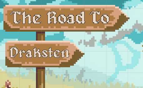
It looks really nice and the leaves are a nice touch. The one thing my eye is drawn to is the lettering. I feel like perhaps the outline might be a bit too thin. It kind of feels like it doesn't fit with the background art. I might be wrong about the outline, it might be something else. I'm usually the type that needs to try something and see it to know if it's right, but there is something about the lettering I feel could be improved.

I played briefly but in-browser games cause my internet to have issues but one suggestion I had for the dialogue is to make the entire thing print out on the click of a button so as to bypass the typewriter effect.

(+1)

Hi Powered by Decaf! Thanks for checking out my game. I have changed the title in the new build, I think I should update this feedback post with the newer content. Yeah, the text is of a bigger base resolution than the signboard, which is why it looks weird haha. I'm trying to increase the outline thickness by just putting one outline on top of another, but here's how it looks for now.

I understand the oddness, but I'll try my best to fix this. 

About the browser issue, you can download the windows build (unfortunately, that's the only machine I have to test on). And the typewriter effect can be bypassed in the newer build. Thanks for your feedback and have a nice day!

(+1)

Hello everyone! Chapter 2 is out! Would love to get some feedback on it. Have a nice day!

https://wolfmakesgames.itch.io/the-road-to-draksten