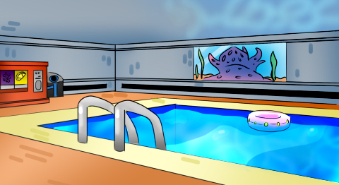
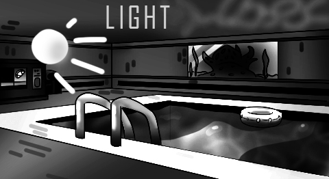
Indie game storeFree gamesFun gamesHorror games
Game developmentAssetsComics
SalesBundles
Jobs
Tags

Your opinion about the design of my backgrounds

A topic by Wolfy games created Mar 11, 2021 Views: 497 Replies: 12
Viewing posts 1 to 10

Hi guys.

I'm making a visual novel. I made some backgrounds for my game.

If possible, tell me which one is better (I know they are very awful, but I do not want it to be professional because it does not suit my art style).

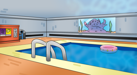
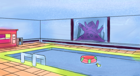
What do you think my designs lack?

What should I add to it?

Or should I start 3d? (:

I am waiting for your answer. Thanks!!

They're not awful! The top one is more like what I'd expect in a game; it's crisper and more cohesive. 

The one on the bottom is throwing me off, I think, mostly because  of the contrast between the perfect straight lines of the room/pool, and the wonky doodly lines of the floaties/tentacle thingy. I do like the watercolory effect though, and the depth to the tentacle tank.


I like the first option from above, but you don't get enough glare on the water.
You need to slightly increase the contrast so that the colors are juicy if this is suitable for your project.
Highlights and shadows are very important, use them.

The second option is very similar to the style from the training books... An interesting option ...

Thanks guys (:

So I have to work more on the top. Although I did not think you would like it more.

Because I liked the latter more.

(1 edit)

Did you notice that I added a reflection?:)

(+1)

Yes it was amazing

(+1)

I also prefer the top one, it just looks nicer.

(+1)

Wait are you making a novel or a game?

(+1)

(I like the second one better because it looks like art you'd see in a kids book.)

(+1)

Ok, first off: Don't belittle your own artwork. It's not cute, nor does it help you grow. We all have to start somewhere and both shown pics are totally fine! For me it's a matter of preference: Which look would you rather like to achieve? The first one is more "clean", but also a little bit more "lifeless" than the second one. The second one offers more texture and a picture book-feel, whereas the first one has more of a "flashy/ polished"-feel. If you chose to work on the second one, I would suggest to decrease the size of the lines on the window, the tentacle-thing and its color seems is a bit too massive, in my opinion. Other than that: I like the vibrant colors in both versions! I'm curious which one you'll use in the end and what kind of story you will tell with it. :)

(+1)

For maximum depth I recommend you add a big flower blurred silhouette or chair & table in the corner + a bit of parallax effect.

Keep up the good work