Indie game storeFree gamesFun gamesHorror games
Game developmentAssetsComics
SalesBundles
Jobs
TagsGame Engines

WebGL theme layout error on mobile?

A topic by Just4FunStudios created Oct 10, 2020 Views: 264 Replies: 1
Viewing posts 1 to 2
(+1)

Apologies if this is the wrong place to post this.

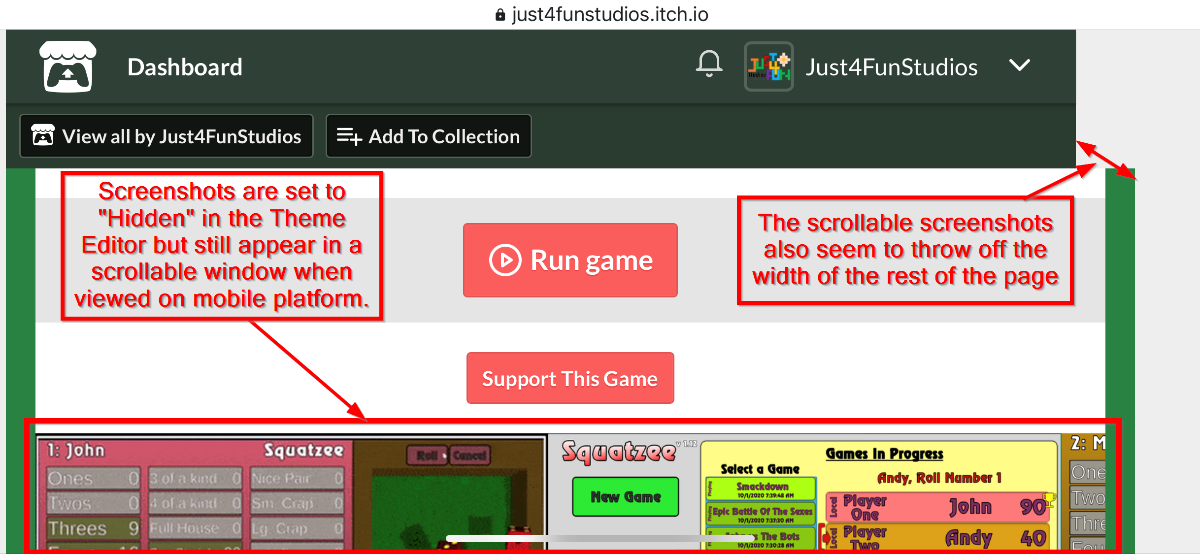
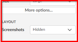
For my WebGL game,  I have turned off the screenshots in the Theme Editor which works as expected in a desktop browser. However on a mobile device the screenshots are appearing in a horizontal scroll beneath the Run Game window. I've confirmed this on an iPhone X in Chrome and Safari and also an Amazon Kindle (only mobile devices I have). It also appears to throw off the width of the page. (Screenshots below)

I could live with the screenshots, but the width change creates design problems for my game. Has anyone else noticed this? Is there a workaround?

Thanks

(+1)

SOLVED!

I found this post,  https://itch.io/t/442426/website-layout-forced-mobile-layout by https://itch.io/profile/harley-torrisi

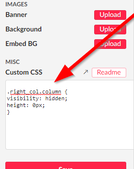
He suggested placing this code into the CSS:

.right_col.column {
visibility: hidden;
height: 0px;
}

After getting CSS access from an Admin it was as simple as pasting that code  into the Custom CSS field in the Theme Editor.

Poof, no more screenshots on mobile devices.

Also, regarding the page-width problem.  I finally tracked that down to the Admin Dashboard shown at the top of our own games. If I view my game page while logged out, I get the standard Itch header and everything lines up properly.


I hope this helps someone else who may have struggled with these problems.

-John

This topic has been auto-archived and can no longer be posted in because there haven't been any posts in a while.