Heyya! Just saw now. I must have forgotten to upload the lastest lastest version to itch.io. My bad! The last couple of years with the kids ... my brain's all over the place. Thank you for letting me know.
Wizardthieffighter
Creator of
Recent community posts
I have to change the URLs to point to wizardthieffighter.com - I shut down the SDM website because with the kids I don't have time to update multiple websites anymore. The rules reference is here: https://www.wizardthieffighter.com/erk-system-reference/
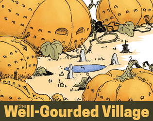
It's a small location setpiece for a GM to run for players with a halloween (and pumpkin) theme.
Mm. For low-ink, I'd just recommend adjusting the printer settings (something like gray-scale / low-res). Try it for free (at PWYW you can always up the amount later if you like it) and if it works, great!
Yep, the Fireball is the typical 3rd level D&D / OSR spell given as an example. All the spells listed in the UVG 2E are power 1 - so level 0.5 (effectively like cantrips).
It is indeed setting + mechanics for travel there. I've been working on the expanded guidebook and the (pretty-much-finished) text is now available: https://www.patreon.com/posts/vastlands-beta-110976074
Hope that helps!
Yeah, a few places around the internet - but generally - 2E doesn't include the SEACAT system and includes more art, more vehicle options, and few extra tables and things.
The system's been moved / updated to SDM, which you can get for free as the BAREGHOST edition of the Eternal Return Key or on syntheticdreammachine.com.
Hey, I do read, but often with a delay!
1. Oracle rolls are for the kind of situation where you just want to "find out" if something could be available or not. A bit like a magic 8-ball. Or quantum world-building. So, yeah, your interpretation of "skill rolls with no risk or variable results" is pretty much close enough. Adding skill in that situation is a bit of a judgement call by the referee. The examples you list - finding a secret or a good sale - if the player gave me a good or funny one-line rationale why their PC's skill would apply this time ... I'd be inclined to either straight up say, "yes" or "yes, if you spend 1d4-1 cash and a quarter of an hour buying some local weirdoes some iguanas-onna-stick."
2. That is absolutely one of the uses of Hero Dice. They're a quick way to regain life (hp). So, the PC can choose - boost your roll now to get a crit? Save your HD for after the fight? Otherwise, life (hp) are one of the attributes that can be recovered after a 1 week rest.
It doesn't fit perfectly - but it's close. The core system hasn't changed that much - the big numbers (level, life aka hitpoints, defenses, travel, dying of thirst, caravan mechanics, carrying capacities, etc.) are all basically the same.
I have to update it, but ... well, it will come!
PS - glad you like the books!
"Welcome" is Heading 1 - in the contents it is styled as SMALL CAPS with an empty linespace above it.
"Do Not... etc." is Heading 2 - in the contents it is styled as Regular with no space above it.
"New Servitor etc." is Heading 3 - in the contents it is styled as Regular with no space above it and a 0.235in indent.
These are all stylistic choices. The simple answer is that I like how it looks.
To change it, select the entry in the table of contents (H1, H2, or H3) and adjust its style in the Text Styles panel. For example, if you want each subordinate entry to have a greater indentation, give the TOC 1: Heading 2 style an indent of 0.235in, and TOC1: Heading 3 style an indent of 0.47in.
The reason for the naming is, quite simply, because I called this TOC style "TOC 1" - i.e. Table of Contents 1.
I hope that helps!


