
Exactly!! The Doomed Defender is well... doomed. They will take more attacks / damage than anyone else. Their friend's will love them... until... well... you know...
A member registered Jan 09, 2025 · View creator page →
Creator of
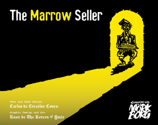
If you are fortunate, or perhaps quite the opposite, you may be able to find Claudius the Marrow Seller...
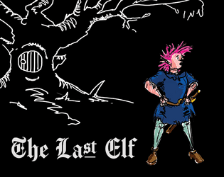
You are the last elf left in the Wästlands, this probably won't end well for you
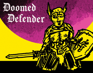
The Doomed Defender is a new traumatised class for Mörk Borg, who protects their friends at their own expense
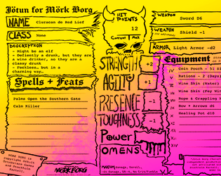
New fillable character sheet for Mörk Borg!!
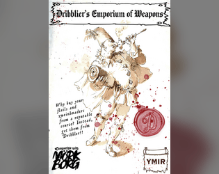
Why buy your flails and zweinhnaders from a reputable source? Instead, get yours from Dribbler!!