Got it thank you!
star-mix
Creator of
Recent community posts
I recently picked up a bundle offering of your tilesets and really love the content! One thing I have recently begun working on; is attempting to integrate your tiles into Godot's tile system specifically with the "Auto-tiling" feature documented here.
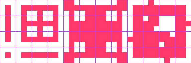
There are lots of different templates to follow but; I gotta say a total dream would be if these packs had artwork arranged like the following:

If we were considering a dirt-road with grassy borders around it, the red would be the dirt path. It makes for a lot more tiles to create, but the end result is really lovely - it allows designers to simply paint and the engine will automatically arrange the appropriate tiles.
I'm working now to try and modify the packs to get this behavior working with more terrain stuff, an "autotiles" pack would be so awesome!
Awesome I appreciate you sharing your process; I really enjoy these types of games but also do not believe I am particularly skilled with them.
Last night after rating a bunch more I came back to your game and played two more sessions and still haven't hit that madness powerup yet! Haha no worries here though I enjoy the puzzle of discovering a nice strategy.
It struck me that these time management games would make probably some fun plotting and data analysis; since everything in it could be modeled fairly directly.
Love these match puzzle games; gets me everytime! Very polished & fun presentation to some nice gameplay mechanics; battling the ker'boblins w/ the swords and maintaining health/armor while going for gold. Could see this being on mobile for sale or freeium play with more enemy and attack types; powerups and things; this is really fun
Clever take on color mixing; the artwork is beautiful, your title page on itch and the character ingame looks really nice; I enjoyed just swimming around in circles just taking in the little reef area. One artifact of me swimming around like that; the enemies clustered together so tightly it was hard to pluck them off! Awesome work , especially for 3 days!
Fun!
I really liked the weapon mechanics; how you have an inaccurate weapon; then a long range; then long range with spread; then the minigun ... not sure if there is any after that?
Nice touch with the music fading in and out too; was thinking it'd be cool to have another song fade in while attacking after awhile to bring in some more intensity. I like the music that plays though!
The visuals are great too; it reminds me of a game called Disco Zoo. I think the sound chosen for beating the zombies added to this for me for some reason; it softens the whole theme of zombies in a fun way.
This was a great submission...I've rated 35 games in the jam so far and this is my favorite. :)
This is really impressive for 3 days of work; the music is catchy; introduction cinematics and the art as a whole really pulls ya into the universe. Puzzle design across the different levels was fun to work thru. The platforming was a bit tricky to control; a bit of a floaty jump; but I also saw how some of the puzzles were designed around that to jump onto high areas and things so this just may be a personal taste thing. Just bringing the whole thing together from concept of the character; the story; and then the platforming is very inspiring : awesome job!
Ah yes additive vs. subtractive color mixing! I find subtractive color mixing with paints and things to be pretty confusing when compared with the additive; I think it's from spending more time doing webdev colors and getting used to the RGB mixing in computer; it's an amazing concept to think on - vision and color is fascinating. Great idea!
The sounds are top notch; really really good the art also; the title screen; gameplay; and that star in the end very cool! I thought maybe each attempt would add another star in the sky like all the souls as a motivator to replay lots. This is really fun I would love to play it with controller support and a buncha levels.
Nice with the functional leaderboard! While playing I thought of another twist; if you prompted the players to match colors instead of the directional arrows; like maybe all the arrows change into identical shaped circles of different colors sometimes; othertimes you need to do the arrow : it's already tricky as it is; just wanted to share the thought! Nice submission :)
Ha this was wild! I know for 3 days we could only do so much; but this inspired a lot of additional ideas; like if the different ships ya combined with had unique attributes added to your ship? I was also wondering how ya worked out the logic of where a ship would get attached; I enjoyed how it was turning into like a monster! This was a really cool idea; awesome implementation.
Probably a lot of different approaches to it! Godot gives the tools for that for sure; it's taken me some time to get into the engine and I'm still learning new things with it everyday...and I know I have only touched the surface on what Godot can do still. Reading over all their official documentation and completing all the tutorials they provide was very helpful for me
I gave this 5 stars all around; gameplay; theme; aesthetics; and the sound, loved the music and the little bings were effective.
Games like this drive me nuts in a good way; I played this multiple times and still have not figured a great strategy to max out the points yet...but I will! Haha, really great idea, the thought of using waiting mechanics didn't occur to me at all.
Had me curious on the design approach; your powerups have humor and also have meaning in the growth rates; did you approach this with some math modeling and plotting progressions? Or is it more of an iterative design approach?
This submission really got me thinking, I love it!
Played this with my kids; we all enjoyed the character sprite - particularly the smile face on there definitely making for a charming presentation. The jump mechanic could be improved by maybe instead of having a linear velocity try a parabola over time; it'll make for much smoother motion. The merging idea was neat; there were a couple places I thought a checkpoint would have been appreciated but - all and all - this is awesome work for such a short period of time! Nice job! :D
Played this on windows with a mouse; I can see how well this works for touch screen interfaces, this would be really neat on a giant touch screen with multi-touch and different users, like if you had 2 teams one on either side of the board; or everyone for themselves 4 player mode...yeah this is a fun submission - I really enjoyed this :)
Oh and the visual effect of stretching out the balls when they go faster; and the merging; really awesome - one thought would be to offer some sort of indicator on how many points a ball is worth before shooting it for the goal; I dunno if it would make sense to toss numbers in there or if that would just clutter things up : just a thought : loved this!


