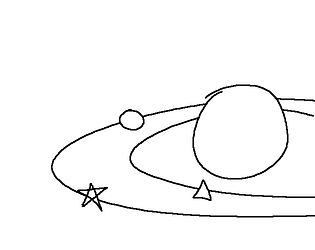
my hope is to create a small app that helps you play the game and put together your solar system for safe keeping :)
A member registered Sep 24, 2020 · View creator page →
Creator of


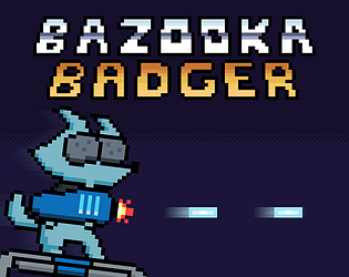
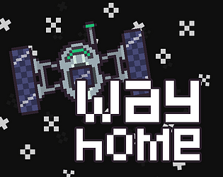
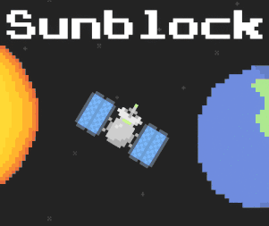
You're the last line of defence in the fight against the suns radiation!
Play in browser
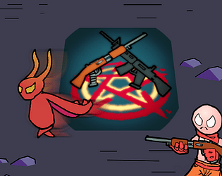
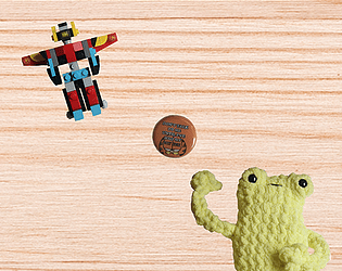
Choose your weapon carefully and defend yourself from unknown alien or enemy or anything you like to call them
Action
Play in browser

[ERROR COPYING FILE] Cannot copy file. Not enough free space. Delete files and try again.
Play in browser