This is a great dating sim. Very accurate to the lore. Would highly recommend!
Especially the ending, love that slow music. Only thing that is missing is the obligatory Beep cameo, step up your game marketing team!
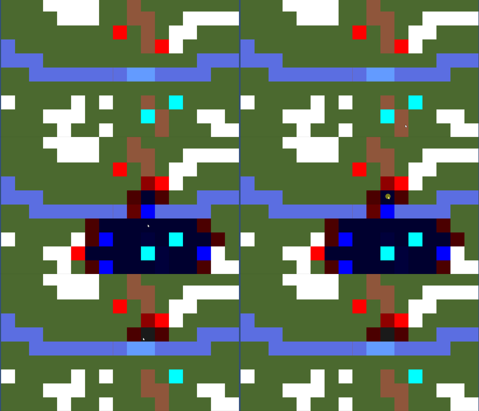
The AI move now but only after I fixed a bug with the movement code. I have discovered that I am spending a large amount of my time tweaking the movement code. Below demonstrates the difference in the code.

Notice how now the blue tiles representing an impassable river as well as other units now block the movement of characters, yet the red tiles represent the unit can attack the tile. This effectively was important to implement because it gives strategic options like blocking off choke points to force favorable fights.
I think it's time to finally make the game look presentable now that the hard technical stuff is figured out. I am quite pleased with the movement code now.
Terrain types are mechanically implemented for movement calculations. It was actually quick to implement, because before when I was calculating distance I just added one to the previous. Instead of one now it just the movement cost of the terrain. I have two arrays, one for the name of the sprite and another for the movement cost. Been thinking of using a different data structure like a struct for simplicity though.
Implementing the new classes are pretty easy so far, as each class is really just different stats at this point. There's no level up system or skills to be acquired due to time constraints unfortunately.
The AI does take their turn now, they just don't move. If a player unit is near them, they will attack the unit with the least health in their range.
Next goal before I submit tomorrow is to get the AI to move to attack. Lastly, this is what I have been looking at, since I am not an artist:

So after getting the AI to move I'm going to swap all this for actual graphics!
Being busy with university has limited my free time to work on the project; however, I am happy to announce that as of now attack ranges are implemented, different terrain types are visually implemented(movement calculation for it doesn't work yet), and the enemy unit can be attacked! In typical TRPG fashion, the attacker goes first, then if the defender is still alive after the attack, they retaliate. Next goal is to get the terrain types mechanically implemented for the movement calculations. If all goes well, a proper AI who fights back will be next.
Since the deadline is coming up, I tried to keep the scope flexible, so if I can just implement one class per side and a unique boss unit I'll be happy.
Sorry, rule of thumb is an English phrase that means "in general." Basically when you aren't sure about something, falling back to the "rule of thumb" is generally a good idea. I hope I have explained the phrase accurately.
Yes, scale the room up, and then you can change the camera to fit the change in scale. You could use two cameras maybe. I would just script the camera to zoom in. camera_set_view_size(camera_id, width, height) is a function you can use for that.
That's a good example to show what you are trying to do. It looks like the player in Indivisible is about a fifth of the height of the camera, so maybe you could try rule of thumb? Indivisible isn't pixel art I would say, so my previous advice about drawing at the size you want to eventually be at won't make sense. Maybe you can scale the room up instead? And then adjust the camera to fit the height of the room? I only had a Game Maker 2 license for one semester at my university unfortunately so I can't go and fiddle with it.
iirc Game Maker 2 does a good job of scaling art down, but it is good practice to draw at the size you want your sprite to eventually end up being, that way you can control which details "get lost," instead of drawing big, scaling down, and then having to make adjustments. Ends up just being more work.
What is the ideal size of the player? You don't want him too big because it limits the level design of your platform segments. Perhaps you could make two versions of him? A smaller chibi version for the platforming segments and then the size of sprite7 for the fighting segment?
Hello all, this is my first game jam. I am a senior studying computer science at a four year university with a concentration on AI, Robotics, and Gaming.
The game I want to make is a Tactical Role Playing Game (TRPG) akin to the Fire Emblem series. My goals for the game jam are to have one playable level with a boss, 1-2 minion types, and 1-3 playable unit types. The units on both sides will be able to move and attack. Clicking on a unit will show their movement and where they can do damage. Game is over when the boss is defeated or all the player's units are defeated.
My current implementation allows the player to select a friendly unit to see their movement range; I used a Dijkstra Map I learned from my AI class to calculate that. The player can move the unit to the selected square if it's in the movement range. The player can pass the turn with space bar to an enemy AI who just passes it back for now.
Since I've been solely focusing on the mechanical side of it, I haven't come up with who the player controls or who the player is fighting. What units should the player control and what units should the enemy control? I am open to suggestions :)
EDIT:
I've decided on vikings vs knights!
This is good, I like the gif dump, it gives me a good indication of your progress. You have taken several twists and turns already, which is fine! I have also taken a turn in my project which slowed me down alittle. The swinging looks really good now. Depending on whether or not you want to emphasize the player's skill in clicking at the right time, or emphasize proper movement control will determine how you trigger the swinging mode. My personal preference comes from terraria which sorta has a grappling hook which is tied to the left mouse button. The grappling hook just shoots in the general direction of the mouse, that way the mouse doesn't have to be RIGHT on the hook-able object, instead the grappling hook just collides with it along the way.
3 to 5 days worth of content with a day and night mode for each? That would be between 3 * 2 to 5 * 2 so 6 to 10 scenes. I don't know if you have multiple scenes but with 4 characters you could give each 2 scenes? That puts you around 4 days total. Just trying to help you plan, dunno if it helped :)
One thing to consider is an end goal for the player. That way it will give you a definitive end point as well so you don't spend too much time defining the special resources and monsters (feature bloat can unfortunately bog a project down). If the procedural generation takes too long, you can still hand craft a level or two to show off the rest of the mechanics. I'm interested in seeing what these special resources are and how the player will use them!