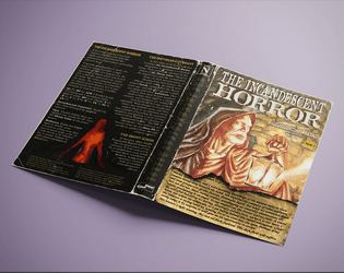
Thanks for the feedback! The Myth is supposed to be Calypso from the Odyssey, but there is thematic overlap with Circe as well.
Path & Stride Games
Creator of
Recent community posts
Thank you for the comprehensive feedback! I would say it is also based on the story of Calypso and Odysseus, at least that was the original idea. Iris, like her greediness suggests, is after money in the end, though she definitely has dealings with companies that could use the data for nefarious purposes (insurance companies etc.) Expanding her ambitions beyond that could be a possibility but I am not sure I can fit everything effectively.
Also, though not explicitly stated, The androids can be of any gender.
I was using the 4 color focus for the most part which does have 2 shades of blue. I cheated a bit with the "never leave" to give it some contrast. Otherwise if there are more instances I might have missed it or it might have been an Affinity thing that sometimes changes the colors a bit during extraction.
I liked the different types of art here, I think it fits the concept great. I would prefer if the last page was the back cover or inside fold. The text above the image on the cover could use some contrast, for example a different size in font, italics or something like that. You did a great job with the writing and what is in here is all very interesting, but I could use some more info on the Lady.
I was worried that making things more complex might take up too much space for me to also include it as a shore leave location. That said I do have some space to play around with, but I might just flesh out what's already there instead of adding extra stuff, like a new room for example.
I think the puzzle is not obvious at first glance, but being able to turn off the NYMPHS completely is quite the benefit. Players might make a connection there, as passwords like these might be an important date, or perhaps the name of a pet, since the cat is something that would probably grab their attention. It can also be "solved" by a character that can do some hacking , with some risk involved of course. I didn't have time to playtest it yet, but adding some sort of stronger hint is not out of the question.
Thank you for the feedback! I think the menu suffers more in terms of readability in the Services section, because the font size there is smaller (not deliberately).
Update: I made the menu cover the whole width of the back cover page, and increased font size, it looks and reads significantly better.
Thank you! Because of working with a theme like this, I put a lot of effort into making something that respects player and character agency, and I think the disclaimer on the first page really is necessary to get the point across to the Wardens.
I would recommend using it as a downtime location until a PC is beguiled (if they choose to be susceptible), and then introducing the adventure - if used as part of a longer campaign.
Yeah definetly some modifications on both maps actually. I might keep the 2 but clarify that the top down is to show room connections on the same floor while the other is a more abstract illustration on the vertical layout. The initial idea was to just have floor 1 and floor 2 on the sideview map instead of room numbering, and when characters were moving there you would use the other map.