Yoooo thats awesome gonna try it out :o
Netherzapdos
Creator of
Recent community posts
Thanks! Personally I've always appreciated samples to see if certain assets work well with my current project so I decided to adapt it w/ most of my packs too :) Good to know my hours of experimenting the character design paid off! 😆
I have tried making a running anim before but given the limited pixel size it's hard to distinguish the current walk style with a supposed running anim 🤔You could use some techniques though like speeding up the walking animation and adding dust clouds
Usually around this time there'd be a notification in our dashboard allowing us to pre set sale dates for the ItchIo summer sale (last year summer sale started on Jul 13), but so far there hasn't been any. A few months ago I also waited for the site wide Spring Sale but it didn't happen either, did I miss something or is ItchIo no longer making sitewide sale events?
Hey, thanks for checking out Pixel Spaces 👋 I'm planning on joining Itch's yearly summer sale, which should happen in the next month or two if they follow their schedule. Was waiting for their Spring Sale but I dont think it happened this year for some reason 🤔Otherwise, the pack is nearly coming up to 5k downloads so if that happens soon, i'll be doing a special 5k download celebration sale!
Hey there! Thanks for the interest in the project! Yes, there is a plan for a Sci-Fi version of the asset pack, it was actually something I've planned early on during the development of this pack. I've seen your reference and it will be quite similar to that. My initial thoughts with the sci-fi version included different modular spaceship parts, space/planet backgrounds, space-themed suits, alien NPCs & more. Due to my full-time job, there is no specific release date or pricing yet, but an early version of the pack will be released within the year!
Thanks for the support 💖 My inspiration for the pack mostly came from a game called 'Tiny Tower', it's a simulation game similar to the sims where you build up your tower, manage and keep your residents happy, decorate rooms, build your city etc.
The scenes I made from the various devlogs were set up in a way that it showcases the initial use case of the pack - which is making buildings, decorating rooms, managing residents, managing neighborhoods etc. That's generally how I envision it but you can absolutely go any way - platformers, adventure, narrative stories etc.
In other words, it's generally designed for a Sims-like (or Tiny Bit) kind of game/project but your imagination is your limit :)
Thanks!! Honestly been a bit busy so haven't been able to work on the pack as much as I used to - currently finishing up the Gamer Room expansion, but after that, I could do a Hospital expansion 🤔Could be beneficial for me so I think there's a good chance I'll work on it after the release of the Gamer Room expansion 💪Have fun with your project and let me know how it goes!
Glad to have helped! And a late happy new year as well 😂 A couple of comments on this page didn't appear in my notifs for some reason so bummed out I replied late to some.
As for the sheets that aren't available in the individual assets folder - there are some that I didnt include like you said which are the floors and walls, my main reasoning for that is because these kinds of assets are mostly applied via tilemaps as it would be more tedious to line up individual wallpaper tiles by hand. Though if there is a demand for it I'll definitely look into exporting them individually!
May I ask how you are implementing your tilesets into Godot? Here is a sample scene I've made:
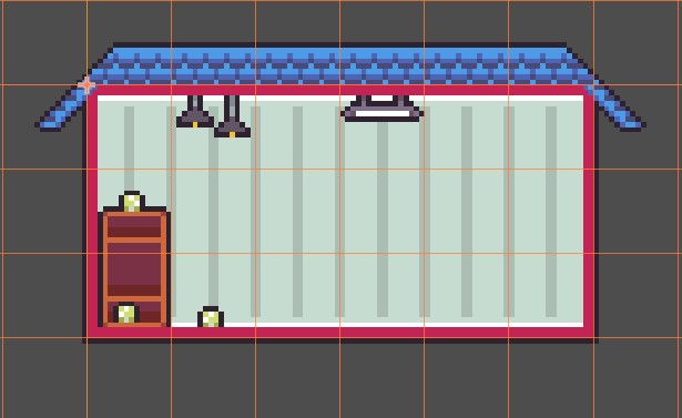
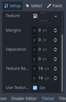
All tilesets use 16x16px and the settings for the tilesets in Godot use a Texture Resolution of 16x16px with no adjustments to the Margins & Separation settings as seen here:
I see that you mention that "individual items not aligning with either the bottom/floor or the top/ceiling ", could it be that you do not have walls setup from the Infrastructure Tileset? The walls in my sample scene above are the pink borders. All tileset assets take into account the walls from the Infrastructure Tileset so without it, objects may look out of place like this:
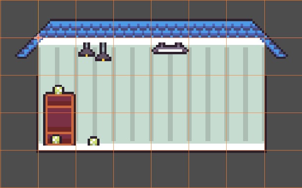
Also, our timezone gaps are quite far so I apologize for the late reply 😅 If you'd like, we can continue our conversation at either my discord (username is netherzapdos) or DM me at Twitter. I think your proposal is possible for the space station, I can design a couple of new modular infrastructure tiles with a couple of exteriors and that should give a good amount of unique combinations so each space station looks different 🤔
Hi there and thanks for reaching out! Happy to help with anything.
I'm not sure which animations you're referring to that isn't being implemented correctly to the other assets - but based on your description it may be the NPC spritesheets? If so, the configuration for all NPC-related spritresheets (Pre-made NPC spritesheets, clothing spritesheets, body spritesheets, etc) all use a 32x32px frame. I think the issue you're facing now is that the character sprite is smaller than all the other assets - so what you need to do now is to increase the sprite size by x2.
The intended size of the character sprites are 16x16, but in order to add customizable features to the characters I increased it to 32x32 and is the reason why the characters would appear small in the editor - it's a small trade off and requires a little bit of adjustment . Hope this helps and let me know if you're referring to a different issue! I'll work on adding a readme to the respective folders to help future devs 👍
Also, very cool to hear you're making games for your kids! That'd be a great core memory for them when you finish making it :) The idea with this asset pack was to always make it easily expandable so I can always come back to it when I've got fresh ideas! I definitely have intentions of making a Space-themed Expansion but it's fairly far in the plans. I can see making a small package update though to help you out 🤔 Maybe introduce it as an Expansion where some guy jury-rigged a small spaceship in his backyard and actually managed to reach space 😂
Update is now live. You should be able to see the labels when you implement the animations in your game engine :)
https://netherzapdos.itch.io/pixel-spaces/devlog/652167/pixel-spaces-updated-npc...
Hi and thanks! No worries, I'll explain it below:
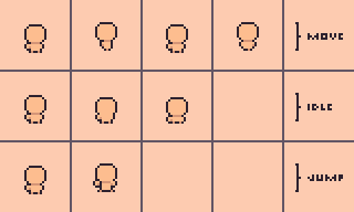
The animation spritesheets are setup as is, with each animation being laid out horizontally, and each row being a new animation. I will make this my priority today and will push out an update to label the body & pre-made NPC spritesheets from both the base pack and the expansions. I will notify you as soon as it's live 😄
I agree with that, AI isn't a 1:1 copy of someone else's work, it's definitely an 'inspiration' of a reference, much like how majority of artists always get inspiration either from references or other people's work. Sometime down the road an artist will always be inspired by something and they make a version of it, and AI generation is the very definition of that, just at a very extreme level.
I don't see any issues with someone using AI as the backbone of their assets, if it's what's helpful to them then the better. From what I've observed what makes AI-assisted development hard to implement is the potential backlash coming your way. You'll get so many people bashing you for using "stolen" content and not so naturally-looking details.


