Thank you for the feedback! Your suggestions sound promising, and I had similar ideas in mind. I will try to improve the project accordingly if I can allocate time for it, and hopefully it will become a proper VR beatmap editor. Also, I'm sorry that I was busy during the voting period, and couldn't play your game. I'm looking forward to your contributions if you are still interested.
Thank you so much for your detailed feedback regarding the gameplay. Also thank you for the discussion on Discord. I have released the source code if you are interested.
Thank you for the kind words! However, please note that this entry is built on another project. See my response to the jam host. Also, as mentioned, I released the source code.
You are right that all beatmap editors (official or otherwise) run on desktop, not VR. It would be cool if this project turned into a fully-fledged VR-based beatmap editor as discussed briefly on Discord. That will definitely be my roadmap if I can find time to develop this further.
The beatmap files also contain the light show (lights and spinning environment pieces). This jam version uses the light show from the beatmaps directly, but generating it automatically sounds doable.
Yes, this entry is based on OpenSaberPlus. As you said on the livestream (sorry, couldn't watch it live!), I mentioned this on the Discord but I overlooked it while preparing the itchio project page since my submission was already late.
Regarding the rules, thanks for allowing this entry despite stretching the rules both in terms of deadline and code usage. To make things clearer for everyone, I suggest adding a question about the used code sources for the next game jams. Personally, I'm okay if everyone used existing projects like me. As a player, I'd prefer to play a complete game that uses another project as a foundation rather than play an incomplete from-the-scratch game.
I'm not the dev of OpenSaberPlus. I submitted a PR to it last month but got no response - the project seems inactive. Therefore, I had my own private fork with several bugfixes and minor improvements. I have just released the source code of Record Saber, which incorporates all of these. Also, I updated many other aspects of OpenSaber for this project, e.g., new saber sounds, models and improved timing. Almost all of the UI underwent complete transformation for better UX.
Nice entry! Movement and shooting felt quite satisfying thanks to the interpolations and screen shake (though it was a bit too excessive at some point). Mouse-only controls were good, would be perfect for a web game.
Died of thirst after 49 days. Interesting concept! However I thought that green areas were for satisfying hunger until I realized it sounds like radiation.
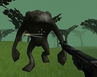
Straightforward but enjoyable gameplay! However I found it too easy to shoot enemies when they are outside the view. Other than that it's cool and music fits pretty well.
Personally, my biggest struggle was with the icons, since they make the notes table a bit hard to read. (I just realized I said "notes" in my original comment, but I meant "mail"—sorry for the confusion!) For example, the O and - icons took me a while to figure out. At first, I thought there were more variations, and I was expecting something more familiar, like an X and a checkmark, which I’m more used to seeing. The effect icons were also a bit hard to follow, especially the one for invincibility. It made the beginning a little confusing until I got used to the icons.
Other than that, I haven't had big issues, but if you're open to suggestions, here are a few ideas to improve it even more:
- I think adding some sort of hover effect to the table (something like the pink hover in the chest menu, but less bright) would help with readability. Right now, the table feels a bit static. - I’d also suggest adding tooltips to the icons. It would really help with understanding what each one means. - The brewing window is great, but having icons next to item names and color-coding the success chance would be super helpful too. - It would be nice to be able to close windows by clicking outside the window boundaries, especially since the character moves with the mouse.
Also, in a game like this, I’d love something like drag-and-dropping each material separately into the cauldron. Though that might be a bit off track.
Thanks for your feedback! I guess there's some room for improvement in terms of graphics but unfortunately we didn't have enough time to focus on that.
Also, you can see the scales in connections. The thickness of a line is determined by the absolute magnitude, IIRC we wrote this to a tooltip but you are right that this could be communicated more clearly. Thank you for your constructive criticism!
Thanks for playing and providing detailed feedback! Good to hear that the restart button addressed your problem. Another way to fix this could be forcing restart if no progress is made after a timeout. I'm busy these days but I will keep this in mind when I circle back to this game.
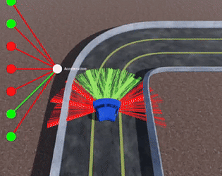
No, this is not the intended behavior. But there's a known bug where cars randomly jump to a great height, presumably due to the quirks of Godot Physics. Your issue might be related to that.
The execution of the concept is brilliant. The pacing is a bit slow, and there isn't much to do outside of managing the star. The shaders are also impressive, especially for a web build.
I love the concept! It's fun to experiment, and the notes you get feel very natural. The menus could have been a bit better, and being able to hold more than one item at a time would’ve been great, too.
I love the concept! It's fun to experiment, and the notes you get feel very natural. The menus could have been a bit better, and being able to hold more than one item at a time would’ve been great, too.
This game is pretty good! I liked that leveling up wasn't an immediate requirement, allowing you to save soul shards. The multiple maps are great, though there aren't many visual differences between them. The main menu is also well-designed, it really pops.
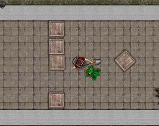
Unique aesthetics on this one! The concept is very creative, too. The enemy variety was great, but I didn't enjoy the stationary ones, they felt a bit too much like bullet sponges. The environments looked very similar, which made it hard to navigate toward the end. Also (spoilers): I chose to kill the human at the end.
Very impressive for a first game. The level generation, AI states, and menus are great. There could be better balance, though. The orange slimes seem more aggressive and primitive than the Darwins. It would’ve been nice to see other Darwin tribes or races instead. The water requirement also felt more unforgiving than the other needs, and I couldn’t find a solution for it as maxed-out stats didn’t seem to help.
The core gameplay is solid. The graphics could have been improved with some animations. My tactic was to hover over enemy spawn patterns so they'd take damage instantly upon spawning. However, I think the game would be better if spawn locations were randomized, the same pattern gets repetitive after a while.
The platforming is very satisfying. I also liked how the aging mechanic affected the platforming. It would be even cooler if aging were strictly tied to time, making precise movements essential. I like it.
Great game! The use of the limited field of view is excellent. The only thing missing is more combat-oriented parts, but I still found it less linear than something like Spore's first stage. The creatures you can create are also visually appealing.
It's like Vampire Survivors, but the deaths actually feel rewarding. The music is great, too. The difficulty ramps up quickly, but the upgrades end up feeling really satisfying in the endgame. I also liked being able to stack multiple upgrades from the same tree. It was great overall
Thank you too for playing and providing feedback! Sorry to hear that keyboard input didn't work for you. It may be a good idea to add mouse-based car controls if I find time to update this in the future. Beyond accessibility, mouse can provide more fine-grained vectors as input.