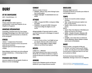
Cool entry with a nice theme and nice mechanics. I especially liked the helpful descriptions of how player action can trigger different outcomes. And of course the demonic twist 😈
koleir
Creator of
Recent community posts
An interesting entry with a very whimsical approach. The greenish sepia theme works well and the collages are super interesting. The variety of areas give a lot of leeway for interpretation.
It took me a bit of time to see the arrows linking areas together as they are quite subtle but what broke the immersion the most for me was the pixel font used for the NPC names.
Thanks a lot for your feedback, I’m glad you liked it!
Regarding the what’s going on part, I tried to summarize it in the intro but I realize it is not clear enough. I also scattered some of the details in the text itself (such as the corrupted priest having summoned the mantis) when they should have been presented upfront.
My idea was also to leave some leeway to DMs for improvisation (I initially thought about writing “Be creative here” in the Deep Forest location description but it felt too cheap lol), so you could easily integrate it in a wider campaign frame.
I’ll keep this feedback for next modules (or the expanded edition!)
A very cool Mausritter adventure! I really like the custom conditions and, of course, the GOATMORPH spell which had make me laugh when reading its description. I also like the creepy vibes and overall weirdness as well as the custom art and overall presentation.
I’ll go into more details as to what I think could be improved since you asked for it on Discord:
- I find the font work to be a bit busy: there are a lots of fonts used, with varying weights and sizes, and sometimes a different font is used for the same kind of information (conditions VS spell of goatmorph for example). A bit more consistency would make it easier to process.
- Some paddings and margins are inconsistent (stat blocks have no padding on the left, location 2 title has no top margin). These could use a tad of polish
- The white-on-yellow used for locations keys on the map is really hard to read for me. I just noticed where the 4 is while writing this 😅
I really enjoyed reading through this entry. It has a strong theme, the letter is really cool and gets you into the story really fast. As others said, it would be great as a handout for players. I also laughed a few times because of the goofy details, which fit really well in an otherwise spooky adventure. The order you are presenting things is working really well and makes it easy to get into.
I would have loved the general design to be a tad more contrasted. It makes some parts of the text a bit harder to read (especially in the striped tables or the floors map).